I grew up with children’s books, and truly loved the stories. Every evening, a favorite book of mine renewed a spark of imagination before bedtime. Story time was the fun part of school while delivering life’s lessons and eventually encouraging me to read. Those books provide me the adventure I craved, allowed me to become a hero for a day and granted me permission to visit new worlds in my daydreams.
The books also gave me and my classmates our very first taste of typography and illustration. Those pictures welcomed us in, but it was the words which really hooked us and carried us away. Some books were easier to read, and some more difficult, depending on our age and reading ability. Word length, character size, and quantity of type versus white space on the page either created comfort or presented a challenge.
In the 70s, the time of my childhood, most of our classic children’s books were typeset in large typefaces from the classifications Humanist Serif (or Old Style) and Transitional Serif.
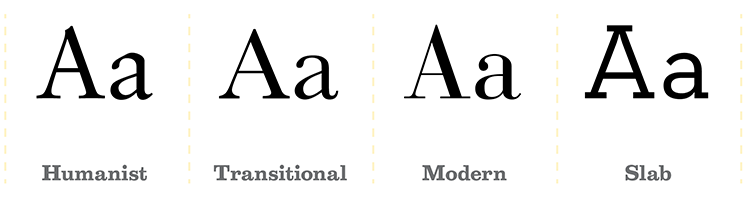
Both serif styles differ in calligraphic style and stroke contrast, but they were both used in children’s books for their similar legibility. These two classes were popular for book typesetting because they are easy to read, mainly attributed from the following five characteristics.
1. High x-height The x-height of a character refers to the visual size of the typestyle, not the point size. Compare the heights of the lowercase ‘x’ from a Humanist Serif to another typeface, and that will give you an idea of how ‘large’ and legible it is.
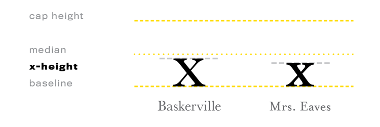
Both of these are Transitional Serifs, but Baskerville is easier to read than Mrs. Eaves, because of its high x-height.
2. Large counters Another indication of letterform size is in the size of the counters. Letters containing closed counters include A, B, D, O, P, Q, R, a, b, d, e, g, o, p, and q. Open counters have apertures (open “mouths”) and exist in the letters c, f, h, i, s and so on. When the counters are larger, they are easier to read.
3. Wide bracketed serifs Brackets are the curved connection between the stem and serif. Think of a wall being a stem and a shelf being a serif. A bracket is used under the shelf to hold it up. Wide serifs with brackets help the reader identify the letter.
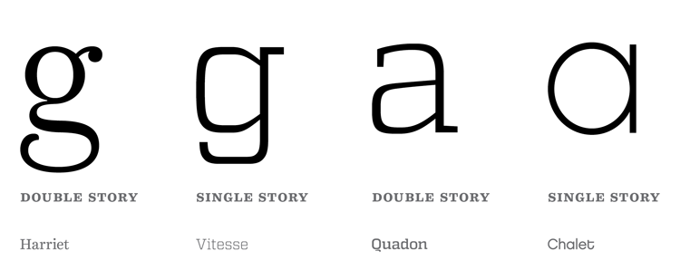
4. Double-story allographs Allographs are considered variants of a letter. The lowercase versions of letter g and letter a have two types of variants. The one we learned how to write in grade school penmanship is single-story. The alternative is double-story. The double-story variants are easier to read because there’s more visual indicators in the letterform.
5. Moderate contrast in stroke variation due to calligraphic origins When there is some contrast and stroke distinction in the letterform, it aids in readability.
The overall layout of the text pages implies the reading level. Large format, type size, white space and illustrations will visually communicate that the book is for beginners. Smaller page size, smaller type size and dense copy with little or no visuals will appeal to older readers. When a child opens the book, they know if they can read it or not, before reading any of the words.
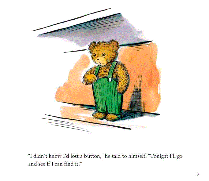
The book Corduroy by Don Freeman (1976) is about a bear who wanders around a department store after closing time. It was a favorite of mine when I was very young. Looking at the text page, the copy is set in a classic Humanist typeface called Palatino, which has a large x-height and wide counters. Only one or two sentences are set at a time, which indicates the book is for toddlers.
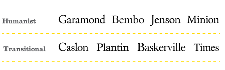
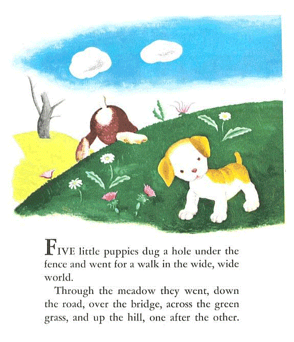
Early readers love Little Golden Books. I used to carry my 12-book box set around the house and would pull out the gold-spined volumes one-by-one. One of the originals, The Poky Little Puppy by Janette Sebring Lowrey (1942) is also set in a Humanist typeface, Garamond.
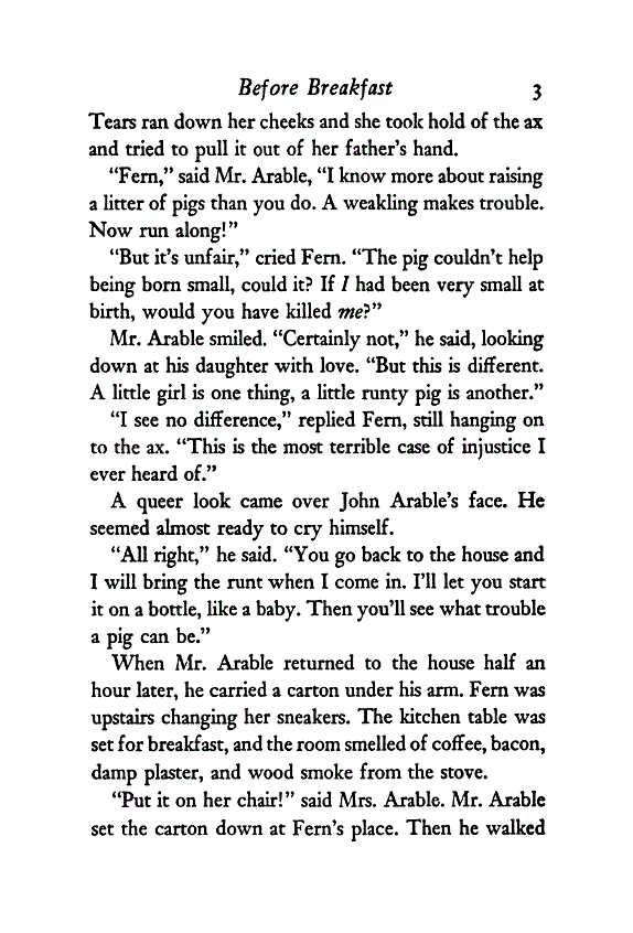
Charlotte’s Web by E.B. White (1952) is a book written for tween readers. The page is set in Caslon, which has been classified both as Humanist and Transitional Serif.
Pull out your old books and take a look inside. Most of the classics were set in serif. And more recent ones, depending on their concept, might be set in sans serif. Either way, they probably have large x-heights, wide characters, and two-story allographs to keep kids reading.
Which books did you love as a child? Did they have memorable typesetting? Please share your favorite books and tidbit ideas on Twitter, don’t forget to tag @TypeEd. I’d love to know what typography first influenced you as a young reader.
All book images are sourced courtesy of Google books and material copyrighted by their authors.
Rachel Elnar is the producer and co-founder at TypeEd, where she helps bring the craft of typography back to design education. Get more type in your inbox and sign up for more about TypeEd columns (and other announcements).