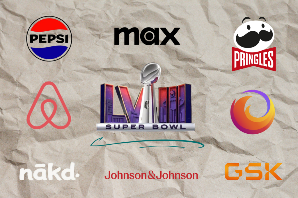
Simple logos are everywhere. Corporate giants like Pepsi, HBO Max, and Johnson&Johnson simplified their logos in 2023 as part of a larger rebrand. In 2022, we saw GSK, Nākd, and Buick make a big shift toward minimalistic designs.
And then of course, there’s Pringles. Back in 2020, Mr. Pringle went bald, and his mustache turned to flat black. It completely divided the internet!
So, do consumers like it?
Social media posts like this one, lamenting the standardization and simplification of the Super Bowl logos, have been circulating for several years. Graphic artists, in particular, don’t seem all that inspired by the designs.
- Veronica Fuentes, a digital marketing manager in Los Angeles, says, “There’s a fine line between brand recognition and creativity. We must never sacrifice one for the other.”
- Lorit Queller, a content manager in Los Angeles, suggests big recognizable brands (like the NFL) have an opportunity to make their logos unique and fun.
- Ernest Esterne, a graphic designer in West Palm Beach, ardently states that “creativity died in 2011.”
If consumers feel that the evolution to minimal logos is boring, why are corporations so tied to the trend?
Brand Recognition: Cutting Through the Noise
Simplifying a logo makes it easier to recognize, according to Blue Text Marketing Agency. A clean and simple design stands out in a complex and cluttered digital environment. Bold and well-defined shapes, minimal colors, and clear typography grab attention quickly and are easier to recall.
Adaptability: We Live in a Digital World
Before the digital era, logos were seen in entirely different contexts (billboards, newspapers, packaging). “The world now operates from the palm of our hands; we’re working on smaller screens with smaller real-estate,” says LinkedIn’s Digital Marketing Leader Jennifer Buntin. From small mobile devices to large desktop monitors, logos designed with clean lines and minimal details can easily be scaled up or down without losing their visual impact or legibility.
Timeless Quality: Leaves Room for Change
By eliminating unnecessary details and complexities, minimalistic logos can transcend passing design trends and maintain a timeless appeal. Additionally, such logos are less likely to be tied to specific products, giving brands some flexibility to change services over time. Unless you’re McDonald’s. Their giant French fry logo (bent into the shape of an “M”) is arguably the most timeless and more famous than its actual menu. Can you imagine McDonald’s without the Golden Arches?
What do you think? Are simple corporate logos a smart and timeless move, or does this trend suppress creativity and make it harder for brands to stand out? Join the conversation on LinkedIn!