Food Desert, Idea Jackpot: The Design Week Open Houses of NW Portland

I may have spoken too soon when I declared that there was no need to plan for dinner during Design Week Portland’s series of open houses. In contrast to Tuesday night’s tour of N and NE Portland offices, where giant tamales, Mediterranean BBQ, and pizza abounded, the scene in NW was a relative food desert.

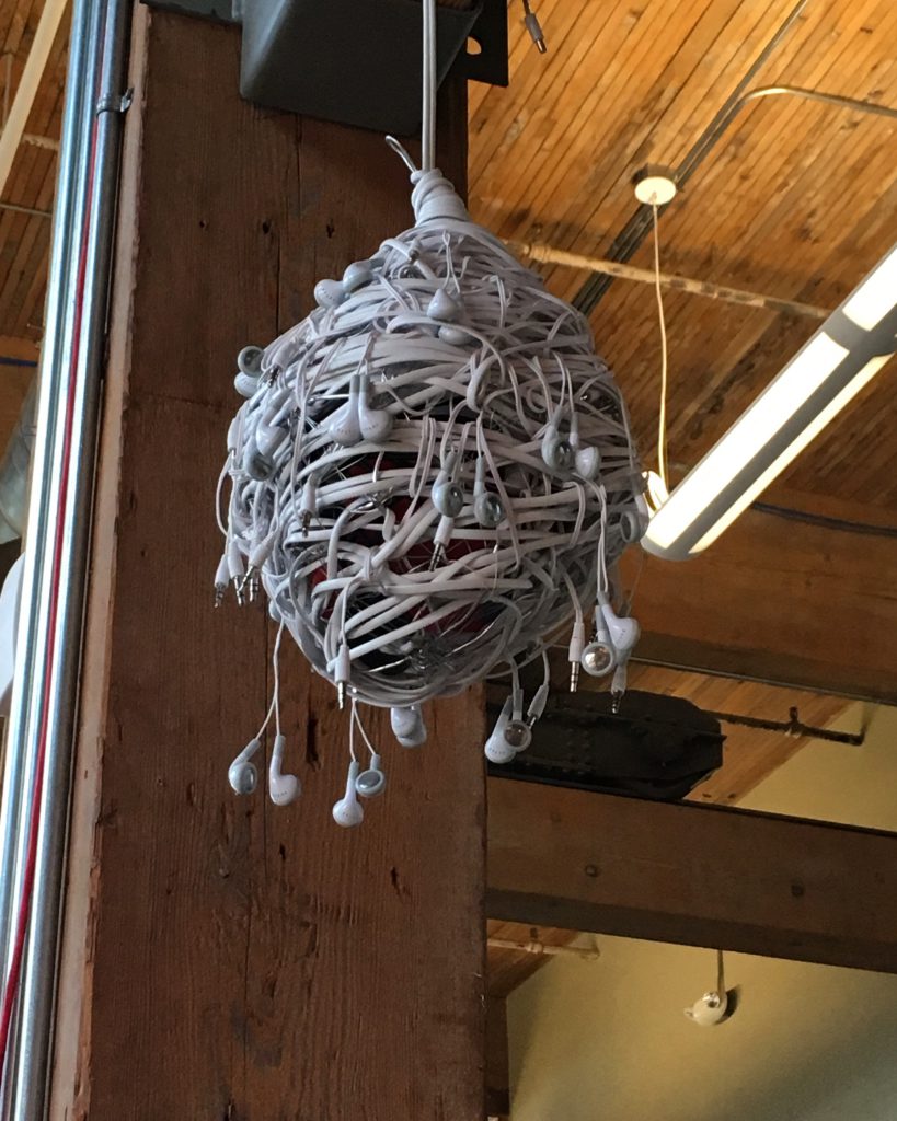
Nevertheless, it was a welcome excuse to check out Citizen, a truly remarkable company that concerns itself primarily with the intersections of design and technology, performing research and analysis of market and culture trends to find new ways for tech advances to integrate into our lives—and they create some seriously elegant flowcharts in the process. They also have one of the coolest office spaces in the city, tucked away on the fringe of where NW starts to become primarily industrial. Upon arrival they had Purple Rain projecting on the wall (respect), a few paces away from a ceiling pendant that had been fashioned out of Apple earbuds.

Design Week Portland Alternate Usage for Earbuds at Citizen Inc

At this point, we’re so deep in Design Week that you can’t help but start to recognize people who are working the same circuit you are. Such was the case with Luke, an architectural consultant I had also seen at Wednesday night’s party at NORTH. Mutual recognition demanded we introduce ourselves, swapping notes about the other events we had already attended, and those we planned to. It was pleasant enough that I stayed longer than I meant to, but eventually I pulled away, on to the next adventure.

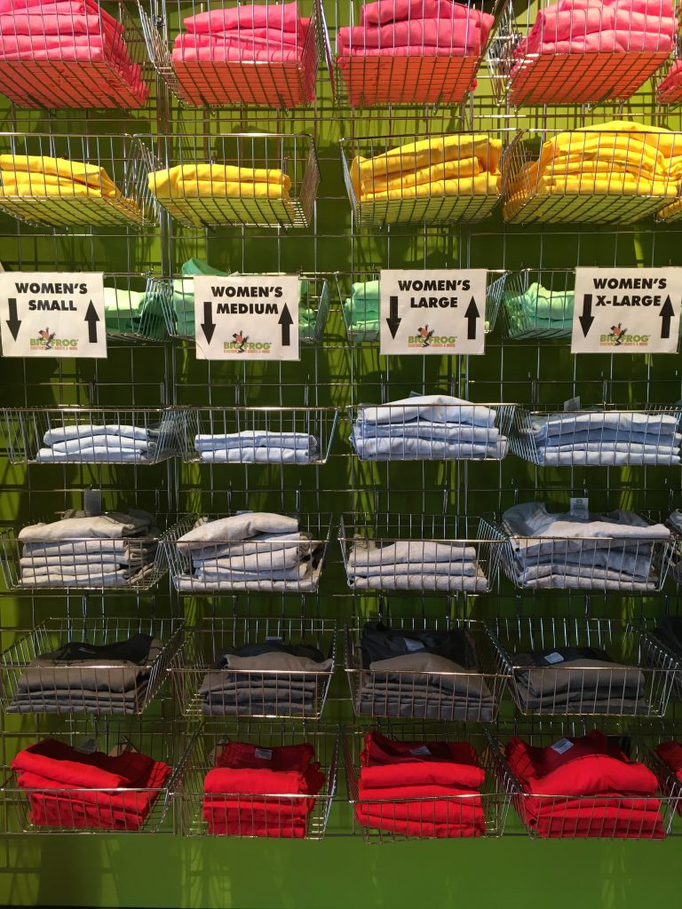
Big Frog Custom T-shirts has been hidden in plain sight on W Burnside for four years, though I’d never heard of them. They’ll digitally print a design of your, or their, making with no minimum, on tees that come in an array of colors and sizes and… that’s pretty much it! But they did have snacks.

Design Week Portland Big Frog T-Shirts

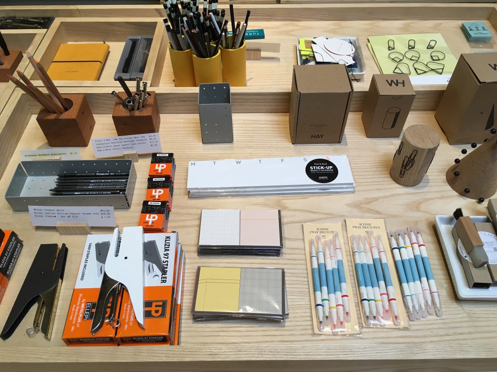
The simplicity of Big Frog afforded me more time at Hand-Eye Supply, a shop that specializes in the best versions of tools for all kinds of projects. There’s a global selection of writing instruments, notebooks, tools, axes, and workwear—a curated retail haven for the fetishization of creative supplies. They are the retail arm of Core 77, an influential design site whose job board, Coroflot, is having its new office built within the adjacent Hand-Eye warehouse. It’s actually on wheels, and began as a planned tiny house by Laurence Sarrazin of Los Osos design studio, built with wood milled on the property it was originally slated for. I’ve met Sarrazin once before—she’s brilliant, and I enjoyed sharing a beer and conversation with her, though my stomach was starting to rumble by the time I finished ogling the Italian-made staplers on my way out.

Design Week Portland Hand-Eye Supply

My last open house of the evening was Anthropologie. I’d been curious about how they’d activate the store for the occasion, and thought they might use the opportunity to highlight their collaborations with independent designers. Nope! They were simply open, business humming as usual. It worked out since I needed to price out a duvet cover, but I didn’t dwell long before walking the few blocks to the westside tomboy headquarters of Wildfang.

Presented by Sockeye creative studio, the event at Wildfang was accompanied by—finally, hooray!—freshly cooked up dim sum treats by Boke Bowl, which just about saved my life. It featured Piers Fawkes, founder and editor of PSFK, a site that specializes in future-thinking news, inspiration, and forecasts. The night’s topic was “The Future of Retail”—basically a breakdown of the latest technology tools being used by companies to communicate with customers, maximize the availability of product information, and streamline their overall systems in ways that are both admirably efficient and depressingly capable of eliminating human employment. It was on the dry side for a jovial, dim sum and canned wine kind of crowd, but it got my juices flowing, and I drove home thinking through the inspiration it gave me for my billion-dollar startup idea.

And no, obviously, I’m not telling you what that is.


Marjorie is a former Creative Circle candidate based in Portland who recently accepted a full-time offer for her dream job. She is a writer/editor and stylist/producer with an emphasis in the design world. If you are interested in working with someone like Marjorie, please contact your nearest Creative Circle office.

Still on the fence about attending events or open houses?

Read our blog on why it’s important.

Points NORTH: The Power of a Good Party

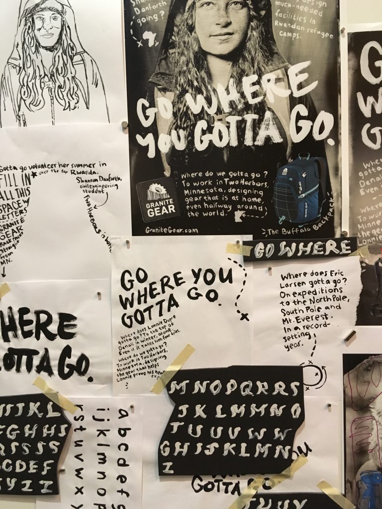
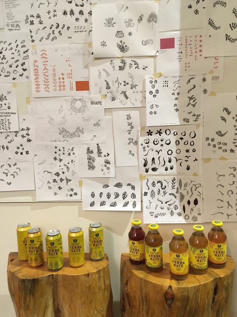
The description was vague but intriguing for “Further North,” a Design Week Portland event being hosted by NORTH, an advertising agency known for its work with Columbia Sportswear, Pacific Foods, and Cover Oregon (not their fault!). Would it be a panel, a lecture… ? Turns out, it was mostly just a party—a really good party—albeit with opportunities to make your own poster in the spirit of NORTH’s handmade methods for creating fonts and label designs. There was also a booth (where you could ask a NORTH employee anything), free burritos, beer on tap, and a display of how the creatives at NORTH go from literally doodling with ink and paper to creating some of the most recognizable package design on the shelves of the grocery store.

Creative Circle_Marjorie S_North Relatable Art

Full disclosure: I knew there would be some familiar faces in the crowd. One of NORTH’s Creative Directors is an old acquaintance who dates one of my good friends, and an art director I’ve worked with for years produces his outdoor adventure magazine, Stay Wild (to which I also contribute writing and copyediting), under NORTH’s custodianship. Since I was rolling solo, this took the edge off potential awkwardness, but instead of limiting me to interactions with people I already knew, these associations served as a bridge to get to know other, looser contacts.

Standing in the same conversation circle as the aforementioned CD put me in position to strike up a long conversation with the NORTH’s Executive Producer—who I’d technically met previously, but only slightly knew. The arrival of a freelance photographer I knew led to an introduction to a Portland-based wardrobe stylist whose work I’ve been following. I didn’t know that Kelley Roy, founder of the ADX manufacturing hub and Portland Made advocacy center, would be there, but I ended up talking to her for most of the last leg of the evening, and I even met, IRL, the owner of a modeling and talent agency before we realized we’d already corresponded over email months ago.

Creative Circle_Marjorie S_North Plans for Cans

I was surprised to check my phone and realize that I’d stayed for almost the entirety of the three-hour event, floating from conversation to conversation, and getting an impromptu tour of NORTH employees’ desk collections (including a ticket stub from Dollywood, a sea monkey terrarium, and a preserved baby shark), their hilarious “email treadmill,” and the dark, upholstered booths hidden throughout their offices for private phone calls (though they look like they’re for making out).

In an industry where relationships and personal chemistry are a bedrock, NORTH set the tone by being welcoming and curious about its guests. There may not have been much formality or structure involved, but I left the event feeling fulfilled, connected, and as though the time—though about twice as long as anticipated—had been well spent.


Marjorie is a former Creative Circle candidate based in Portland who recently accepted a full-time offer for her dream job. She is a writer/editor and stylist/producer with an emphasis in the design world. If you are interested in working with someone like Marjorie, please contact your nearest Creative Circle office.

Still on the fence about attending events or open houses?

Read our blog on why it’s important.

Open Houses and Oversharing: The Design Week Portland Meal Plan

Good news: No need to make dinner arrangements during these few days that Design Week Portland’s open houses are in effect. This year, the studios, agencies, and retailers who are opening their doors have really kicked it up a notch with the hosting duties. Show up early enough and you may well find a full dinner awaits. In fact, if I’d wanted to, I could have eaten three dinners last night, between attending four open houses and one well-sponsored event.

I began at Beam & Anchor, an out-of-the-way gem of a design shop on N Interstate that traffics in beautifully curated housewares and one of the best selections of accessories in the city. Above the retail space are a few studios occupied by makers of various sorts, who welcomed the public upstairs for a rare glimpse behind the scenes.

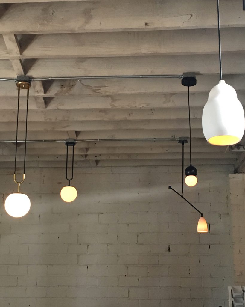
As a serial DIY-remodeler, I’m a magpie for all things home-oriented, so I was immediately drawn to the corner of the space occupied by Current Collection, a not-quite-launched line of pendant light fixtures designed by Nash Martinez. There’s no website or official list of stockists yet, and Current’s Instagram is claimed but unused, but you can glimpse a few of the pieces exclusively downstairs in Beam & Anchor should you be in the market for an illuminating conversation starter. (Note: there was hummus and grapes and that sort of thing, but the gustatory highlight of this open house was definitely the bottle of limited edition Spanish red wine Martinez opened for the occasion.)

Design Week Portland Beam Anchor Current Collection Open House

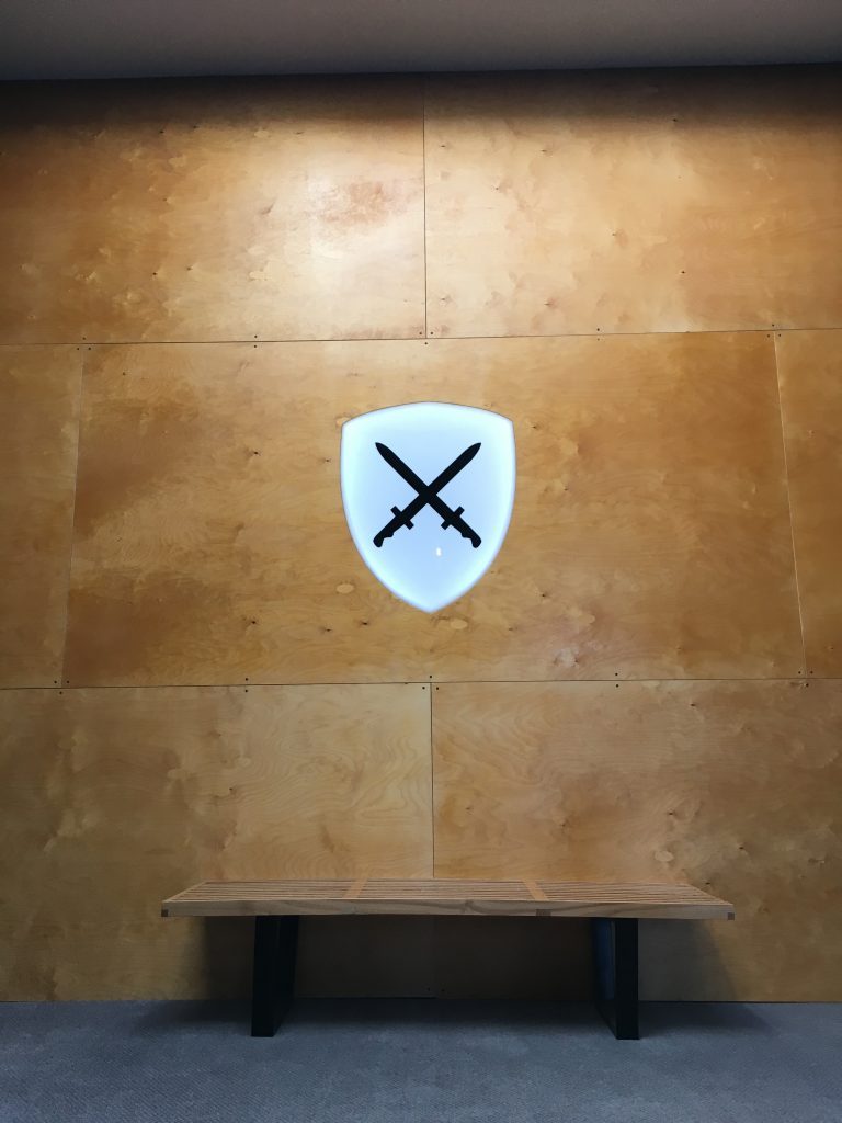
Moving on, around the corner I had to check the address twice to be sure I had arrived at The Brigade. The black door leading up to the spacious, whitewashed offices of this young digital agency is marked only with their logo, a pair of crossed swords. It’s an agency with a musical bent—they’ve worked extensively with Spotify, and helped create the Nike Women Move Mix app, which curates athletes’ playlists based on taste, type of workout, and pace—and a young, friendly staff, who gathered around an enormous spread of tamales from Tamale Boy, which is set to open a new location in The Brigade’s neighborhood. After downing an enormous vegetarian version, I set about making new friends, including super-nice Brigade partner Zeke Howard, with whom I connected over a few mutual contacts and swapped email addresses.

Design Week Portland The Brigade Open House

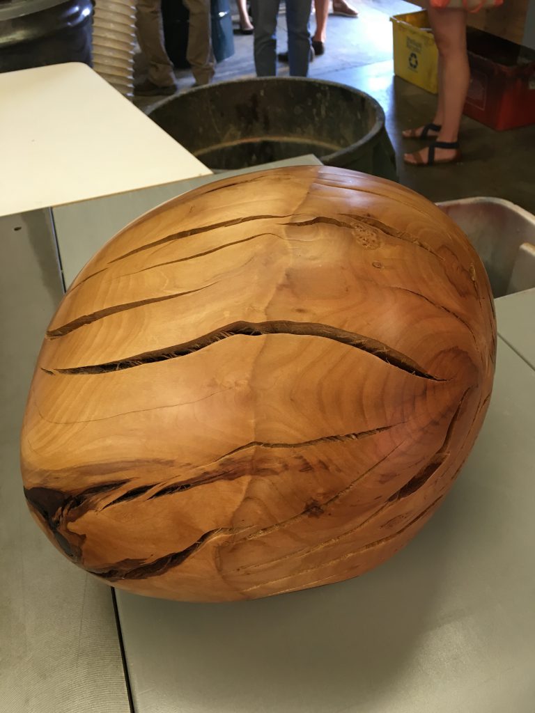
Dining and networking needs addressed, it was time to move on to 534, the shared studio space of Spacecraft, Merkled Studio, New Refined Basics, and VINCAdesign, where there was a casual, family friendly Mediterranean-style cookout underway. Used mainly by people working with wood and metal for furniture and jewelry, the space has a garage-y vibe, littered here and there with intriguing evidence of ongoing experimentations, like a giant egg-shaped tree burl that’s been polished smooth for no apparent purpose. There I bumped into a few familiar faces from Portland’s independent retail and fashion design scene, sampled an unlikely sounding cocktail involving spicy black pepper, pomegranate, and cucumber infusions (unique, delicious), and took a peek at furniture prototypes inspired by tree shapes and midcentury aesthetics.

Design Week Portland Tree Burl

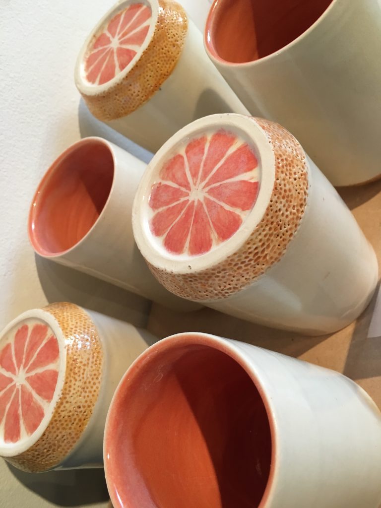
The last open house of the evening was actually more of a group sale featuring the work of students from the MFA in Applied Craft + Design program created as a collaboration between the Oregon College of Applied Craft (OCAC) and the Pacific Northwest College of Art (PNCA). Students, alum, and faculty offered an array of work priced at $50 or less, spanning hang-able art, wearable art, ceramics, handmade books, and more. A few clever items, like the grapefruit drinking vessels by Cat Chidester Brown, made me wish I had as much space in my cabinets as I do love for discovering new ceramics designs (read: limitless).

Design Week Portland Cat Chidester Brown Ceramics

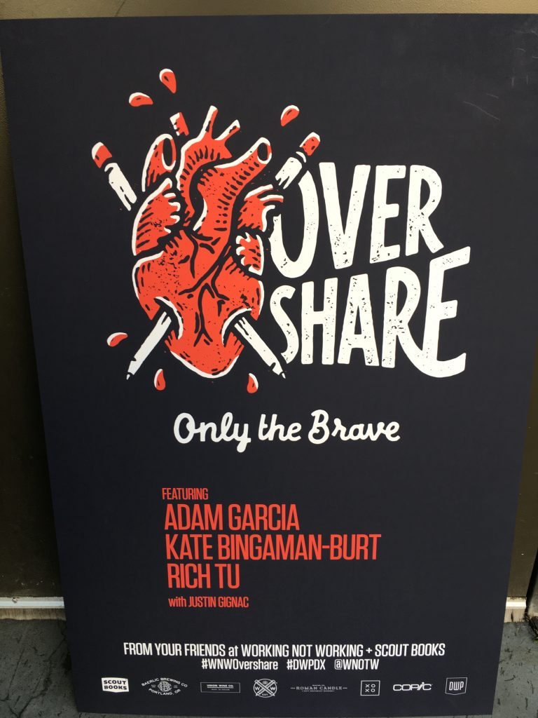
I ended the night next door, in the spacious XOXO Outpost warehouse, where I passed on dinner opportunity #3 in the form of free pizza from Roman Candle. Worry not—it was decimated without my help by fellow attendees of Overshare, a panel discussion and podcast taping hosted by the creative freelance network Working Not Working. The Portland-centric panel featured illustrator and educator Kate Bingaman-Burt, The Pressure’s Adam R. Garcia, and newly minted Nike designer Rich Tu. Beginning with a round of white wine shots (ewwwww) to break the ice, WNW co-founder Justin Gignac set about grilling his panel on everything from their feelings about Portland past, present, and future to admissions of their worst professional anxieties.

Design Week Portland Overshare

Billed as a casual, unguarded exercise in real talk, plenty of F-bombs were dropped as the panelists proved themselves generously forthcoming about their methods of self-preservation, early days of struggle, and the ongoing work of staying inspired (turns out maintaining a state of perpetual dissatisfaction may be a sign you’re doing it right). There wasn’t a lot of prescriptive advice, but it helped serve as evidence that those who pursue a creative career path share the same struggles. Not only is that struggle real, but in the long run, it’s also the point.


Marjorie is a former Creative Circle candidate based in Portland who recently accepted a full-time offer for her dream job. She is a writer/editor and stylist/producer with an emphasis in the design world. If you are interested in working with someone like Marjorie, please contact your nearest Creative Circle office.

Still on the fence about attending events or open houses?

Read our blog on why it’s important.

Design Week Portland starts this week. We asked designer Matthew T. to share how Portland lives creative through some of the city’s inspirational spaces.

The Good Mod

Creative-Circle_Matthew-T_The-Good-Mod

Nestled in one of West Burnside’s longstanding warehouse loft spaces, The Good Mod boasts a diverse stockpile of refurbished Midcentury furniture and design. Ascend the old-school industrial elevator via the unassuming glass-paned entrance on street-level, and you will be greeted by a pleasant host who will help you navigate the towers of Eames chair frames and nordic coffee tables. A unique quality of The Good Mod is its ability to seem peaceful and minimal while functioning as an active repair shop. The open concept and natural light allows for a moment of peace in the buzz of Portland’s thriving West End neighborhood.


Ace Hotel

Creative-Circle_Matthew-T_Ace-Hotel

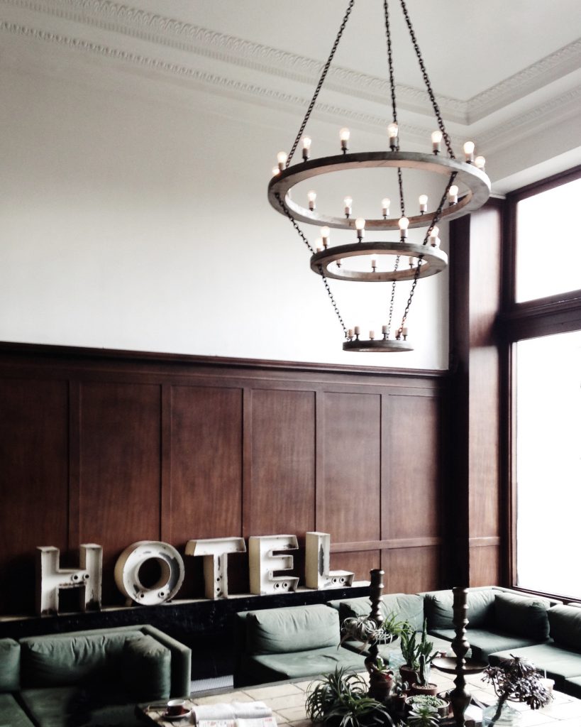
Further embedded in Portland’s West End is the flagship location of Ace Hotel, an independent hospitality effort focused on design-driven hosting, with extra care attended to the presence of local designers and an engaged staff. Aside from its bright lobby, which also houses a Stumptown Coffee location, the upstairs common areas host an intimate study area where anyone can go to relax, meet others, or read one of the many publications complimentarily provided.


Clyde Common

Creative-Circle_Matthew-T_Clyde-Common

A staple of the west side, Clyde Common features a clean, rustic interior which buzzes with activity during happy hours on weekdays. Common plates include poutine, rustic eggs, or a charcuterie plate to share. Pair those with a local draft ale or their “pacific standard” cocktail, and you have an outfit ready to suit your spring evening.


Good Coffee

Creative-Circle_Matthew-T_Good-Coffee

As the name might imply, this cafe was established with the intent to put a quality cup first. Started by a few industry veterans, the new cafe now boasts two locations on Portland’s east side. When you go, look for a variety of bean offerings as well as the unique drinking vessels you are served.


Olympic National Forest

Creative-Circle_Matthew-T_Olympic-National-Forest

A drive outside of the city may find you in one of the nearby national forests. One popular destination has been the entryway to the greater Olympic National Forest, which resides near Lake Cushman, Shelton, and other rural communities. Nearby you’ll find trellises, old bridges, and an abundance of nature trails.


Matthew is a Creative Circle candidate and your guide to DWP’s events and open houses.

Still on the fence about attending events or open houses?

Read our blog on why it’s important.

Can’t attend?

Follow us on Twitter and Instagram for updates and recaps.

We all have body issues, well, at least I do. Sometimes it’s bloated and every so often, it feels too wide or tall. On occasion, I don’t feel comfortable with it, or it just isn’t appealing enough for readers to get to know better.

Are you working hard in one area but not making overall progress on your page?

Pages of copy will not be paid attention to unless the type looks irresistible. But I’ve found a way to have readable sections, svelte rags and desirable line lengths that just feel so… right.

Here are seven ways to make your readers beg for more (information).

1. Read it first, or at least scan it.

Review and take notes on the content types. Then be sure the typeface you choose contains the weights, special characters, and glyphs found in the draft copy. You don’t want to be typesetting for two days in and realize the font you’re using doesn’t support the fractions on page 24.

2. Keep it simple.

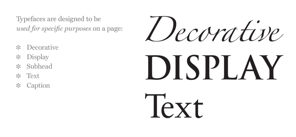
Avoid using display fonts for body copy. Display fonts have a lot of personality, and that personality gets in the way of the reading experience. Leave the personality to the cover type, headers and subheads. For run-in subheads, body copy and smaller type, stay legible and readable with roman typefaces.

Our Notebook_Typographic Tidbits_display

3. Contrast communicates context.

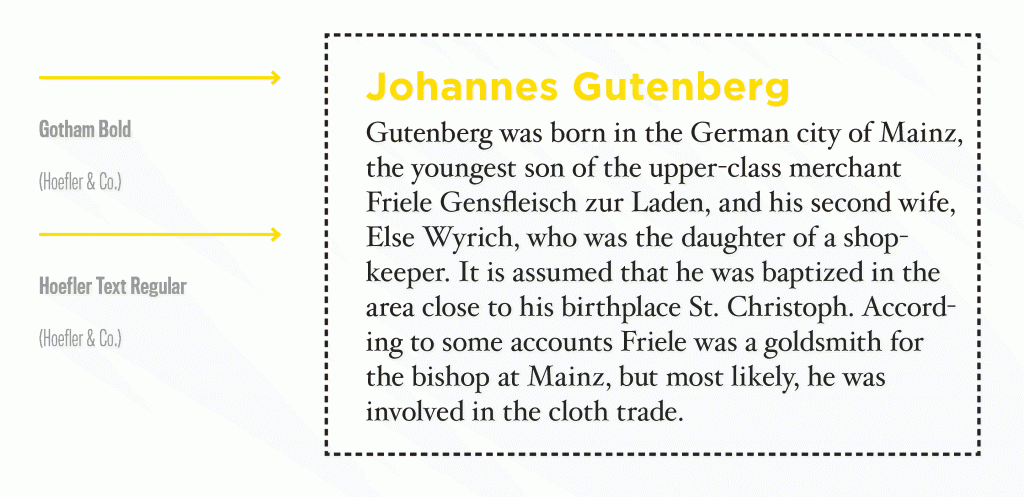
When pairing, choose faces from different classifications. When typefaces are too similar, they play tricks on your readers eyes. The body copy might be Helvetica but if the subheads are Arial, they might be difficult to identify. To play it safe, choose a serif and sans serif.

Our Notebook_Typographic Tidbits_pairing

4. Less is more.

An elegant typography system can be created with different weights from the same family. You don’t need more than two typefaces to create beautiful body copy. And in many cases, it can be done with just one if the typeface has many fonts. Many families have gorgeous italics or small cap fonts to help you create variety while maintaining consistency.

5. Maintain consistency.

Establish a system early in the project to ensure the same fonts and guidelines for usages are adapted among your team. Cement the system designated with headers, subheads, body copy, captions and legal into a style guide and utilize across all media for a persistent look to all brand communications.

6. Keep your lines comfy.

Readers’ eyes can only scan so much at one time, typically 50-70 characters per line, so keep your line lengths short. When lines are too long, it’s difficult to find where to begin reading the next sentence and continue. When lines are too short (less than ten words), your copy block will lack elegant rhythm and proportion. Try to either adjust the font size or create two columns to create a comfortable line length.

Our Notebook_Typographic Tidbits_linelength

7. Create body shape.

Left justified type is lovely, and even more so when the rags are shapely. To create beautiful, curvy rags at the right edge of all of your paragraphs, use hyphens. Avoid leaving a hyphen on the first line, and don’t allow three hyphens in a row (the term for three in a row is called pigtails), because it’s difficult to locate the next line. Keep to three or four hyphens per paragraph, if possible.

Our Notebook_Typographic Tidbits_Body Copy

Incorporate these tips as part of your copy setting process, and then stand up and be proud of your body! Your page layouts will invite the reader in and they will love your new body copy.

To gather inspiration on how others create hierarchy and set body copy well, we refer to the printed versions of Worth , Fast Company , New BeautyMcSweeney’s Quarterly and more. If you’re looking for really clean blocks of copy, download a few Mercedes brochures. Nothing like a little German engineering in the typesetting to inspire us all.

For those who are really into refining your body copy, read more about Michael Stinson’s secret to setting a perfect block.

Do you have any favorite magazines or books that draw you in with their body copy and keep you reading? Let me know by tweeting us at @TypeEd. I’d love to see what inspires your design work.


Rachel Elnar is the producer and co-founder at TypeEd, where she helps bring the craft of typography back to design education. Get more type in your inbox and sign up for more about TypeEd columns (and other announcements).

Since the dawn of time, ah-hem, actually since the 18th century, there’s been a clash of preference around serif vs. sans serif letterforms. What’s up with the typeface tussle? Is there really a difference? Well, some people love serifs, some people hate them.

What are serifs? They are the small feet at the end of the strokes on a letter or symbol. Some typefaces are serifed, and others are unserifed, otherwise known as sans serif.

content_serifsans
Which side do you fight for in the ultimate typeface choice for your needs? Well, that depends.

Rivalry for readability!

There’s been 100 years of research and argument on which style is more readable. This is the general thought in the typography community about serifs:

“Serifs are used to guide the horizontal “flow” of the eyes; The lack of serifs is said to contribute to a vertical stress in sans serifs, which is supposed to compete with the horizontal flow of reading.” [De Lange, R. W., Esterhuizen, H. L., Beatty, D. (1993), Electronic Publishing]

This has not been fully proven. There are a few factors in favor of serifs though, serifs have additional indication to their characters that sans serifs do not, thereby improving identification. And, readability also is increased if typeset well.

What the sans serif team has going for it, is the fact that sans serifs are much more easy to read when set small. Those pesky serifs tend to clog up negative spaces when scaled down. It’s been claimed that sans serifs are easier to read on screen.

I’m not sold on that, but I agree with that statement pre-2010 before hi-resolution and retina screens came into play on our devices. Those serifs used to crumble against the harsh light of the LCD monitor screen.

The tried-and-true application was always serif for reading copy, sans serif for emphasis.

Spar for medium!

Determining the final output of your piece will help you advance towards the best choice. Besides the differences in color spaces CMYK vs. RGB, the way we perceive light is totally different between paper and screen. Light reflects off paper to read, whereas on a screen, the surface is backlit (which can cause a degree of fatigue).

We used to assume that we could make any ol’ serif and sans serif fonts play nicely. But that was 10 years ago, but now we have to know if they were designed for print or for screen. Screen fonts don’t have print features like ink traps.

And same goes with the screen. Many digital versions of classic fonts have been re-engineered for the screen. Just make sure you source recent versions that work best with the software. Needing to set really small type? Choose Reading Edge fonts, which were developed for reading at small sizes on the screen.

If you’re going to press with your piece, think about how many printing plates you’re specifying, and what paper you’ll be printing on. This consideration will also affect the final output.

If you are printing on textured paper or reversing out your type, you’ll have to increase the type size or weight, or choose a typeface that can hold the ink. Consult with your print rep to make sure. If you’re planning on staring on the big screen (or small screen), consider these three things: how far from someone’s eyes your type will be seen, what the final screen resolution is and environment your design will be viewed.

Clash for context!

Read the content before you set it, and decide which works best to translate the tone.

Serif typefaces are the elder of the two styles; the first letterforms created were serifs, and sans serifs are relatively new on the scene (18th century). So, if you want to demonstrate a bit of history or authority, serifs are your weapon of choice.

If you’d like something more contemporary, choose a sans serif. Sans serifs are typically informal, and serifs formal, but from there, there’s no rules. Once you decide, start digging into your classifications to narrow it down and really make decisions based on the nuances of letterform anatomy.

So which one is the best?

As you see, there’s a bunch of qualities to consider just in the first step of choosing between serif and sans serif. There’s no one single answer. But no matter which you choose, a successful choice will be evidenced by the message understood first when reading, not the style of the font.

Once you make that choice, you’ll need to dive into classifications. We love the book The Anatomy of Type, A Graphic Guide to 100 Typefaces by Stephen Coles. The book demonstrates the characteristics between classifications to help you choose wisely.

Back in the phototypesetting years, there was hundreds of fonts to choose from. Nowadays, picking out a typeface is much more difficult as there are over 300,000 fonts available for direct download. Ay caramba.

Know what you’re designing and then you can make your choice more swiftly. In our online Type 1 Class, I provide an ESPN-highlight view of classifications, which I dive deeper into this topic. Do you typically prefer serif or sans serif fonts? Let us know on Twitter at @TypeEd.


Michael Stinson is a co-founder and instructor at TypeEd, where he helps designers implement better typography, efficiently. Get more typography in your inbox when you sign up for more updates about TypeEd.

I grew up with children’s books, and truly loved the stories. Every evening, a favorite book of mine renewed a spark of imagination before bedtime. Story time was the fun part of school while delivering life’s lessons and eventually encouraging me to read. Those books provide me the adventure I craved, allowed me to become a hero for a day and granted me permission to visit new worlds in my daydreams.

The books also gave me and my classmates our very first taste of typography and illustration. Those pictures welcomed us in, but it was the words which really hooked us and carried us away. Some books were easier to read, and some more difficult, depending on our age and reading ability. Word length, character size, and quantity of type versus white space on the page either created comfort or presented a challenge.

In the 70s, the time of my childhood, most of our classic children’s books were typeset in large typefaces from the classifications Humanist Serif (or Old Style) and Transitional Serif.

Classifications

Both serif styles differ in calligraphic style and stroke contrast, but they were both used in children’s books for their similar legibility. These two classes were popular for book typesetting because they are easy to read, mainly attributed from the following five characteristics.

Serif Class

1. High x-height The x-height of a character refers to the visual size of the typestyle, not the point size. Compare the heights of the lowercase ‘x’ from a Humanist Serif to another typeface, and that will give you an idea of how ‘large’ and legible it is.

x height

Both of these are Transitional Serifs, but Baskerville is easier to read than Mrs. Eaves, because of its high x-height.

2. Large counters Another indication of letterform size is in the size of the counters. Letters containing closed counters include A, B, D, O, P, Q, R, a, b, d, e, g, o, p, and q. Open counters have apertures (open “mouths”) and exist in the letters c, f, h, i, s and so on. When the counters are larger, they are easier to read.

3. Wide bracketed serifs Brackets are the curved connection between the stem and serif. Think of a wall being a stem and a shelf being a serif. A bracket is used under the shelf to hold it up. Wide serifs with brackets help the reader identify the letter.

4. Double-story allographs Allographs are considered variants of a letter. The lowercase versions of letter g and letter a have two types of variants. The one we learned how to write in grade school penmanship is single-story. The alternative is double-story. The double-story variants are easier to read because there’s more visual indicators in the letterform.

Allographs

5. Moderate contrast in stroke variation due to calligraphic origins When there is some contrast and stroke distinction in the letterform, it aids in readability.

The overall layout of the text pages implies the reading level. Large format, type size, white space and illustrations will visually communicate that the book is for beginners. Smaller page size, smaller type size and dense copy with little or no visuals will appeal to older readers. When a child opens the book, they know if they can read it or not, before reading any of the words.

The book Corduroy by Don Freeman (1976) is about a bear who wanders around a department store after closing time. It was a favorite of mine when I was very young. Looking at the text page, the copy is set in a classic Humanist typeface called Palatino, which has a large x-height and wide counters. Only one or two sentences are set at a time, which indicates the book is for toddlers.

Corduroy

Early readers love Little Golden Books. I used to carry my 12-book box set around the house and would pull out the gold-spined volumes one-by-one. One of the originals, The Poky Little Puppy by Janette Sebring Lowrey (1942) is also set in a Humanist typeface, Garamond.

The Poky Little Puppy

Charlotte’s Web by E.B. White (1952) is a book written for tween readers. The page is set in Caslon, which has been classified both as Humanist and Transitional Serif.

Charlotte's Web

Pull out your old books and take a look inside. Most of the classics were set in serif. And more recent ones, depending on their concept, might be set in sans serif. Either way, they probably have large x-heights, wide characters, and two-story allographs to keep kids reading.

Which books did you love as a child? Did they have memorable typesetting? Please share your favorite books and tidbit ideas on Twitter, don’t forget to tag @TypeEd. I’d love to know what typography first influenced you as a young reader.

All book images are sourced courtesy of Google books and material copyrighted by their authors.


Rachel Elnar is the producer and co-founder at TypeEd, where she helps bring the craft of typography back to design education. Get more type in your inbox and sign up for more about TypeEd columns (and other announcements).