Most people work with inches when designing their pages. Makes sense, right? We are used to working with inches when we start designing because that’s the physical measurement unit of the format, and where we typically start: the size of the flyer, brochure, box, etc.

But when we stay in inches, the type is not in harmony with the page. To rectify, we need to use the correct unit of measurement.

Our type is measured in points. For example, 9 – 12 point size for body copy is typical. So how do we build visual uniformity from the page to the type? Easy. Picas.

I think I just heard you groan out loud. Yeah, yeah, I hear you, designers don’t like math. Well guess what, this isn’t rocket science, it’s simple division. The units are so small using picas are easier than using inches because there’s little need for fractions and decimals.

our-notebook-picas

A pica is a unit of space that connects points to inches. There are 6 picas to an inch. See? Sooooo simple. It is a term from the 1580s, probably from pica, a name of a book of rules in the Church of England for determining holy days. I know, a little random.

A point is the unit we use to measure overall type size, and there are 12 of them in a pica. So, if there are 12 points in a pica and 6 picas to an inch, there is 72 points to an inch. That means, depending on the typeface, a header that’s 72-point type size, could be possibly an inch high. Easy, right?

our-notebook-picas-points

Next time you open up a fresh Adobe InDesign document, don’t immediately switch your measurement system to inches (um yes, points and picas are the default!).

Instead, try typing in your format size in an inch measurement (for example: 8 in), and InDesign will convert it automatically for you. Thanks, Adobe. Picas and points are the measurement system of the environment you’re working in for print. It’s not inches. It’s not pixels. It’s points and picas.

I use points and picas to create a visual relationship from the page to the type. It’s that intimate relationship that creates great looking copy on the page. Columns, alleys, gutters, margins; they all look better if set in a relative measure to the type size.

Develop a fondness with points and picas. Love them and they’ll love you back.

Do you use picas or inches? Tweet us at @TypeEd and let us know your preference.


Michael Stinson is a co-founder and instructor at TypeEd, where he helps designers implement better typography, efficiently. Get more typography in your inbox when you sign up for more updates about TypeEd.

After I graduated from college in 1993, I got an internship at an annual report firm. We were designing and producing spreads, by hand, onto boards. Our process included thumbnails, sketching, drawing a grid onto the board, ordering type over the phone, trimming out type galleys, hand-kerning type, waxing it down, and so on. You could say it was a lot of work and it took a long time.

our-notebook-mechanicalThis process was great, because you became intimate with the projects because you had your hands on them. You had to know your tools and type really well. Our office was not yet using computer software for design and production, so the task ended up on me to make the transition.

My boss taught me the fundamentals of the grid and typography well, but it was really up to me to figure out how to translate those skills to the computer. (I talk about my experience in this video.)

Remember, there was no YouTube at the time. There was no Google. If you wanted to learn software, you had to take classes in-person. So I learned Quark XPress 3.1 and Illustrator 88 in the Art Center at Night program.

There was a lot to figure out because I was trying to connect the abilities of the software to solving the actual problems I was facing during the day. I was taking what I learned in class and trying to figure out how to translate those tools for application at work.

And through this process I learned two lessons, which eventually influenced my teaching style today:

  1. It’s important to understand the fundamentals and how to apply them in the software. Tool training is, and should be, integrated into the learning process. I’ve taken classes where I was presented a problem with a goal in mind, but expected to figure out how to do it with little guidance. To often, educators don’t want to teach software, only theory. But teachers need to help with application and tool training. Sure, software tutorials can be found online and students need to be resourceful; but applying and handling type is a craft, much like playing music. For example, music teachers do not just hand over a sheet of music, share a recording of the song, and then expect a student to recreate it. Once the tool is learned, constant practice is needed. It takes finesse and feeling to make type sing.
  2. The mindset of design is very important. In my perpetual learning of design (and yes, to this day I’m still learning), it’s crucial to know the WHY, as well as the HOW. If one doesn’t understand why parts of the process is essential to the whole, then one won’t understand how to prioritize when things change. The mindset helps to apply, add new and change processes while maintaining integrity when there shifts in the field.

In my 22-year design career, I’ve seen typesetting houses come and go, photographers struggle in the popularity of stock photos, and print shops shift from to digital just to stay in the game. Be assured that there will be more shifts coming in the field of design. This is why I think we need to keep adjusting and updating our skills so we can handle whatever design challenge comes along.

What won’t change is how people naturally read and the psychology of how design communicates. Humans are visual. And that’s why the fundamentals are important.

How have you shifted your process over time? Please let me know by tweeting us @TypeEd. I’d like to hear where you came from and where you’re going. And if you know anyone who might be inspired by this, feel free to share!


Michael Stinson is a co-founder and lead instructor at TypeEd, where he helps designers implement better typography, efficiently. Learn more about how to design for readers by signing up for TypeEd courses.

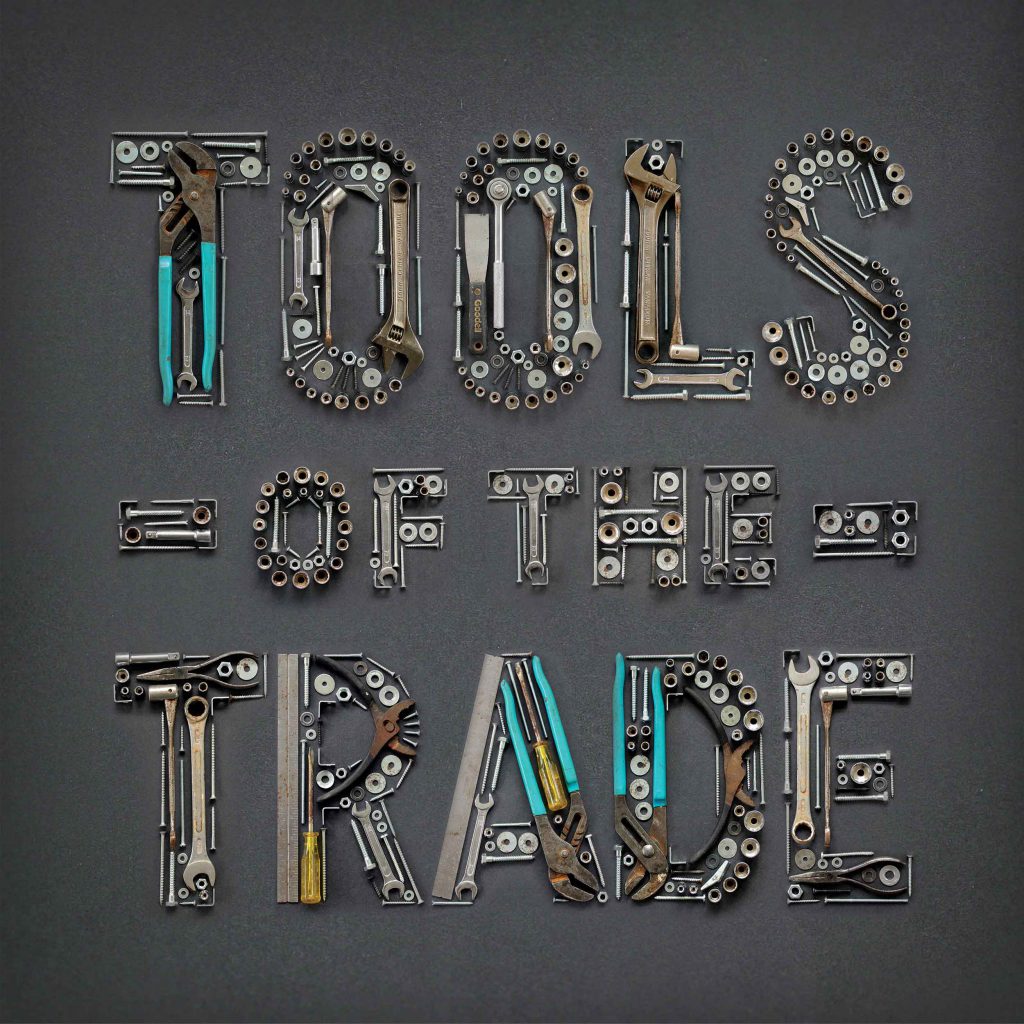
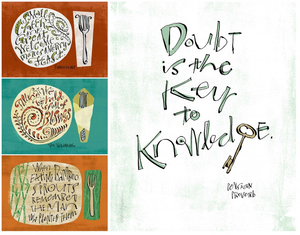
Hand lettering is huge these days, and is inspiring many designers to add hand-lettering to their skill sets. With the explosion of the sharing economy, designers are learning from each other.

Hand-letterers craft letters using mark-making tools for a specific application or use. What’s the best way to get started or level up in lettering? These six up and coming hand-lettering artists use their skill to create artwork that evokes meaning and expression. Get their best advice on how to improve your own skills.
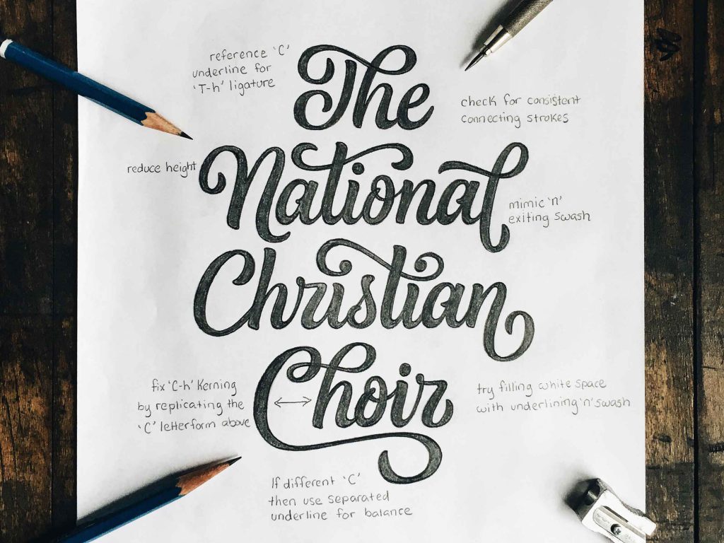
The Details Matter

Lettering Artist - Joseph - 1Joseph Alessio is a typographic illustrator based in San Francisco who blends type, letters and animates a host of mixed media in typographic compositions. Joseph’s approach with spatial relationships in type and motion is unique. He loves that part of the process in the middle, when you feel like you can experiment and play and discover – “that’s to me the most exciting and fulfilling part.”

Joseph recommends any of Doyald Young’s books as resources for new letterers. “He has an impeccable sense of composition and spatial relationships, how to handle flourishes, etc, and you can learn so much by studying his sketches.” He also recommends for understanding the nuance of letterforms is Designing Type by Karen Cheng. “It’s ironically not about actually designing type, but rather examines in great detail the minutiae of stroke weights, optical adjustments and balancing, character dimensions etc., and was really eye-opening for me as to how quality letterforms, especially within the context of working with other letterforms, are crafted.”

Find Joseph on Instagram, Twitter or his website.

The Fundamentals

Lettering Artist - Colin - 1
Colin Tierney runs Tierney Studio, a Baltimore-based design studio that specializes in hand lettering, calligraphy and branding. To Colin, details that no one might ever notice are integral to the final design. His favorite part of the process is the initial pen to paper phase when he’s hashing out all of his ideas—the good and the bad.

Colin loves throwing on some headphones and listening to music. Music is a passion of his that isn’t directly related to design, so it’s easy to get away from the work and find another source of inspiration through a different kind of love. He recommends to aspiring calligraphers and hand lettering artists his Crayligraphy series. “I go deep into teaching the fundamentals of calligraphy with a Crayola marker. These lessons are perfect for beginners because Crayolas are cheap, accessible and easier to write with.”

Find Colin on Instagram, Twitter and Dribble.

Push Your Craft

Lettering Artist - Erick - 1
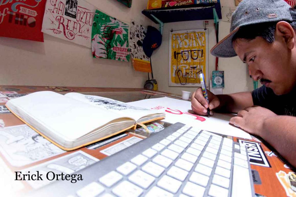
Erick Ortega is a freelance illustrator and lettering artist from Cali, Colombia. The tactile quality of his handmade artwork is one of his trade marks and he enjoys most inking the artwork and finalizing the piece as a digital file. He’s inspired by books, movies, pop culture, but by far, music is his biggest inspiration in many ways. “Being an independent artist is about doing it all yourself and making things happen. Making yourself from scratch and keep pushing your craft to where you want to be next.”

Erick recommends picking up a copy of In Progress by Jessica Hische for both rookies and seasoned designers for information on lettering as a craft, and as a business.

Check out Erick on Behance, Instagram and Twitter.

Get the Lettering Bible

Lettering Artist - Jason - 1
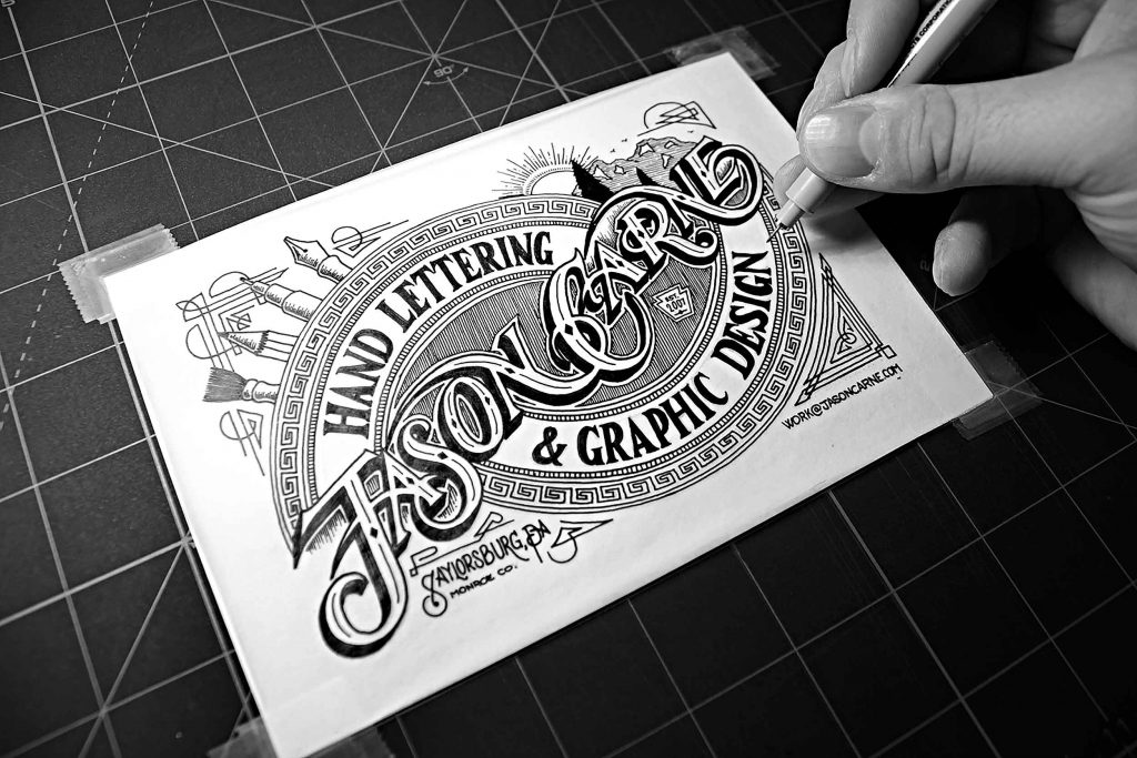
Jason Carne, a freelance graphic designer who letters and designs type in Saylorsburg, Pennsylvania, specializes in decorative, ornamental lettering. He is heavily inspired by the past, and constantly looking at old packaging, decades-old photos of signage from decades or centuries ago, and vintage record covers. He admits, “I feel like there was a stronger connection to ones craft in 1916 than there is in 2016, there was a desire to make sure something stood the test of time.”

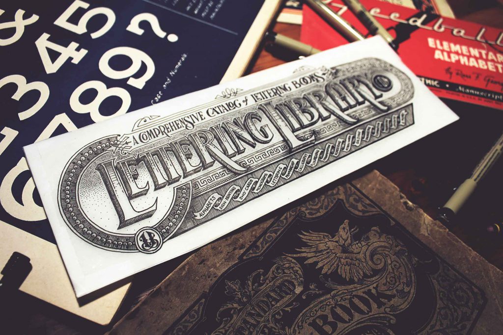
Jason recommends a couple of books for lettering students, the first being Leslie Cabarga’s Logo, Font and Lettering Bible. “Beyond the gorgeous specimens included within its pages, it has tons of insight and secrets from some of the best lettering artists of the past few generations. A close second I’d recommend would be any Speedball book you can find, the most easily attainable being the recently published 100th anniversary edition including original works from Ross F. George (the artists behind the original Speedball books) as well as many modern masters.”

See more of Jason’s work on Dribble, Behance and Instagram.

Let the World Inspire You

Lettering Artist - Danielle - 1
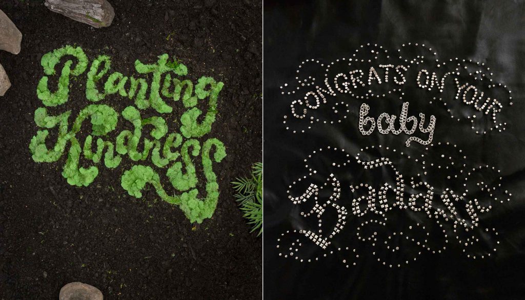
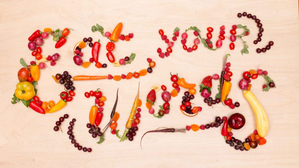
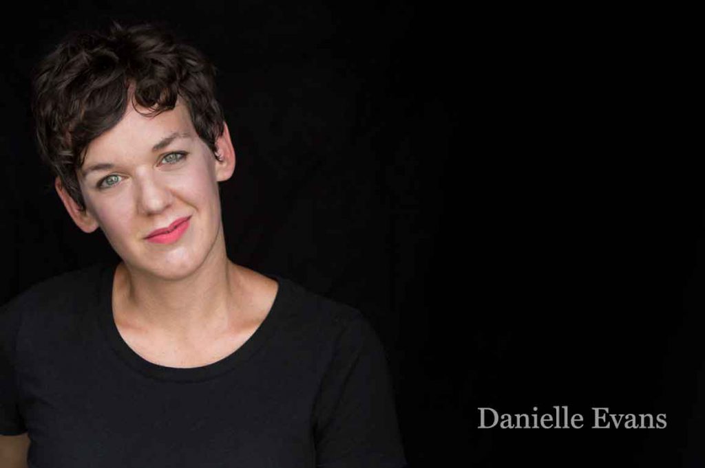
Danielle Evans is an object lettering artist, art director, and animator from Columbus, Ohio. She uses objects and food to create her lettering, and rather than chose mediums for color or trendiness, she crafts the materials and forms around a concept. She loves finding the correct energy in her strokes or stumbling across a new technique as well as the styling process. To get inspired, Danielle’s recommendation would be to go outside.

She also attests to one of the most useful books she’s read, which isn’t about lettering at all. “The $100 Startup by Chris Gillebeau was a fantastic reminder that gorgeous letterforms don’t spring from the best reference books, supplies, a fancy studio space, or the most renown peer group,” Danielle remarks. “The book profiles several creatives struggling to actualize their dreams who modestly and resourcefully generate profitable businesses out of small investments. After finishing, I remember realizing my lettering deserved proper investment of my skills, time, and financial backing if it was to flourish.”

Follow Danielle on Twitter, Instagram and her website.

Start on a Letraset Quest

Lettering Artist - Alex - 1Alex Savakis, a designer and illustrator from Concord, California, deconstructs letters to create new expressions of their forms. He finds the work of fellow lettering artists and calligraphers inspirational, including the American Greetings lettering team with whom he trained with. He says, “Their enthusiasm, spirit and grit inspire me to make something everyday.”

Lettering Artist - Alex - 2

Lettering Artist - Alex - 3For those learning to letter, Alex recommends finding a Letraset catalog from the 80s. “The catalog was a couple of inches thick, spiral-bound and loaded with typefaces. If a copy is available at a used bookstore, grab it! Also, look online at the lettering work that excites you, deconstruct it to see how it was created, then recreate it in your hand or style. Developing your style will take time, more than you might expect. Keep at it.”

Follow Alex on Instagram, his blog and his website.

Want to find out more about inspiring artists and designer who are leading the way in type and typography? Follow us on Crowdcast. If you’d like to learn more about what we do, visit us at type-ed.com.


Rachel Elnar is a co-founder and producer at TypeEd, where she helps designers implement better typography, efficiently.

No matter if you’re designing a book, a brochure, a web page or even your resume, line lengths can make or break the readability of your page.

It’s really all about the harmonious relationship, or proportion from one element to another that makes design beautiful. And the proportion between page, measure and type size is super important in creating perfect line lengths that create comfortable reading copy.

Proportion is a central principle to architectural theory and the connection between mathematics and art. Well-designed buildings have space, symmetry and proportion that you can experience and feel as you walk through the space. This physicality of proportion ignites the senses while walking through the space.

With hierarchy and proportion in graphic design, readers take cues from the designer on what to read when, in what order, with what speed, in what tone and so on. Think of the designer as the tour guide through ‘spaces’ of content.

Now you might not like numbers or math, but this is not mind-bending rocket science. It’s just a few steps to begin with to help make your page look better. Think about it like this: A triple play in baseball is a rare act, but can be done if the mindset of all the players involved are in sync. Let’s take it play-by-play.

First Play: From the Format to the Grid

Creating proportion in design starts with the format or page size, which determines the grid. For a large format, like a newspaper, you can have 5 or 6 columns and accommodate a lot of content. On a small format, like a medical pamphlet, you might be dealing with a single column.

Our Notebook-Typography Tidbits-grid types
The page size is like the outer walls of a house which determines the structure of the rooms on the inside. The page size will narrow down your grid choices, as will the type of content.

Second Play: From the Grid to the Measure

The Measure is the name given to the width of a body of type, or column. Let’s use the example of an 8″ x 10″ book. It’s small, needs to be easily read, and set for flowing body copy, so I’ll assume it needs a double-column grid. Let’s test that.

The page size is 8″ x 10″, with 8 inches being the horizontal size. Subtracting a margin of 1/2 inch on both sides, and we end up with a body copy area of only 7 inches wide. Seven inches converts to 42 picas (6 picas per inch) across. You know this because you have that Conversion Chart in your hand.

Third Play: From the Measure to Type Size

If we lay in 9 points body copy, we end up at 138 characters per line. Too long. So, to calculate the type size based on the size of the 42 pica measure, we’ll split that value in half to start. The measure, on average is 1.5 to 2 times the type size. That means if we stay with our single column, our type size is going to be between 21 to 28 points. Whoa, that’s too big for body copy.

138 characters across per line, as indicated by the Info palette, is too difficult to read.

If we divide the measure into two columns, each column will only be 21 picas, or less with alleys, let’s say 19 picas. If so, we can set our type size between at 9.5 and 12.5, depending on the typeface. Use your info palette in InDesign to check the character count, and aim between 50 and 70 characters. A trained eye will make the final call on the correct size and weight for the page.

66 characters across per line, that's in the sweet spot.
66 characters across per line, that’s in the sweet spot.

If you prefer to see it in action, you can view some of basics of line length calculation process in this video.

This formula saves a lot of time in guesswork, right? It has saved me tons of time. Just knowing the size of the book, report or page has allowed me to be able to estimate print prices on the spot for clients. Based on the format size, I know how many words will copyfit onto the page, and how many pages are needed and figure out a rough production budget for printing.

The format helps us decide on the grid and dictates the measure size. The measure size helps determine the body copy size. They all work together to score a home run for your design career.

We didn’t even address leading, margins, hierarchy, etc. But it’s okay, because now calculating line lengths and creating proportion on the page is now in your strike zone.

Did you try this formula out? Let me know on Twitter at @TypeEd. If you’d like to learn more, visit our blog at type-ed.com.


Michael Stinson is a co-founder and instructor at TypeEd, where he helps designers implement better typography, efficiently. Get more typography in your inbox when you sign up for more updates about TypeEd.

If you’re on the quest for a free font, this bit of advice is not for you. A true beauty is worth every penny. You get what you pay for when it comes to purchasing typefaces.

When you are seeking a mate, you need to know who you are and what you want to find a good match. It’s the same with typefaces; you need to know more about the project, and and who it’s for in order to find the ideal partner font. Because once you choose, you’ll be committed to her for the life of the project.

Good designers do more than just “pick a font.” There are other variables in play, such as how to pair well with other typefaces, where to place them in hierarchy for full effectiveness, and how well they work with the visuals on the page. I call the process “typecasting,” similar to casting an actor in a movie. Designers will want to ask themselves these questions about the nature of the project to create seamless storytelling.

1. Who’s the client and who are their clients?

Are they a big beverage brand speaking to consumers, or a small boutique hotel looking for travelers? Is there a large standards guide to follow, or is it a fresh, new campaign? Always begin by gaining an understanding of the nature of your client or campaign, you can begin to narrow down to type classification.

2. What is the project? And what are all the mediums and languages involved?

Will you need screen fonts or desktop fonts? Is the project large enough that you’ll need licensing for multiple mediums? If so, no matter which font family you use, you’ll want to plan to source web font versions for your desktop fonts or vice versa. This may limit the foundries from where you source your typefaces from. Or is it a an international ad campaign where you’ll need some translation? If that’s the case, look at Pro versions or typefaces with additional language support.

3. What’s the concept?

Once you have an idea of classification, begin by writing down all the words you can think of that describe the main idea. Reference imagery to help your brainstorming session. Open it up to related themes if you need more words or you’re designing a few directions. Then sift through and choose the top six that best describes the direction.

For example, if the project is a tabletop bar menu promoting baseball season, I will begin by start looking at type baseball field images. I’ll look at photos of Fenway Park, scoreboards, signage, uniforms. Since we’re talking about America’s game, I’ll Google images of vintage baseball and see if that conjures up nostalgic words for possibly another design direction.

Wikipedia_Green_Monster
Image of Fenway Park, courtesy of Wikipedia

4. What is the voice & tone of content?

When you read the raw content, you can assess what sort of voice is being spoken. The tone of the writing will give you more clues to the personality of typeface to choose.

I used to give a project in school where my students had to pick a poem and lay it out with type only, across a spread. Typeface choice was critical, because one wouldn’t choose a fancy script for say, a quote by Teddy Roosevelt or Winston Churchill. You’re going to pick something heavy, perhaps set in all caps, to reflect the voice of the speaker.

Our Notebook-Possibilities
5. How much content? How will it be read?

How many pages are you going to be typesetting? How much content is involved, and in what form? If the format will be a 6″ x 9″ tabletop menu and the client has over 20 different drinks, you already know that the typeface will be pretty small. And if there’s a lot of reading copy, consider a typeface that has letterform legibility at small sizes.

If you’re working on screen, how will the typeface affect the reading experience on a low-resolution device or moving fast in a movie title treatment? Will the user be reading all the content or just merely scanning?

6. How many levels of content?

Hierarchy works as navigation to lead the reader across the page and to separate the content and indicate context. Assess how much content you have to deal with in the space, and then determine how many levels you’ll need to help you determine the font family needed.

Our Notebook-Menu Test
On our baseball drink menu menu, we will only need two levels of hierarchy to separate the name of the drink from the description, and there are many typefaces with only 2 or 3 weights. However, if you are redesigning a magazine, you may need up to 15 or 20 weights and styles, so seek for large families or super families, which narrows your quest considerably.

In order to choose and find the font that works best for your graphic design project, all aspects of the final outcome have to be considered. You need to know what you want in order to be happiest. Just do your due diligence, and you’ll find happiness in a font that fits the project. Don’t worry, letter love is waiting for you.


Michael Stinson is a co-founder and instructor at TypeEd, where he helps designers implement better typography, efficiently. Get more typography in your inbox when you sign up for more updates about TypeEd.

Proportional and Tabular

Did you know that there are two ways to set numerals? You know uppercase and lowercase letters exist, but did you know there are also ‘uppercase’ and ‘lowercase’ figures? In addition to lining and old-style, there’s also two different spacing formats, proportional and tabular.

So much to know about figures, so here’s how it breaks down.

Differences in Height

Old Style numerals (otherwise known as text or lowercase figures) have varied heights in a fashion that resembles a typical line of running text. They follow the ascenders and descenders of lowercase letters. If you set body copy, use old style figures for dates, phone numbers and other uses. Whenever sentence case is used, set your figures in old style. It might look weird because you’re not used to it, but it follows the way people read.

Old Style
Notice how the old style figures here rise to the x-height and have descenders much like lowercase letters.

Using lining numerals (otherwise known as titling or uppercase figures) in body copy disrupts the flow of reading, in the same way that ALL CAPS SHOUT to your reader. Lining numerals work best next to all-cap height letters, or more commonly, in financials for accounting applications. Having all the figures line up at the cap-height makes them easy to read in a line.

Differences in Width

Proportional figures have variable spacing, which results in even color on the page created by horizontal rhythm and reading. The spacing around each figure allow for the width of each figure. Not only do I recommend old style numerals for body copy, I will also recommend them to be proportional. In order to implement, look for “proportional old style” numerals.

Tabular
Notice how the tabular figures here line up vertically. The decimal points line up all the way down.

By contrast, tabular figures have uniform spacing and have the same width. These numerals act more like monospaced glyphs, so where no matter what the actual width of the character is, the space in the glyph will be the same. Tabular figures are perfect for financials, price lists and setting math, because they will be aligned vertically when set into columns. For accounting applications, be sure to choose “tabular lining” numerals.

Why it Matters

When choosing a typeface, not only are glyphs important to the usage, but so are the numbers. Figure height and width spacing matters. If you’re setting long-form reading content, choose a typeface that has proportional old style figures. If setting financial-heavy documents, choose a typeface that has tabular lining figures. Choosing the right typeface for your project will help you design a great reading experience.

I explain more about numerals, letters and glyphs and all you need to know about choosing the perfect typeface in our online typography basics class, Type 1. Does your favorite typeface have old-style or lining numerals as a default? Let me know by tweeting us at @TypeEd. I’d love to see what type of numerals you’re using.


Michael Stinson is a co-founder and instructor at TypeEd, where he helps designers implement better typography, efficiently. Get more typography in your inbox when you sign up for more updates about TypeEd.

We all have body issues, well, at least I do. Sometimes it’s bloated and every so often, it feels too wide or tall. On occasion, I don’t feel comfortable with it, or it just isn’t appealing enough for readers to get to know better.

Are you working hard in one area but not making overall progress on your page?

Pages of copy will not be paid attention to unless the type looks irresistible. But I’ve found a way to have readable sections, svelte rags and desirable line lengths that just feel so… right.

Here are seven ways to make your readers beg for more (information).

1. Read it first, or at least scan it.

Review and take notes on the content types. Then be sure the typeface you choose contains the weights, special characters, and glyphs found in the draft copy. You don’t want to be typesetting for two days in and realize the font you’re using doesn’t support the fractions on page 24.

2. Keep it simple.

Avoid using display fonts for body copy. Display fonts have a lot of personality, and that personality gets in the way of the reading experience. Leave the personality to the cover type, headers and subheads. For run-in subheads, body copy and smaller type, stay legible and readable with roman typefaces.

Our Notebook_Typographic Tidbits_display

3. Contrast communicates context.

When pairing, choose faces from different classifications. When typefaces are too similar, they play tricks on your readers eyes. The body copy might be Helvetica but if the subheads are Arial, they might be difficult to identify. To play it safe, choose a serif and sans serif.

Our Notebook_Typographic Tidbits_pairing

4. Less is more.

An elegant typography system can be created with different weights from the same family. You don’t need more than two typefaces to create beautiful body copy. And in many cases, it can be done with just one if the typeface has many fonts. Many families have gorgeous italics or small cap fonts to help you create variety while maintaining consistency.

5. Maintain consistency.

Establish a system early in the project to ensure the same fonts and guidelines for usages are adapted among your team. Cement the system designated with headers, subheads, body copy, captions and legal into a style guide and utilize across all media for a persistent look to all brand communications.

6. Keep your lines comfy.

Readers’ eyes can only scan so much at one time, typically 50-70 characters per line, so keep your line lengths short. When lines are too long, it’s difficult to find where to begin reading the next sentence and continue. When lines are too short (less than ten words), your copy block will lack elegant rhythm and proportion. Try to either adjust the font size or create two columns to create a comfortable line length.

Our Notebook_Typographic Tidbits_linelength

7. Create body shape.

Left justified type is lovely, and even more so when the rags are shapely. To create beautiful, curvy rags at the right edge of all of your paragraphs, use hyphens. Avoid leaving a hyphen on the first line, and don’t allow three hyphens in a row (the term for three in a row is called pigtails), because it’s difficult to locate the next line. Keep to three or four hyphens per paragraph, if possible.

Our Notebook_Typographic Tidbits_Body Copy

Incorporate these tips as part of your copy setting process, and then stand up and be proud of your body! Your page layouts will invite the reader in and they will love your new body copy.

To gather inspiration on how others create hierarchy and set body copy well, we refer to the printed versions of Worth , Fast Company , New BeautyMcSweeney’s Quarterly and more. If you’re looking for really clean blocks of copy, download a few Mercedes brochures. Nothing like a little German engineering in the typesetting to inspire us all.

For those who are really into refining your body copy, read more about Michael Stinson’s secret to setting a perfect block.

Do you have any favorite magazines or books that draw you in with their body copy and keep you reading? Let me know by tweeting us at @TypeEd. I’d love to see what inspires your design work.


Rachel Elnar is the producer and co-founder at TypeEd, where she helps bring the craft of typography back to design education. Get more type in your inbox and sign up for more about TypeEd columns (and other announcements).

Since the dawn of time, ah-hem, actually since the 18th century, there’s been a clash of preference around serif vs. sans serif letterforms. What’s up with the typeface tussle? Is there really a difference? Well, some people love serifs, some people hate them.

What are serifs? They are the small feet at the end of the strokes on a letter or symbol. Some typefaces are serifed, and others are unserifed, otherwise known as sans serif.

content_serifsans
Which side do you fight for in the ultimate typeface choice for your needs? Well, that depends.

Rivalry for readability!

There’s been 100 years of research and argument on which style is more readable. This is the general thought in the typography community about serifs:

“Serifs are used to guide the horizontal “flow” of the eyes; The lack of serifs is said to contribute to a vertical stress in sans serifs, which is supposed to compete with the horizontal flow of reading.” [De Lange, R. W., Esterhuizen, H. L., Beatty, D. (1993), Electronic Publishing]

This has not been fully proven. There are a few factors in favor of serifs though, serifs have additional indication to their characters that sans serifs do not, thereby improving identification. And, readability also is increased if typeset well.

What the sans serif team has going for it, is the fact that sans serifs are much more easy to read when set small. Those pesky serifs tend to clog up negative spaces when scaled down. It’s been claimed that sans serifs are easier to read on screen.

I’m not sold on that, but I agree with that statement pre-2010 before hi-resolution and retina screens came into play on our devices. Those serifs used to crumble against the harsh light of the LCD monitor screen.

The tried-and-true application was always serif for reading copy, sans serif for emphasis.

Spar for medium!

Determining the final output of your piece will help you advance towards the best choice. Besides the differences in color spaces CMYK vs. RGB, the way we perceive light is totally different between paper and screen. Light reflects off paper to read, whereas on a screen, the surface is backlit (which can cause a degree of fatigue).

We used to assume that we could make any ol’ serif and sans serif fonts play nicely. But that was 10 years ago, but now we have to know if they were designed for print or for screen. Screen fonts don’t have print features like ink traps.

And same goes with the screen. Many digital versions of classic fonts have been re-engineered for the screen. Just make sure you source recent versions that work best with the software. Needing to set really small type? Choose Reading Edge fonts, which were developed for reading at small sizes on the screen.

If you’re going to press with your piece, think about how many printing plates you’re specifying, and what paper you’ll be printing on. This consideration will also affect the final output.

If you are printing on textured paper or reversing out your type, you’ll have to increase the type size or weight, or choose a typeface that can hold the ink. Consult with your print rep to make sure. If you’re planning on staring on the big screen (or small screen), consider these three things: how far from someone’s eyes your type will be seen, what the final screen resolution is and environment your design will be viewed.

Clash for context!

Read the content before you set it, and decide which works best to translate the tone.

Serif typefaces are the elder of the two styles; the first letterforms created were serifs, and sans serifs are relatively new on the scene (18th century). So, if you want to demonstrate a bit of history or authority, serifs are your weapon of choice.

If you’d like something more contemporary, choose a sans serif. Sans serifs are typically informal, and serifs formal, but from there, there’s no rules. Once you decide, start digging into your classifications to narrow it down and really make decisions based on the nuances of letterform anatomy.

So which one is the best?

As you see, there’s a bunch of qualities to consider just in the first step of choosing between serif and sans serif. There’s no one single answer. But no matter which you choose, a successful choice will be evidenced by the message understood first when reading, not the style of the font.

Once you make that choice, you’ll need to dive into classifications. We love the book The Anatomy of Type, A Graphic Guide to 100 Typefaces by Stephen Coles. The book demonstrates the characteristics between classifications to help you choose wisely.

Back in the phototypesetting years, there was hundreds of fonts to choose from. Nowadays, picking out a typeface is much more difficult as there are over 300,000 fonts available for direct download. Ay caramba.

Know what you’re designing and then you can make your choice more swiftly. In our online Type 1 Class, I provide an ESPN-highlight view of classifications, which I dive deeper into this topic. Do you typically prefer serif or sans serif fonts? Let us know on Twitter at @TypeEd.


Michael Stinson is a co-founder and instructor at TypeEd, where he helps designers implement better typography, efficiently. Get more typography in your inbox when you sign up for more updates about TypeEd.

I grew up with children’s books, and truly loved the stories. Every evening, a favorite book of mine renewed a spark of imagination before bedtime. Story time was the fun part of school while delivering life’s lessons and eventually encouraging me to read. Those books provide me the adventure I craved, allowed me to become a hero for a day and granted me permission to visit new worlds in my daydreams.

The books also gave me and my classmates our very first taste of typography and illustration. Those pictures welcomed us in, but it was the words which really hooked us and carried us away. Some books were easier to read, and some more difficult, depending on our age and reading ability. Word length, character size, and quantity of type versus white space on the page either created comfort or presented a challenge.

In the 70s, the time of my childhood, most of our classic children’s books were typeset in large typefaces from the classifications Humanist Serif (or Old Style) and Transitional Serif.

Classifications

Both serif styles differ in calligraphic style and stroke contrast, but they were both used in children’s books for their similar legibility. These two classes were popular for book typesetting because they are easy to read, mainly attributed from the following five characteristics.

Serif Class

1. High x-height The x-height of a character refers to the visual size of the typestyle, not the point size. Compare the heights of the lowercase ‘x’ from a Humanist Serif to another typeface, and that will give you an idea of how ‘large’ and legible it is.

x height

Both of these are Transitional Serifs, but Baskerville is easier to read than Mrs. Eaves, because of its high x-height.

2. Large counters Another indication of letterform size is in the size of the counters. Letters containing closed counters include A, B, D, O, P, Q, R, a, b, d, e, g, o, p, and q. Open counters have apertures (open “mouths”) and exist in the letters c, f, h, i, s and so on. When the counters are larger, they are easier to read.

3. Wide bracketed serifs Brackets are the curved connection between the stem and serif. Think of a wall being a stem and a shelf being a serif. A bracket is used under the shelf to hold it up. Wide serifs with brackets help the reader identify the letter.

4. Double-story allographs Allographs are considered variants of a letter. The lowercase versions of letter g and letter a have two types of variants. The one we learned how to write in grade school penmanship is single-story. The alternative is double-story. The double-story variants are easier to read because there’s more visual indicators in the letterform.

Allographs

5. Moderate contrast in stroke variation due to calligraphic origins When there is some contrast and stroke distinction in the letterform, it aids in readability.

The overall layout of the text pages implies the reading level. Large format, type size, white space and illustrations will visually communicate that the book is for beginners. Smaller page size, smaller type size and dense copy with little or no visuals will appeal to older readers. When a child opens the book, they know if they can read it or not, before reading any of the words.

The book Corduroy by Don Freeman (1976) is about a bear who wanders around a department store after closing time. It was a favorite of mine when I was very young. Looking at the text page, the copy is set in a classic Humanist typeface called Palatino, which has a large x-height and wide counters. Only one or two sentences are set at a time, which indicates the book is for toddlers.

Corduroy

Early readers love Little Golden Books. I used to carry my 12-book box set around the house and would pull out the gold-spined volumes one-by-one. One of the originals, The Poky Little Puppy by Janette Sebring Lowrey (1942) is also set in a Humanist typeface, Garamond.

The Poky Little Puppy

Charlotte’s Web by E.B. White (1952) is a book written for tween readers. The page is set in Caslon, which has been classified both as Humanist and Transitional Serif.

Charlotte's Web

Pull out your old books and take a look inside. Most of the classics were set in serif. And more recent ones, depending on their concept, might be set in sans serif. Either way, they probably have large x-heights, wide characters, and two-story allographs to keep kids reading.

Which books did you love as a child? Did they have memorable typesetting? Please share your favorite books and tidbit ideas on Twitter, don’t forget to tag @TypeEd. I’d love to know what typography first influenced you as a young reader.

All book images are sourced courtesy of Google books and material copyrighted by their authors.


Rachel Elnar is the producer and co-founder at TypeEd, where she helps bring the craft of typography back to design education. Get more type in your inbox and sign up for more about TypeEd columns (and other announcements).