No matter if you’re designing a book, a brochure, a web page or even your resume, line lengths can make or break the readability of your page.
It’s really all about the harmonious relationship, or proportion from one element to another that makes design beautiful. And the proportion between page, measure and type size is super important in creating perfect line lengths that create comfortable reading copy.
Proportion is a central principle to architectural theory and the connection between mathematics and art. Well-designed buildings have space, symmetry and proportion that you can experience and feel as you walk through the space. This physicality of proportion ignites the senses while walking through the space.
With hierarchy and proportion in graphic design, readers take cues from the designer on what to read when, in what order, with what speed, in what tone and so on. Think of the designer as the tour guide through ‘spaces’ of content.
Now you might not like numbers or math, but this is not mind-bending rocket science. It’s just a few steps to begin with to help make your page look better. Think about it like this: A triple play in baseball is a rare act, but can be done if the mindset of all the players involved are in sync. Let’s take it play-by-play.
First Play: From the Format to the Grid
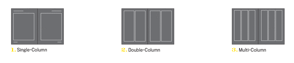
Creating proportion in design starts with the format or page size, which determines the grid. For a large format, like a newspaper, you can have 5 or 6 columns and accommodate a lot of content. On a small format, like a medical pamphlet, you might be dealing with a single column.
The page size is like the outer walls of a house which determines the structure of the rooms on the inside. The page size will narrow down your grid choices, as will the type of content.
Second Play: From the Grid to the Measure
The Measure is the name given to the width of a body of type, or column. Let’s use the example of an 8″ x 10″ book. It’s small, needs to be easily read, and set for flowing body copy, so I’ll assume it needs a double-column grid. Let’s test that.
The page size is 8″ x 10″, with 8 inches being the horizontal size. Subtracting a margin of 1/2 inch on both sides, and we end up with a body copy area of only 7 inches wide. Seven inches converts to 42 picas (6 picas per inch) across. You know this because you have that Conversion Chart in your hand.
Third Play: From the Measure to Type Size
If we lay in 9 points body copy, we end up at 138 characters per line. Too long. So, to calculate the type size based on the size of the 42 pica measure, we’ll split that value in half to start. The measure, on average is 1.5 to 2 times the type size. That means if we stay with our single column, our type size is going to be between 21 to 28 points. Whoa, that’s too big for body copy.
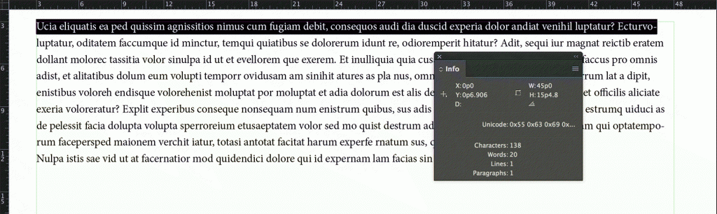
138 characters across per line, as indicated by the Info palette, is too difficult to read.
If we divide the measure into two columns, each column will only be 21 picas, or less with alleys, let’s say 19 picas. If so, we can set our type size between at 9.5 and 12.5, depending on the typeface. Use your info palette in InDesign to check the character count, and aim between 50 and 70 characters. A trained eye will make the final call on the correct size and weight for the page.
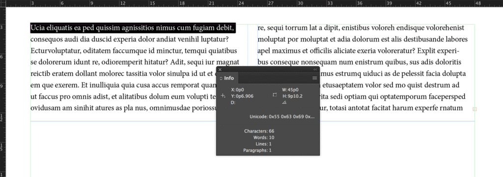
66 characters across per line, that’s in the sweet spot.
If you prefer to see it in action, you can view some of basics of line length calculation process in this video.
This formula saves a lot of time in guesswork, right? It has saved me tons of time. Just knowing the size of the book, report or page has allowed me to be able to estimate print prices on the spot for clients. Based on the format size, I know how many words will copyfit onto the page, and how many pages are needed and figure out a rough production budget for printing.
The format helps us decide on the grid and dictates the measure size. The measure size helps determine the body copy size. They all work together to score a home run for your design career.
We didn’t even address leading, margins, hierarchy, etc. But it’s okay, because now calculating line lengths and creating proportion on the page is now in your strike zone.
Did you try this formula out? Let me know on Twitter at @TypeEd. If you’d like to learn more, visit our blog at type-ed.com.
Michael Stinson is a co-founder and instructor at TypeEd, where he helps designers implement better typography, efficiently. Get more typography in your inbox when you sign up for more updates about TypeEd.