The best way to consistently crank out “B-minus,” mediocre copy is to read nothing but ads and industry publications. Even the best ad copy is just a narrow window into the possibilities of language that should get your head exploding with ideas. For the creative who wants to become a better copywriter, these people can inspire you to get to the next level.

Malcolm Gladwell

You may not know his name, but you’ve probably heard the idea that it takes 10,000 hours to truly become a master of something, which Malcolm Gladwell wrote about at length in his 2008 book, “Outliers.” He’s a walking, breathing TED Talk: he’s brilliant, insightful, and ever in search of questions without answers.

Across books like “Outliers,” “Tipping Point,” “Blink,” and “David and Goliath,” his omnivorous intellect romps through questions like how fashion trends (and disease epidemics) get started, why the best Canadian hockey players are born in January and February, and how much information is the right amount and how much results in “analysis paralysis.”

A playful brain is probably one of the most important assets a copywriter can have, and you could do worse than trying to emulate Gladwell’s broad-ranging curiosity. Read Gladwell and then challenge yourself to “think different” before your next big creative assignment.

Allie Brosh

Allie Brosh was in school to become a scientist when she started Hyperbole and a Half, a comic and blog that explores the trials and tribulations of marching to the beat of a different drummer, as well as catalogues her struggles with mental illness. It is poignant, true to life, and spit-liquid-out-your-nose funny; usually all those things, at once. In 2013, AdAge lauded her as one of the 50 most influential creative figures in the world. Bill Gates is a fan.

She uses everything in her arsenal to tell a story and solve a problem creatively: Brosh is not a fine artist, but she adopted Paintbrush graphics to great effect. Even though her blog reaches millions, her stories make you feel like they were written especially for you. It’s not a cliché to say that the Brosh brand is strong.

Sadly, Brosh seems to have fallen off the map; Hyperbole and a Half has been dormant since 2013. It still lives online (and there’s also a book), and it’s an excellent resource for anyone needing a creative boost.

Stephen King

One of the things I love about Stephen King’s first few books is his utter devotion to spinning a good yarn. He works lean and mean, without getting bogged down in unnecessary subplots, yet he still manages to fully animate his characters and the worlds they live in. While maybe not everyone has the stomach for books like “The Shining,” “Cujo,” or “Carrie,” they show King at the height of his story-telling powers—and what is advertising, if not storytelling?

Another reason King is on the list: his nonfiction book “On Writing” is one of the most insightful books on the craft, combining interesting personal anecdotes with practical observations and advice for anyone who writes (yes, copywriters, too).

David Sedaris

If you’re an NPR nerd like me, then you’re probably already familiar with David Sedaris, whose quirky personal essays about topics such as family, being an American living abroad, and the merits of taxidermy as holiday gifts regularly grace the pages of The New Yorker. No one is better at finding humor in the mundane than Sedaris, who’s often referred to as this generation’s Mark Twain.

There’s a longstanding debate as to whether ads should be funny or not — especially because we’re in an era when emotional realness is the flavor of the day. By mining the relatable, the human, and the everyday, Sedaris creates humor that connects with the emotions.

Sedaris is easy to read, and The New Yorker archives are a good starting point for anyone who wants to get to know his work.

James Ellroy

You may already know James Ellroy as a screenwriter on the award-winning neo-noir film, “LA Confidential”, or as the author of the true crime opus, “Black Dahlia.” Ellroy’s enviable career had a nightmarish start: His mother’s grisly, unsolved murder started him on a path that first detoured into petty crimes and general antisocial behavior until he found redemption behind a typewriter.

What makes Ellroy a standout is his use of dialogue: It’s staccato and alive and creates a vivid portrait of the person speaking. Even if you removed everything but the dialogue, you’d understand the characters and have a rich, cohesive narrative. Still, he does not skimp on the details or action, writing prose that is both evocative and descriptive.

In advertising, we’re often told that we need to show, rather than tell. Ellroy uses words to paint graphic pictures and then further burnishes those images with his tone and pacing.

Just read it (and see it and listen to it)

Don’t stop with these five sources: One of the most important parts of becoming a better copywriter is constantly seeking out things that stoke your imagination and fire up the language center of your brain — it doesn’t need to be the written word! Keep challenging yourself to find not only the best culture, but anything that’s new and different.


Lisa is a Creative Circle candidate and seasoned advertising copywriter who lives in Los Angeles. Her background includes both in-house and agency work on Fortune 500 and global accounts in the consumer and healthcare/pharmaceutical fields. She excels at words, fashion, and cats. If you want to work with Lisa, contact Creative Circle Los Angeles.

Let’s see a show of hands: How many of us started to consider a career in advertising based on Mad Men? Or Melrose Place, if you came of age during the ’90s? Hollywood has always been fascinated with Madison Avenue, and consequently, there are a lot of skewed, distorted, and just plain wrong ideas about working in the industry. Even though it’s fun to think of advertising as a glamorous, volatile career where glamorous, volatile people fight, drink, and sleep with one another, advertising is more of a business than a soap opera. Below are a few of the myths that paint the most unflattering portraits of us advertising professionals and what we do.

Myth #1: Creatives are sensitive, moody people

Many people, even other advertising professionals, still think of creatives as little better than werewolves in Warby Parker glasses: One minute, we’re normal and reasonable, and the next, we’re raging out of control and going for the throat of anyone who deems to lift their red pen against us.

The truth: When many of us first start out, we give our all and are married to our concepts. But over time, those with long and/or successful careers learn that advertising is more about good customer service than it is about making art. So we learn to compromise, collaborate, and be approachable. And once you’ve paid your dues, proved yourself, and realized that people genuinely want and respect your opinion, you’re less inclined to be combative.

Myth #2: Advertising is a complete boozefest

Even beyond Mad Men, the industry gets a lot of press that makes it sound like everyone drinks, all the time. (Arnold Worldwide in Boston famously has a vending machine that dispenses beer).

The truth: People who work in the industry definitely like the occasional beer or cocktail, but the three-martini lunch is a relic of another era. Many agencies sponsor happy hours or stock their fridges with microbrews as a company perk, but as agencies become increasingly more corporate, there are also standards of conduct that preclude drinking to excess or bad behavior to promote a safe, harassment-free working environment for everyone.

Myth #3: Copywriters are failed novelists, and art directors are wannabe filmmakers

Even today, it’s a common belief that advertising creative departments are filled with artists and writers who really want to make movies but don’t have what it takes to make it in Hollywood.

The truth: Given how intense the competition is to break into the industry, it’s safe to say that any copywriter who makes it in isn’t a failed anything. It’s true that a lot of would-be creative writers end up seduced by the promise of a steady paycheck and job security, but that doesn’t mean they have an agent on speed-dial. And likewise, being an art director is one career and being a filmmaker is quite another.

Whether you’re a copywriter or an art director, advertising is a demanding profession that requires constant learning. Most of the copywriters I know, myself included, are happy to have a stable job that pays well and allows us to do what we love. Many of us do have side hustles, but we’re not planning on quitting the day job. However, some creatives do transition to the production side — and yes, a few do go on to make movies (most famously, directors like Michael Bay and David Fincher).

Myth #4: All account people do is schmooze the clients and play with spreadsheets

If you based your ideas about account professionals only on pop culture and snarky comments from the creative team, you would suspect account managers were a bunch of killjoys who lived for spreadsheets, free meals, and bleeding red ink all over the creative.

The truth: Account work may be a different kind of work from creative — and it’s work that does often lead to meals and drinks with the client — but it’s still essential and time-consuming. Account managers are basically the people who reassure the client that those millions of dollars are well spent (which means they’re constantly reassuring the client of how amazing the creative is). And because their job is to know their client’s business problems and their outlook on advertising and marketing, account professionals often have unique, valuable insights into the creative work.

Myth #5: Advertising professionals are brash, egotistical jerks

Almost every depiction of advertising in popular culture makes advertising professionals look like liars and megalomaniacs — and this is perpetuated by the fact that it’s usually the outspoken, Don Draper-types who get press coverage.

The truth: Advertising does require a certain amount of showboating and self-promotion to get ahead, but most of those people forging ahead are doing so on the strengths of their professional accomplishments. And if you’ve ever wondered why so many advertising agencies are named after their founders rather than given some creative name, it’s usually because those individuals started making their own names at other people’s companies and needed to communicate the unique selling proposition of their new agency.

It’s true you are going to meet some jerky people in advertising, but it’s probably not much worse than any other profession

What do you think?

These five advertising myths just happen to be my least favorites, but there are dozens more. What are some of your pet peeves? Let us know in the comments!


Lisa is a Creative Circle candidate and seasoned advertising copywriter who lives in Los Angeles. Her background includes both in-house and agency work on Fortune 500 and global accounts in the consumer and healthcare/pharmaceutical fields. She excels at words, fashion, and cats. If you want to work with Lisa, contact Creative Circle Los Angeles.

If you’re a writer and you believe that your only tool for doing your job is words, then you’re not creating to your fullest potential! For writers, words are important; and for many people, words are hard. Having the skill to use them well is a gift, but it’s not the entire picture.

Being able to work with everything on a page (or a billboard or a banner ad) that isn’t words will elevate your creative output. And that’s true whether you’re a marketing copywriter who deals with long-form work like brochures and annual reports, or you’re a creative copywriter who concepts ad campaigns.

Here are tips, grouped by writer type, to stimulate your visual problem-solving capabilities.

Long-form tip #1: Think about the white space

Chances are good you’ve worked with an art director who doesn’t even look at your manuscript, yet will ask you to cut it by 20%. And the designer has a point: White space makes a design look more elegant and modern. You can use white space to reduce reader fatigue and move them down a page.

One of the best ways to help achieve a greater balance of white space is to simply have fewer words. Go back and ruthlessly copyedit your work. One of the best indicators that a passage needs a surgical intervention? Look for semicolons and em dashes. We writers really do love our words, and these punctuation marks enable our dependence on complicated and overly wordy thoughts. Also look at paragraphs with more than three or four sentences to see if they can be simplified.

Long-form tip #2: Use charts and graphics for creative effect

Don’t let yourself be limited by the idea that you have to use numbers to create a chart. Charts and infographics can be used to suggest a family or grouping of things, linear narratives, and changes over time. If you want to be wowed by how infographics can bring an inherently non-technical story to life, look at this history of The Beatles and their creative output. Way more fun than reading something like a Wikipedia page, right?

Creating infographics, or data visualization, is a skill unto itself. But that doesn’t mean you can’t start thinking about graphic ways to tell a story.

Long-form tip #3: Evolve your copy

Here’s what happens most of the time: you’ll attend a kickoff meeting. You and your designer receive the same brief, you’ll write a manuscript that eventually gets dumped into a layout, and that’s the end of the story for you.

If there’s time and budget, grab the layout after the designer has set it up and flowed your copy in. How does it look? Are there places you could break the copy up with subheads and bullet points? Strive for that balance of content and space that invites readers in.

At every stage, you and your designer should work collaboratively so that everything you’ve created, individually, works together as a finished piece.

Creative copy tip #1: Do what your AD does

As a creative copywriter, your first instinct for concepting is probably to sit down and write lines. But what if you did what your art director partner does and immediately went to Cannes Lions or a great portfolio site? Give it a try. Better yet, look over your art director’s shoulder and talk about the work that really moves and excites you.

Creative copy tip #2: Challenge yourself to create concepts without words

Whether you’re working in print, digital, or out of home, you’ve got seconds to capture your audience’s attention. Figure out how to say what you need to say without words.
Rich territory to explore includes:

A visual metaphor of the problem to be solved or the need for your product. What kind of images or scenarios can you imagine that demonstrate the need for what you’re offering? This is a strong approach to cause or non-profit marketing—you get the points of this Thai diabetes campaign and this Canadian Mothers Against Drunk Driving ad immediately.

What your customers (or the world around them) look like after the use of your product. This approach simply showcases the benefit, like this word-free light bread ad or this sugar-free candy ad. This vintage, copy-free candy ad is a little hokey, but it’s a visual formula (candy = happy kids) that reads fast—and clients will always love an ad that shows their product making people happy.

Final note: Keep practicing

For marketing or long-form writers, that first set of tips is something you can put to use immediately and see results. For creative copywriters, shifting your paradigm may take time. But keep at it. Being able to think visually is another tool that, besides enhancing your own work, makes you a better partner to your art director. And for both types of writers, it’s an approach that makes your work better and your job more fun.


Lisa is a Creative Circle candidate and seasoned advertising copywriter who lives in Los Angeles. Her background includes both in-house and agency work on Fortune 500 and global accounts in the consumer and healthcare/pharmaceutical fields. She excels at words, fashion, and cats. If you want to work with Lisa, contact Creative Circle Los Angeles.

Ah, procrastination, the scourge of the work-at-home freelancer! As a freelance writer, editor, and researcher, I spend an inordinate amount of time habitually procrastinating. Deadlines are, however, a reality in my freelance practice, and to meet those I’ve learned a few strategies for managing my procrastination.

Note that I say “managing,” not “overcoming.” Procrastination is a part of my nature, and I will never be able to eradicate it. I’ve learned that beating myself up for it is a waste of time. Self-recrimination does nothing but prolong my procrastination. Instead, I use tricks like the ones below to get myself on task.

1. The 15-minute rule

Some years ago, I read a self-help book that described a woman who had completed her class work for her graduate degree, but was completely blocked when the time came to sit down to write her thesis. She was asked how much time she felt she could realistically bear to spend every day on beginning her writing—a half-day? Two hours? One hour? She finally agreed to 15 minutes.

She set a timer for 15 minutes, calmed by having the end of her writing time well in sight. And that was how she completed her thesis—15 minutes at a time. Naturally, as she got more and more involved in her task, she began to exceed her 15 minutes a day. At all times, however, she remembered that she could stop working after 15 minutes with a feeling of having accomplished what she needed to that day. The “15-minute rule” got her through.

It was a revelation, and it absolutely works for me. When I know I have to stop procrastinating, I will set the timer on my smartphone for 15 minutes, after which, I tell myself, I can stop. The alarm seems to go off absurdly quickly. Within the first 15 minutes, I’m usually well engaged in my writing, and I don’t feel like stopping for at least another hour or two, or until the assignment is completed.

2. The breakdown solution

Bigger jobs can seem overwhelming. Procrastination feels insurmountable as the deadline approaches. When I’m faced with a larger assignment, for example, a white paper or a chapter, I can start to feel overburdened and find it difficult to get my creative juices flowing. A strategy related to the 15-minute rule is to break the job down into smaller components.

I start with a rough outline of the complete paper that can be as minimal as a few lines on a post-it note. That way, I can see smaller units instead of one large task, and I can begin by drafting a single sentence on the topic of the first chunk. The outline will evolve, and it may change as I go along, but the key is that I don’t need to think beyond the first few paragraphs to start.

3. The Ernest Hemingway solution

When you’re working on a longer-term creative project, knowing exactly what you will do at the start of the next day makes it easier to get going. I picked up this tactic when I read about the writing habits of the author Ernest Hemingway, who struggled with procrastination when he was writing his books. According to the Harvard Business Review, “When someone asked Ernest Hemingway how to write a novel, his response was, ‘First you defrost the refrigerator.’”

Hemingway’s habit was to leave a strong cue for himself when he stopped writing for the day. He would stop before the next sentence he had in mind, and make a note of it instead of writing it. When he knew exactly what the first sentence on the next day’s blank page would be, he could sidestep his procrastination and get started right away. In an October 1935 article in Esquire, he advised, “The best way is always to stop when you are going good and when you know what will happen next. If you do that every day when you are writing a novel you will never be stuck.”

4. Rewards and treats

Anyone who has trained a pet (or raised a child, for that matter) knows how effective a system of rewarding desired behaviors can be. Back in the ‘70s, the term “inner child,” was coined to mean a remnant in our unconscious minds of the feelings of childhood that are supposed to play a role in dictating our behavior. It’s one part of the mind that responds to training by reward. That child-self is also thought to be a wellspring of creativity later in life.

Although I personally prefer to stay in touch with my inner adult, I can’t deny that choosing a reward I’ll give myself when I finish the work I’m putting off can be tremendously helpful. The reward can be as trivial as giving myself permission to watch a silly video, or as substantial as permission to shop for a new sweater. Is my choice of the word “permission” evidence of that inner child in action?

It’s my hope that these tried-and-true solutions may be as useful for my fellow creative freelancers — who occasionally find they are languishing at their desks or drawing tables, avoiding that blank page — as they have been useful for me.


Julie Goodman is an experienced freelance writer, editor, and content creator in Santa Monica, California. A mentor and a career advisor, she cares about the community of freelancers who are finding new ways to work successfully in today’s gig economy.

#LiveCreativeChat Recap

It’s easy to say you’re an out-of-the-box visual thinker or a witty tagline machine, but the only way to show what you’ve got is through your work. Enter: the portfolio. Instead of listing your experiences on a boring sheet of paper like an average resume, embrace the portfolio as a chance to advertise not only what you’re capable of, but what it means to #livecreative. Both you and your future employer will appreciate it.

We turned straight to the source for what recruiters, employers, and other creatives look for in a successful portfolio in our monthly #LiveCreativeChat on Wednesday, April 19. Check out the highlights below on what makes your portfolio a representation of who you are and what you have to offer. Also be sure to check out our Portfolio Guide for more resources.


4-19-17 Live Creative Chat Q1

Your portfolio should be a compilation of your best and most recent work. Make your portfolio a reflection of who you are as an individual by showcasing your most unique and creative pieces.


4-19-17 Live Creative Chat Q2

After selecting what to show in your portfolio, stay cohesive – make it look like a complete family of design work. Your portfolio is a chance to express your creative aesthetic and your passions.


4-19-17 Live Creative Chat Q3

Your portfolio should be updated as you start to take on new projects that you want to showcase. Interested in learning secrets to a successful portfolio? Download our Portfolio Guide here.


4-19-17 Live Creative Chat Q4

The most important elements in a portfolio are variety, unity, showing your best work, and personal branding. In terms of variety, you want a collection of exceptional work that captures the range of your skill set. To focus on unity, make sure your presentation method flows nicely and that the pieces complement each other. Showcase your best work because your portfolio is only as strong as your weakest piece, and make sure your portfolio reflects your personal brand: the essence of your work and you as an individual.


4-19-17 Live Creative Chat Q5

Shine a light on your critical thinking skills by succinctly breaking down each project from start to finish. Showcasing your design process and the ideas you brainstormed for a client can help show your problem-solving capacity.


4-19-17 Live Creative Chat Q6


Sad it’s over? Sorry you missed the live conversation? Don’t worry – we have a live Twitter Chat on the 3rd Wednesday of every month at 12pm PST! Tune in then for the next #LiveCreativeChat.
Want to hear more about building your portfolio? Download our full Portfolio Guide here.

In college, design schooling outlines the basic requirements for career preparedness, and instructors try to give as much real-world training as they can in such a short amount of time. Not everything you need to know in preparation for your design career can be taught in four years, and instructors know that not every concept can be realized or practiced.

We asked design educators from some of the top design programs in the nation to share the number one fundamental area of typography that their students have a hard time grasping. Think of these answers as recommendations on typography areas to brush up on to help excel past your peers.

Mindset of the Craft

“Type learners only get into technical (historical, analog, digital) and aesthetic detail when they see how they need to be invested in the craft as part of learning and eventually working as typographers, in addition to being visual artists; not illustrators, Photoshoppers, game designers or other fields or technology they might first be exposed to as young artists and designers in high school, community college, or foundation classes.”
— Joseph Coates, Lecturer at Maryland Institute College of Art (MICA)

“Negative space and relatedly, scale.”
— Margaret Urban, Associate Professor of Graphic Design at the State University of New York at Fredonia

“The proportion of type size to page and everything in between: margins to column widths to type size to leading. They keep looking at the type itself, not at the type and how it’s connected to the page holistically. Everything’s connected proportionally.”
— Michael Stinson, Adjunct Faculty at Laguna College of Art + Design (LCAD)

Personality

“That type has a specific voice that comes along with it. I try to get my students to actually find photos of people that match type.”
— Andrew Hochradel, Design & Photography Educator, California Baptist University, Riverside

“Choosing an appropriate typeface for a project.”
—Victoria Pickett, Lecturer of Visual Communication, Northern Arizona University

Don’t Leave It to the Software

“I think most students fail to understand that they do not have to use the default settings that come in a font. Type is scalable and the type designer optimized the internal metrics of a font for a particular size. Once a student starts changing the size and setting, adjustments to the letter space and word space must be made, and that is where they generally go wrong. I would also add that I think there is too much emphasis on ‘experimental’ or ‘conceptual’ typography in design schools. Most students cannot set a proper paragraph justified, rag right, rag left or centered. And most still cannot find the correct quote marks. But it shouldn’t surprise me, most working designers cannot do it either.”
– James Montalbano, Assistant Professor at Parsons School of Design

“That perception trumps mathematics. It’s developing a typographic sensitivity to know when to break the mathematical system in order to perceptually adhere to it. Like how an ‘O’ overhangs the baseline so it isn’t perceived as floating.”
— Ben Hannam, Associate Professor at Elon University

“All type needs to be adjusted once typed. Auto leading and kerning is not acceptable. Also stretching type and not “knowing” about the fonts they choose. For example, I say, “why did you choose Impact as the type for this project?” and they say ‘how did you know I used Impact?’ and ‘I don’t know, I like it.’”
— George Garrastegui Jr., Design Educator at New York City College of Technology

Final Details

“Have you ever had a client say they gave proofed copy to a designer and it came back with formatting errors? Students are not catching the basics. I tell my design students they should be known for caring about accuracy and quality. They don’t understand that typography is about communication and when they don’t run spell checks or understand the basics of grammar, they are doing themselves and their clients a disservice.”
— Rachelle Woo Chuang, Graphic Design Educator, Chapman University, Orange

“Restraint.”
— Nikki Juen, Design Faculty at Rhode Island School of Design and Vermont College of Fine Arts

Are you an educator who feels your students could improve their typography in a certain area? Let us know what they have a hard time grasping by tweeting at @TypeEd.


Rachel Elnar is the producer and co-founder at TypeEd, where she helps bring the craft of typography back to design education. Get more type in your inbox and sign up for more about TypeEd columns (and other announcements).

Most people work with inches when designing their pages. Makes sense, right? We are used to working with inches when we start designing because that’s the physical measurement unit of the format, and where we typically start: the size of the flyer, brochure, box, etc.

But when we stay in inches, the type is not in harmony with the page. To rectify, we need to use the correct unit of measurement.

Our type is measured in points. For example, 9 – 12 point size for body copy is typical. So how do we build visual uniformity from the page to the type? Easy. Picas.

I think I just heard you groan out loud. Yeah, yeah, I hear you, designers don’t like math. Well guess what, this isn’t rocket science, it’s simple division. The units are so small using picas are easier than using inches because there’s little need for fractions and decimals.

our-notebook-picas

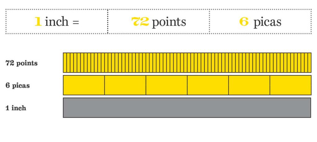
A pica is a unit of space that connects points to inches. There are 6 picas to an inch. See? Sooooo simple. It is a term from the 1580s, probably from pica, a name of a book of rules in the Church of England for determining holy days. I know, a little random.

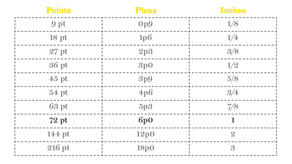
A point is the unit we use to measure overall type size, and there are 12 of them in a pica. So, if there are 12 points in a pica and 6 picas to an inch, there is 72 points to an inch. That means, depending on the typeface, a header that’s 72-point type size, could be possibly an inch high. Easy, right?

our-notebook-picas-points

Next time you open up a fresh Adobe InDesign document, don’t immediately switch your measurement system to inches (um yes, points and picas are the default!).

Instead, try typing in your format size in an inch measurement (for example: 8 in), and InDesign will convert it automatically for you. Thanks, Adobe. Picas and points are the measurement system of the environment you’re working in for print. It’s not inches. It’s not pixels. It’s points and picas.

I use points and picas to create a visual relationship from the page to the type. It’s that intimate relationship that creates great looking copy on the page. Columns, alleys, gutters, margins; they all look better if set in a relative measure to the type size.

Develop a fondness with points and picas. Love them and they’ll love you back.

Do you use picas or inches? Tweet us at @TypeEd and let us know your preference.


Michael Stinson is a co-founder and instructor at TypeEd, where he helps designers implement better typography, efficiently. Get more typography in your inbox when you sign up for more updates about TypeEd.