In 1920, after over a century of proposals, petitions, and protests, the 19th Amendment was finally ratified, granting women the right to vote. The road to that ratification is long, messy and complex, just like most of American history. As with many complex battles, there are lessons to be learned. Here’s a breakdown of what the suffragettes did well, and where they failed.

Finding the Angle

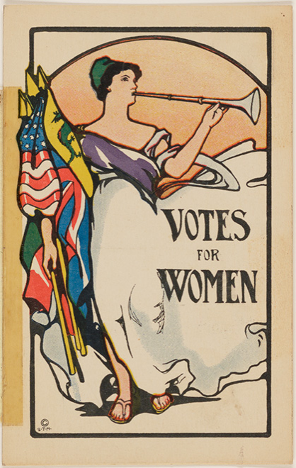
While most of our modern fights come from a human rights and justice perspective, the women’s suffrage movement had to get crafty with their point of view. Some people feared giving women the vote would lead to familial chaos and a breakdown of societal structure. (Men in power truly are the biggest drama queens out there.) So instead, suffragettes focused on how giving women the vote would favorably affect families and society. This affected the tone of their pamphlets, the kinds of events they held, and even the way they dressed.

suffragetteImage credit: Woman Suffrage Memorabilia

Battling Bad Press

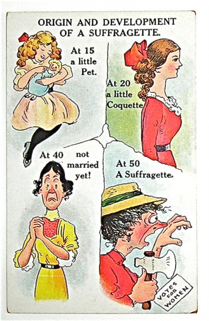
Anti-suffrage propaganda was fierce as hell, although modern women have probably seen worse in the deep dark corners of the internet (and probably their inboxes). Looking back, it’s jarring (and honestly sad) that so many of these posters showed men taking care of children as a societal nightmare instead of the utter joy most modern fathers see it as.

Instead of further bruising the male ego, the suffragettes came up with a range of campaigns to quell the fear of social disaster and familiar destruction. These included:

  • Fundraising suffrage coffee + tea
  • Suffragette cookbooks, claiming “the best cooks are suffragettes”
  • Postcards and greeting cards with cute and clever cartoons
  • Social events, balls, and parades
  • Swag on parade day: buttons, leaflets, “keep cool” fans
  • Pins to rouse conversation and later the “jailed for freedom” pin (see “The Tides Turn” below)
  • Mascots, sashes, banners, and coordinated colors
  • A film that actually showed suffragettes in a positive light (because there were many that didn’t): Your Girl and Mine
  • Coordinating with photographers to capture pivotal moments (see “The Tides Turn” below)

They additionally used the power of symbols and imagery to draw attention, change associations and garner recognition to their plight. For instance, they used the color white to battle their image as ugly spinsters to show purity of cause, youth and vitality. (I’m not saying it’s cool, I’m just saying it’s what happened.)

Lesson: “When they go low, we go high.” — Michelle Obama

Image credit: Library of Congress

Selling Out the Sisterhood

Many suffragettes decided to distance themselves from the Black women among their ranks because they believed focusing on the vote for white women would help their cause. They departed from their abolitionist roots and started courting Southern women, leaving out their Black sisters to appease the racially-divided south.

Not only was it cringeworthy, this tactic clearly failed as Black men won the vote before women did.

Lesson: Throwing your comrades under the bus has consequences and is not a good look in the eyes of history.

Racism Within the Movement

In case you haven’t picked up on it yet, most of the suffragettes were problematic at best and horribly racist at worse. When Black men won the vote before women as the 15th amendment was ratified, white suffragettes were, in a single phrase, less than pleased. Susan B. Anthony went on to proclaim, “I will cut off this right arm of mine before I will ever work or demand the ballot for the Negro and not the woman.” Yikes.

White women saw the 15th amendment as a slap in the face, turning a blind eye to the crimes of white southern women (who had made up 30% of slave owners), and essentially upheld a white supremacist stance to court political favor.

Lesson: Kill your idols. Every. Single. One.

Black Women Speak Up

“I feel that I have the right to have just as much as a man. There is a great stir about colored men getting their rights, but not a word about the colored women; and if colored men get their rights, and colored women not theirs, the colored men will be masters over the women, and it will be just as bad as it was before.”

— Sojourner Truth (1867)

Interestingly enough, the famous “Ain’t I a woman?” speech may not have even contained that phrase, as Truth’s words were changed to sound more southern 12 years after the original transcription by Frances Dana Gage. Truth didn’t speak in a southern dialect as she grew up in New York, but as Tammy L. Brown points out, these vernacular changes “depicted Truth to white audiences as a genuine albeit primitive ally in the fight for women’s rights… this progress is tainted by white suffragists’ attempts to control Truth’s voice.” Despite the bastardization of her words, this OG abolitionist and champion of civil rights kept speaking out until the day she died, fighting for the liberty of all people.

Ida B. Wells-Barnett, a lesser known MVP of the suffrage and early civil rights movement, was outspoken about how little white liberals were doing to oppose crimes against Black Southerners. She organized an anti-lynching campaign and then went on to organize the Alpha Suffrage Club for Black women in Chicago. The women were met with opposition from the 1913 Woman Suffrage Procession. Wells-Barnett refused to be delegated to the back of the parade and instead rushed in to walk between two white supporters to protest the segregation decision. Despite the efforts of many of the suffrage movement’s leaders, activists like Wells-Barnett would not back down from contributing to the movement.

Lesson: Segregation is no way to dismantle the patriarchy.

Deeds, Not Words

In 1913, Alice Paul and Lucy Burns broke from the National American Woman Suffrage Association (NAWSA) to form the National Women’s Party (NWP) because they thought the NAWSA were not getting rowdy enough to make s#*t happen. They were a significantly smaller force — 50,000 vs. NAWSA’s 2 million — but they went hard. They continued protests during World War I, calling out Woodrow Wilson’s hypocritical war stance, while NAWSA took a break from campaigning to contribute to the war effort instead. The NWP were focused on winning a federal amendment rather than the NAWSA’s state-by-state approach, as they felt that strategy had already taken too long.

Their tactics included:

  • Aggressive agitation
  • Relentless lobbying
  • Creative publicity stunts
  • Repeated acts of nonviolent confrontation
  • Examples of civil disobedience

During their wartime protests, the “Silent Sentinels” were arrested, beaten, and tortured. Any anti-government criticism during the war was seen as treason.

Lesson: The road to justice is a bumpy one. We area standing on the shoulders of women and men who faced government cruelty in response to calls for equality—which inadvertently worked to tip the scales in favor of the oppressed. When the going gets tough, the tough double down for their cause.

The Tides Turn

In the early 20th Century, suffragette art became more sophisticated and targeted. Posters and ads depicted the glory of equality that had already been won at the state level in much of the west, the education, work, and taxes women have contributed to society, and depictions of torture in prisons.

Leaders like Alice Burns coordinated with the press to get images of suffragette arrests in newspapers across the nation. They also created the Jailed for Freedom pin that was given to all the women who were arrested and tortured for picketing and demanding the vote. By circulating photographs of their arrests, the suffragettes were able to paint a more sympathetic portrait of their cause.

Eventually, Puck magazine, which originally published anti-suffrage cartoons, started publishing pro-suffrage cartoons instead. Public opinion started to turn, the women’s contribution to the war effort became undeniable, and enough representatives were finally worn down enough (or convinced, who knows) to vote for the 19th amendment’s ratification.

“Women have suffered agony of soul which you can never comprehend, that you and your daughters might inherit political freedom. That vote has been costly. Prize it!” — Carrie Chapman Catt (1920)

However, this wasn’t the end of the fight, especially for Black women, who had additional barriers and voter suppression to contend with. In fact, the battle for universal suffrage isn’t quite over, at least not in practice. With voter ID laws, the shutdown of polling locations, reduced opportunities for registration, limiting early and mail-in voting,*  and most pressingly attacks on the US Postal Service, voters are facing more challenges than ever to cast their ballot.

*These measures were introduced in more than a dozen pivotal states after voter turnout increased between 2004 and 2008 which has me shaking my head, to say the least.

What can we do? Save the USPSCall our Senators and Representatives to demand an end to voter suppression (along with any other issues you may care to bring up), and for the love of liberty, VOTE.

Lesson: The truth of oppressive brutality, targeted lobbying, and showing your worth can swing public opinion, but the battle is never truly over.


About the author.
Alessandra is the mentor, educator, and writer behind Boneseed, a private practice devoted to deep self-inquiry through a range of physical, energetic, and mental modalities. She has over 500 hours of yoga, mentorship, and facilitation training and can be found slinging knowledge on her website, newsletter, and @bone.seed.

As a copywriter or creative, you may be tasked with creating alt text (or alternative text) for images that appear in the digital content that you make. Having a good understanding of how alt text is used will help you to make your work more accessible. Here are some best practices for creating text descriptions.

What is Alt Text?

Image text alternatives explain a picture, illustration, or chart through web page markup. People who are blind or low vision can use a screen reader like JAWS, which reads text on the web to them. People with slow internet connections may turn off images to load pages faster, showing the text description of the image instead. Also, people with cognitive or learning disabilities may elect to read text descriptions of images for better comprehension.

Complying with Web Content Accessibility Guidelines affirms the right of people with disabilities to be able to navigate the web freely and independently. While the average reading speed for an adult is around 300 words per minute, a person accustomed to using a screen reader may process text as fast as 500 wpm (like speeding up a podcast). Without image descriptions, even if the image isn’t necessary to comprehend the page, the screen reader sometimes reads an error. This creates confusion or frustration because the site is not fully accessible to the user.

If an image has a function, such as a donate button or to click somewhere, without alt text, the user will be lost. They might not be able to make a purchase, to fill out a form, or to understand an important piece of information. It’s worth mentioning that W3C WAI guidelines say that if an image is decorative, it should simply have null alt (alt=””). But many people in the disability community and their allies add a short description regardless.

Context is Everything

People who use screen readers — like sighted people — scan a page of text. That’s why it’s so important to use properly formatted headers, so the reader can jump from one section to another. Other navigation tools ensure that the reader doesn’t get stuck in a navigation trap or endlessly scrolling through a page. When an image conveys information about what is being discussed, tabbing through image descriptions can help the person using a screen reader to understand the content of the page or article. Or it may be necessary to advance within the page.

The first step to writing better alt text is to understand the context for which the image is being used. Often an image is intended simply to break up large blocks of text on a page but is related to the subject. It may not be crucial to understanding the meaning of the text, or it can show something mentioned in the text for emphasis. Keep descriptions short. A simple alt text like “woman seated at desk, using computer” is enough. Cut unnecessary words: you don’t have to write “image of” or “link” because the screen reader provides that information.

Many people attempt to describe an image in greater detail, such as: “white woman wearing blue and white striped shirt seated at desk, working on computer and smiling.” In this case, think about the purpose of the image and whether the color of her skin or shirt is critical to comprehend the page. Some graphic designers, photographers, or art directors, who rely more on visual information, can get bogged down in the details of an image. But it’s not necessary to describe every detail unless it adds value to the reader’s understanding of the image and the content of the story.

If an image is essential for understanding the content of the story, clearly explain what it depicts. For example: “people at rally holding signs saying ‘xyz’” or “empty shelves of coronavirus tests.”

Shorter is Better. Usually.

Shannon Finnegan (they/them) is an artist who examines disability in their multidisciplinary work. With artwork constantly being shared on websites and in social media, Finnegan became curious about accessibility and exploring the questions that come up as we try to describe images. With collaborator and fellow disabled artist, Bojana Coklyat, they teach workshops on “Alt Text as Poetry.”

If a picture is worth a thousand words, well, it seems that “sighted people have a tendency to over describe,” Finnegan confirms. Perhaps it’s because they’re constantly engaging with and categorizing visual information. Or maybe they’re concerned about making a mistake. But usually a concise description is better, saving the reader time and conveying the significance of the image without describing every detail.

It Should Match the Tone of the Piece

Finnegan interrogates subjectivity in the alt text workshops. They believe that when possible, there should be a “unified perspective or voice” in digital content. It can be confusing if a piece is confessional and the images are described in an objective way. In a first person piece, it might make sense to even use slang or jargon in a description.

Finnegan points out that it is also a choice to have a very technical description of an image. It’s not neutral, and something is lost when the feeling of an image isn’t conveyed.

It is also possible to be more transparent in image descriptions. If an image is being used to convey a point, the description could use less authoritative words. It can demonstrate that the image is being interpreted: “seems to show,” “can be,” etc.

Don’t Forget about Complex Images

Many people forget or avoid including alt text when it’s far more challenging. Social media graphics with long pull quotes or charts with lots of detail are complicated. Meaning is being conveyed through images with text or through data visualization. In these examples, it is necessary to explain the information in greater detail.

The DIAGRAM Center has extensive resources and training tools for how to describe more complex images, like flow charts, maps, and diagrams. If you are a creative who regularly designs infographics or charts, it’s worthwhile to check out their slide decks.

Another challenge is describing people. There can be value judgements ascribed when mentioning a facial expression or gesture. Some people think that it is best to omit descriptions of race or ethnicity entirely. Others think that it can be more direct to describe skin tone, physical characteristics, or body type. Sometimes it may also be important for the client to show that the images include a specific population.

Gender identity and expression is another challenge. The writer may assume that they know the identity of the person pictured. Where possible, Finnegan suggests, ask people to provide the image description for their own headshot or portrait. That enables them to share any personal preferences they may have about language and identity.

We make assumptions and categorize people all the time visually. This becomes even more apparent when thinking about describing an image for alt text. The complexity of visual information can be overwhelming at times, but that leads to the next point.

It Doesn’t Have to Be Perfect

Many people worry about getting it right when they need to create alt text. But omitting a description altogether is far worse than an imperfect description. Practice helps. Discuss standards or tone for image descriptions for a particular project in advance. Include them in a style guide. It’s helpful to think about why you’re making the choices that you’re making and to understand that they are, in fact, choices.

These are “interesting and complicated questions,” Finnegan believes, adding that we can all “practice together.”

With more lawsuits opposing lack of equal access and a greater awareness of accessibility in general, writing good alt text is not just “a nice thing to do.” It ensures that people with disabilities have the same access to information as everyone else.


About the author.
Jess Powers writes about marketing, food, and wellness. She has experience in nonprofit communications and emergency management. Follow her @foodandfury.

From emails to Facebook, newsletters to Twitter to texts, the quality of our writing often determines that first impression across the digital landscape. In a content saturated world, it’s a battle just to increase our odds of getting noticed, understood, and actually read. When our content is up against an endless supply of words and images behind glowing screens, we need to make sure we not only capture attention, but keep it. (Oh my god, it’s like we’ve manifested our childhood need for attention into a professional way of life.)

From general writing advice to medium specific necessities, we’ve got you covered, dear reader. We’re going to take you through how to sharpen your language, adapt tone for different mediums, and perhaps most importantly, capture attention with direct brevity (and a little humor).

Write Better Emails

Not only are emails the default form of professional communication, emails are your paper trail. Especially in the workplace, you want to make sure any verbal agreements are translated to paper ⁠— and that you’re writing as if anyone might read your words.

You also want to make sure those emails actually get read. While email attention spans have grown, here are some ways to get better results whenever you click send.

Be direct / Be brief
I used to wonder why no one knew the information that was clearly stated in emails I sent. Spoiler alert: it’s because no one read them. If the first few sentences don’t highlight what’s important⁠ —  and you don’t keep pertinent info in separate lines or at the top of the paragraph ⁠— they’ll barely get glanced at.

Make sure you have short paragraphs and lead with the most important information. If you can cut a paragraph down to 2 sentences, people will love you. Or rather, if you say in 2 paragraphs what could’ve been communicated in 2 sentences, people will hate you.

This all goes double for the subject line. What. Are. You. Emailing. About?

BCC is your friend. Reply all is your enemy.
""
Okay, so this isn’t specifically about the actual writing, but if there were commandments for sending emails, these would be the first two. The other 30 people on that office-wide email chain don’t need to be abreast of every “okay” and “thanks.” Spare them, and yourself, some grief by paying attention who is in what line of the To/ CC/ BCC trifecta.

Write Better Newsletters

This is your most direct and intimate lifeline to your audience. When you saddle into their inbox, you’ll be competing against dozens if not hundreds of other emails clamoring for their attention.

Every blast should provide purpose, and if appropriate, a little entertainment. Studies show most people read emails between 9 and 11AM on weekdays, so ideally you’re sending that blast between 7 and 10AM (but make sure to check that against your own analytics).

Grab attention with the subject and preview
""
Let your readers know what they’ll get out of your email. What’s the value add? New projects? Discount codes? New products? Why should I care? If it’s time-sensitive, make that clear. Words like “breaking” and “urgent” get clicks. Just make sure you use those bait-y words with purpose.

Important information goes “above the fold.” Why should someone spend their precious inbox moments reading what you have to say? What problem are you solving? Expand on the key words in your subject line with the preview text. For more in-depth tips, check this out.

Sound friendly, but not overly familiar
Ahh, the fine line of tone. To take me for example, this vibe is fairly casual. It’s a long form blog where I have the space to form intimacy. I don’t assume to know too much about you, but I give you enough personality so that you might feel like you’re getting to know me. People and brands that have distinct voices always stand. Find yours and use it.

Master the image to text ratio
""
If you look at a heat map of where people’s eyeballs go when they read an email, you’ll see attention goes to headlines, images, the first two words of a paragraph … and then they trail off.

To keep engagement, break up the text and include plenty of images. Whether it’s a pop culture reference, charts and graphs, or a promo flyer, save those eyeballs from a text wasteland.

Write Better Social Media Posts

Social media has become everyone’s public persona. How do you present yourself, your brand, your company? Know thy audience, know thy medium, know thyself.

Write for the medium
Instagram better have great visuals with a clever caption. Good lighting, clear images, or some sort of infographic will go far. The words are just there to support that. A lot of people won’t even read them. On Twitter you better make those characters count. One sentence is ideal unless you’re clever.

Facebook can handle a combination of links, text, and photos. LinkedIn is, of course reserved, for professional accomplishments, events, and articles. Just like with newsletters, your personal analytics matter more than the general rule of thumb so check in with that.

Give it purpose
Whatever you’re using, make sure there’s a value-add and a purpose. Now, that purpose can be a joke, but you better make your audience laugh in a non-cringe kind of way. Add a call to action to make it really count.

Keep it casual 🙆🏻‍♀️

Especially for Twitter and Instagram, you can bend the grammar rules and play with hashtags and emojis. Adding a meta awareness to your posts can score you big points with younger audiences.

Write Better, Period.

Write like a human person
When you get hyper formal, overly “rah-rah,” or a little too fake, it’s obvious and off-putting. Sound like yourself, or at least sound like a human. Gauge the level of formality needed for the situation and don’t go beyond that. Unless you’re working in an industry with antiquated formal standards of practice, tis better to err on the side of casual.

Why?

  1. You will sound more likable.
  2. You will sound smarter.

You know who writes in a casual tone? People who don’t have anything to prove. If you actually know what you’re talking about, it’ll come off as confidence.

Of course, there’s a fine line. Going too casual with an abundance of emojis, exclamation points, colloquialisms, and misspellings will have the opposite effect.

Cut unnecessary prepositions
As a matter of fact, cut out all unnecessary words. Unless you’re combing for the perfect metaphors to describe the sunset …

KEEP
IT
SIMPLE

For example, instead of
“I’m writing to inform you of a new propositions that may alleviate workflow issues you may be experiencing in your business.”

You can sharpen that to
“I’ve developed a new proposition aimed at solving your business problems.”

Find the “of”s, the passive language, the qualifiers, and get rid of them.

Use action verbs where possible
Chuck Palahniuk has an extremely frustrating, but insanely effective technique for creating dynamic prose. Go through whatever you write. Cross out the “thought” verbs (thinks, knows, understands, realizes, etc). Replace them with unpacked action verbs. He also insists including “is” and “has” verbs as well as “loves” and “hates.”

While this advice was written for novelists and storytellers and certainly qualifies as overkill for most online media, there are a few really useful ideas behind it that will benefit anyone.

First, it forces active language. For daily writing it won’t make sense to replace every “thought” and “to be” verb, but if you can replace a handful for every page of writing, you will arrive at your point faster and hold attention longer.

Second, it asks us to figure out what it is we’re actually trying to say without short cuts. I love this ⁠— especially when working with buzz words. Instead of “authenticity,” “manifest,” “abundance,” “optimize,” “organic,” what are you actually trying to communicate? Are those the best words? Sometimes they are, but often they’re BS.

You can even take this advice to a resume. The first line of every bullet point should have an engaging action verb like “wrote,” “designed,” “produced,” “implemented,” not something like “helped” or “was the point person for.” Specifics are everything.

Write now. Edit later. Always revise.
Get the words down. Now. Don’t get stuck on the perfect phrases. Practice spitting them out. Then go back. Edit. Revise. Hone. Reread. THEN submit. After all…
""


About the author.
Alessandra is the mentor, educator, and writer behind Boneseed, a private practice devoted to deep self-inquiry through a range of physical, energetic, and mental modalities. She has over 500 hours of yoga, mentorship, and facilitation training and can be found slinging knowledge on her website, newsletter, and @bone.seed.

Seven Things to Try When You’re Having a Creative Block

As creatives, we all have times when a design concept doesn’t quite come together or the words just don’t flow. In the workplace, you often have to push through those creative blocks at a quicker pace than you do on a personal project. Try out a few new methods to replenish those creative reserves.

Get Some Space

Once you’re staring at a blank screen for too long or going down a rabbit hole seeking elusive perfection before submission, know when to walk away. If you have the luxury of getting feedback from a colleague, this is the time to ask.

Some people try to slog through, but as frustration and stress mount, you’re less likely to solve the challenge or to get unstuck. Try to switch gears and return to the work with fresh eyes. Having a small win by finishing another task, like checking in with another team or sending that invoice, can shift your mindset.

A day off a project, if possible, will generally provide an opportunity for copywriters to catch a few lingering typos or the awkward phrases missed when reading the same piece over and over again.

It’s tempting to use this pause to check your phone or watch some cute cat videos. But a break in screen time can help you more effectively reset (and give your eyes a needed break). You could read a magazine, stretch, get a cup of coffee, chat with a colleague, tidy up your desk, or even fold laundry if you’re working remotely.

Work in Spurts

Better yet, learn to work with your brain’s natural productivity cycles. Our ultradian cycles alternate between 90 to 120 minutes of high frequency brain activity and 20 minute periods of less intensity when we’re awake. If you time your periods of deep concentration accordingly, you’ll find that it’s far easier to work through creative blocks.

Get Physical

We’ve all heard that sitting is the new smoking, and even standing desks have their issues. Coupled with feeling stuck on a particular project, it could be time to get physical.

Moving around or going for a walk is great, but the trick is to get out of your head and to feel more centered in your body. More intense physical exercise, like going for a run or hitting the gym on your lunch hour, could provide that shift. Releasing endorphins in the body reduces the stress of a creative block, and it’s not just exercise that does that — eating foods like chocolate and having a good belly laugh works too.

Get Centered

Ironically, another way to release those endorphins is by sitting still and getting centered. Meditation has a host of benefits for your health and well-being, but by learning to focus on the present moment, it is often possible to work through a creative block. Being in the moment clears your mind of other distractions, enabling you to address the task at hand.

In the longer term, a dedicated meditation practice can profoundly increase concentration. If you’re just getting started, the free app Insight Timer has an enormous library of guided meditations of varying lengths, tracks the amount of time that you meditate, and offers paid course content if you want to work on specific subjects.

Opt for a Change of Scenery

For many copywriters, writing is thinking, and much of that process doesn’t come naturally in front of the screen. If you have the opportunity to walk around, or to visit a gallery or city park, you can often work out the structure of a piece or resolve a lingering challenge by passively thinking about it as you wander.

The health benefits of walking in nature are vast, and creative types have long relied on nature to reset or inspire creativity. Composer John Cage famously taught mycology (mushroom identification) to his music composition students as a means of getting them to look at the world differently. If you can, getting out in nature is an effective way to get through a creative block for a design or concept.

Switch Disciplines

Copywriters might find it helpful to use an adult coloring book when faced with writer’s block, while some visual creatives enjoy reading, socializing, or dancing. “Live music usually inspires me, though I am a 2D artist,” says Mandy Fraser, a painter, illustrator, and graphic designer living in New Bedford, Massachusetts.

Use Prompts

Other creatives use prompts to work through a slump. The Surrealists used games like the exquisite corpse and exercises such as automatic writing, which many artists and writers still employ. Joie Rey Cohen, a visual artist based in San Francisco, relies on online prompts to drive creativity and get unstuck. Some excellent suggestions include:

Similarly, writing something lighthearted and fun might provide a needed break when you’re writing a lot of heavy pharmaceutical or financial content.


Jess Powers writes about marketing, food, and wellness. She has experience in nonprofit communications and emergency management. Follow her @foodandfury.

Advertising is such a social and highly collaborative industry that it’s practically a job requirement for you to competently navigate relationships among a wide variety of people through networking. But for some of us, making new friends — or at least making new connections or workplace allies — doesn’t always come easy.

As a lifelong introvert, I am more aware of this than practically anybody. What I’ve learned from my 10+ years in the biz is that making connections is a long-term process. If you’re also an introvert, it’s important to remember the benefits, and remind yourself that it’s worth the work that goes into networking — even if it’s just inside your office.

Why Workplace Networking is Important

1. It can make your life better.

Having friends, compadres, confidantes, or whatever else you’d like to call them, is essential to having a long and successful career. In an industry where there are a lot of late nights, working lunches, and missed vacations, having work friends can take the edge off and help you avoid burnout.

2. It can make your work better.

You don’t have to be friends with everyone, but developing a few key strategic alliances can make it easier to do your job.  As a copywriter, I always make a point of trying to cultivate relationships with the senior account and strategy people for the brand that I work on. It makes my job easier, more fruitful, and less painful. When people know who you are and trust that you’re working toward the same goal they are, they’re more receptive to exploring boundary-pushing work.

3. It can make you better.

Friendly relationships can also reshape the dynamics of feedback and criticism. It softens the blow to hear criticism come from someone you perceive as a teammate (and conversely, they may be more sensitive about giving it if they’re friendly with the person on the receiving end). If you’re getting professional feedback from a colleague with whom you’ve forged a relationship, instead of listening with resentment and dismissing their words, you’ll hear suggestions for doing better work coming from a knowledgeable partner who has the best interests of the project in mind.

How You Can Improve Your Workplace Networking

It can feel like a fine line between making strategic connections and dressing up as an extrovert. Even if it doesn’t come naturally — and it won’t, at first — there are a few little things you can do every day that can make the process easier.

  • Smile. When you’re in an overwhelming situation, it may be difficult to crack a smile, but smiling can help you be less stressed. You don’t have to smile at everybody, but do think about it like it’s a welcome mat.
  • Speak up in meetings. It shows people who you are and invites the opportunity for conversation. Start small by making short statements or asking a simple question.
  • Network outside your office, too. Read about how you can win your next networking event and add more connections who can help you achieve your professional goals.
  • Challenge yourself. The objective isn’t to turn you into an extrovert; it’s just to make it easier and less forced when the right opportunities do present themselves.
  • Give yourself the time and space to recuperate. Expanding your comfort zone is hard work. Introverts get their energy from within so after doing something particularly challenging, make sure you block time out for yourself.
  • Pace yourself. There’s no need to get out there and do everything at once. Try one of the tips or all of them; the important part is to stay true to yourself.

Networking isn’t a “one and done” process

Any kind of relationship takes work and nurturing. You don’t acquire a new friend and then have that friend forever without doing some work. The same is true with business or workplace relationships.

You’ve probably heard that it can be more expensive for a business to acquire a new customer than it is to retain an existing one. Now think about that in terms of maintaining your network. Keep nourishing your new connections by showing value, whether it’s lending a friendly ear, providing key information, or offering to make an introduction.


Lisa is a Creative Circle candidate and seasoned advertising copywriter who lives in Los Angeles. Her background includes both in-house and agency work on Fortune 500 and global accounts in the consumer and healthcare/pharmaceutical fields. She excels at words, fashion, and cats. If you want to work with Lisa, contact Creative Circle Los Angeles.


As creatives, we don’t always have control over what the day brings us (hello, same-day deadlines!), but there are several time management strategies that can help you have both the time to complete a project and the creative energy to do it well. Try one or all of these time management strategies so you’re prepared the next time you get asked to deliver something by 2 p.m. (and you were about to run out to grab lunch real quick…)

1. Ask more questions at kickoff meetings.

Before kickoff meetings, take time to go over the project brief; review everything you know (and don’t know) about the project and list out questions or missing pieces you find. Having a little knowledge upfront can keep a project from bottlenecking once you’ve started it so you don’t have to stop mid-project to wait on someone to give you what you need.

Ask questions that are appropriate to the clients and project, including ones that will save you time and money down the road.

  • Who is the point person at your end?
  • Are there brand guidelines I should be aware of?
  • When is my first draft due, and what is the drop-dead date for completion?
  • How many different concepts/approaches would you like to see?
  • Are there additional creative assets for this job I might need? Who has them?
  • Do you already have something in mind?
  • How many people will need to review it?
  • If there’s more than one reviewer, will you collect all of the changes, or will I need to make changes after each individual reviews it?

2. Come up with a system for classifying your jobs.

It isn’t always sound business to have a creative director, a senior art and copy team, a proofreader, and a designer at a kick-off meeting to discuss edits to a small change in an e-blast. Yes, clients don’t always understand that. A few years ago, when I was working at an in-house shop, we struggled to make our clients aware that, even though we were right on the premises, our team didn’t function like bottomless mimosas, so we came up with a project classification system. The system pre-determined how much time and creative energy we could expend on an assignment:

  • Level 1 were basic jobs requiring simple art or copy elements without much strategy;
  • Level 2 might require a little ideation, but was mainly just design or writing; and
  • Level 3 needed the big creative guns and the whole team working.

Even when I left that job, I held onto that system, and I currently use it for all of my freelance assignments. I spend my peak working hours on the more challenging assignments, and the lower-grade projects are shoehorned in at the end of the day.

3. Keep a well-organized swipe file.

Technically, a swipe file is a physical collection of ads, direct mailers, and brochures that have performed well in the past. It’s a way of keeping things that inspire you and have been called a “must-have” if you want to improve your marketing and communications. Your creative swipe file would work in the same way and can also include photos, magazine spreads, packaging, or whatever else wows or inspires you. Some people do keep physical copies but others use tools like Trello, Evernote, or Pinterest to look for and organize inspirational images and ads.

If you don’t already have one, start with one file for one topic and you’ll find that you’ll keep thinking of cool new things you want to save. Whether it’s digital or analog, keep your files organized so when you get that last-minute request and it’s time to brainstorm you can easily look through the work that inspires you.

4. Look for things you can automate.

If your job includes a lot of repetitive actions — for example, copying and pasting, resizing images, or creating many similar web pages, take advantage of whatever technology is available to automate the process or do things faster. You can probably find thousands of tips for specific programs you use, but here are a few that will apply to any program you’re working in:

  • Customize your workspace so that all of the tools or tabs you use frequently are in one place.
  • Learn the keystroke shortcuts for the functions you do frequently, and try programming your own (which you can do in everything from Word to After Effects).
  • Create your own templates and style sheets (and save them in the same spot).

5. Practice the “Two Minute” rule.

The “Two Minute” rule is simple: If you can do a task in under two minutes, do it immediately. Whether it’s responding with a quick approval to an email, or updating the one line of copy in round 4 of the deck, get it out of the way so you can move on to the bigger things and also let the people waiting on you move on with the project. The bonus is that you won’t have to deal with what would have been a small task at the end of the day.

Those two-minute tasks can pile up, though so there’s a lot of back and forth about procrastination making you more creative, but the reality is if it’s something that can be done in two minutes, you’re not robbing the world of a masterpiece of innovation. If you have a hard time sticking with this, and two minutes turns into 20, time yourself or set aside a 30-minute time block for these small tasks.

We’re always looking for ways to improve our productivity, and these time management strategies are just a few ways to do it. Keep reading and learning new ways for yourself, though; it’s time well spent!


Lisa is a Creative Circle candidate and seasoned advertising copywriter who lives in Los Angeles. Her background includes both in-house and agency work on Fortune 500 and global accounts in the consumer and healthcare/pharmaceutical fields. She excels at words, fashion, and cats. If you want to work with Lisa, contact Creative Circle Los Angeles.

Stock photo literacy isn’t just for designers and art directors! Beyond producing LOL-worthy memes, stock imagery is one of the great equalizers in marketing, allowing companies that don’t have the budget for original photography to use sharp, high-quality images in their communications.

If you work at a small agency or company and wear many different hats, you’ll probably be asked at least once to help research stock photos. Or, you may even be asked to complete a project that requires using stock photography. Here are a few basic terms and ideas that can set you up for success (and help you avoid getting sued).

Rights-managed images vs. Royalty-free images

When you go to select images from one of the leading online stock photo agencies like Getty Images or Shutterstock, you’ll be able to search and filter based on photos that are either royalty-free or rights-managed. Know the difference before you make your selection.

Rights-managed images
For public-facing communications that have to stand out for the right reasons, you’ll probably want to choose rights-managed images (which are generally more expensive). The costs are based on the intended usage, duration of time, the media you’re using (e.g., digital only, print, billboard), where the image will appear, and if you want any exclusivity — that is, if you are willing to pay enough so that the photographer or agency won’t license it to other companies in your industry, and geographical location. You can even purchase complete exclusivity. It’s not quite ownership, but you are drastically reducing the chances that one of your images will turn up in a competitor’s ad in two months. Rights-managed images have very specific terms of use, and you may need to renew your rights (i.e., pay more) to use the image over time.

Royalty-free images
The basic idea behind a royalty-free image is that you pay for it once, and you can use it as many times and in as many different places as you want. Royalty-free image prices are based on image size (and of course, where you get them) and tend to be much less expensive than rights-managed images. The downside is that you have no guarantees of exclusivity — the same image you purchased to represent your customer service rep may be used on a package for adult incontinence products or grace a magazine spread for an article about heroin addiction. These are admittedly extreme examples, but there are more than a few angst-riddled tales about stock photo models who’ve suffered the consequences of having their photos used as stand-ins for terrorists, werewolves, and guys with really awful penis conditions (SFW). Royalty-free images are great for internal communications, images of secondary importance, backgrounds, or inanimate objects.

Free images

There are also public domain or Creative Commons images. These images are free, but you may need to credit the photographer or agree to use them in a specific fashion. There are hundreds of sites dedicated to hosting Creative Commons images; if you want to go this route, try places like Flickr’s Creative Commons section or the aggregator site Creative Commons Search. All of them have different legalese and licensing agreements so make sure to read the fine print before downloading and using photos!

Illustrations

Most stock houses also sell illustrations known as vector graphics. Vector images are drawings or clip art that can be used in logos and illustrations. These are usually created in Illustrator. Unlike a photographic image, which is usually made of pixels, vector graphics can be scaled up or down without losing resolution.

Things to know

You can assemble an entire image library from stock photography. Many agencies have extensive selections of work from each of the photographers they represent. Most of the bigger stock photos houses have representatives who can help you find “of a kind” images (i.e., you give them a photo, and they can suggest ones that are stylistically or compositionally similar), which can save you countless hours of research.

You should never “screenshot” stock images or use “samples.” Even if you’re just creating an internal PowerPoint deck that will only be seen by three other people, grabbing low-res “samples” from stock photo agencies is technically stealing. Of course, it’s not likely that you’ll be discovered, but it’s really bad form and could be liable for fines or criminal charges. It’s risky and unnecessary, considering there are places where you can buy royalty-free stock photos for as low as $3.

Choosing and using stock photos is fun, but it is serious business. No matter what your needs are, ALWAYS read the fine print to keep yourself and your company in the clear.


Lisa is a Creative Circle candidate and seasoned advertising copywriter who lives in Los Angeles. Her background includes both in-house and agency work on Fortune 500 and global accounts in the consumer and healthcare/pharmaceutical fields. She excels at words, fashion, and cats. If you want to work with Lisa, contact Creative Circle Los Angeles.