If you’re on the quest for a free font, this bit of advice is not for you. A true beauty is worth every penny. You get what you pay for when it comes to purchasing typefaces.
When you are seeking a mate, you need to know who you are and what you want to find a good match. It’s the same with typefaces; you need to know more about the project, and and who it’s for in order to find the ideal partner font. Because once you choose, you’ll be committed to her for the life of the project.
Good designers do more than just “pick a font.” There are other variables in play, such as how to pair well with other typefaces, where to place them in hierarchy for full effectiveness, and how well they work with the visuals on the page. I call the process “typecasting,” similar to casting an actor in a movie. Designers will want to ask themselves these questions about the nature of the project to create seamless storytelling.
1. Who’s the client and who are their clients?
Are they a big beverage brand speaking to consumers, or a small boutique hotel looking for travelers? Is there a large standards guide to follow, or is it a fresh, new campaign? Always begin by gaining an understanding of the nature of your client or campaign, you can begin to narrow down to type classification.
2. What is the project? And what are all the mediums and languages involved?
Will you need screen fonts or desktop fonts? Is the project large enough that you’ll need licensing for multiple mediums? If so, no matter which font family you use, you’ll want to plan to source web font versions for your desktop fonts or vice versa. This may limit the foundries from where you source your typefaces from. Or is it a an international ad campaign where you’ll need some translation? If that’s the case, look at Pro versions or typefaces with additional language support.
3. What’s the concept?
Once you have an idea of classification, begin by writing down all the words you can think of that describe the main idea. Reference imagery to help your brainstorming session. Open it up to related themes if you need more words or you’re designing a few directions. Then sift through and choose the top six that best describes the direction.
For example, if the project is a tabletop bar menu promoting baseball season, I will begin by start looking at type baseball field images. I’ll look at photos of Fenway Park, scoreboards, signage, uniforms. Since we’re talking about America’s game, I’ll Google images of vintage baseball and see if that conjures up nostalgic words for possibly another design direction.
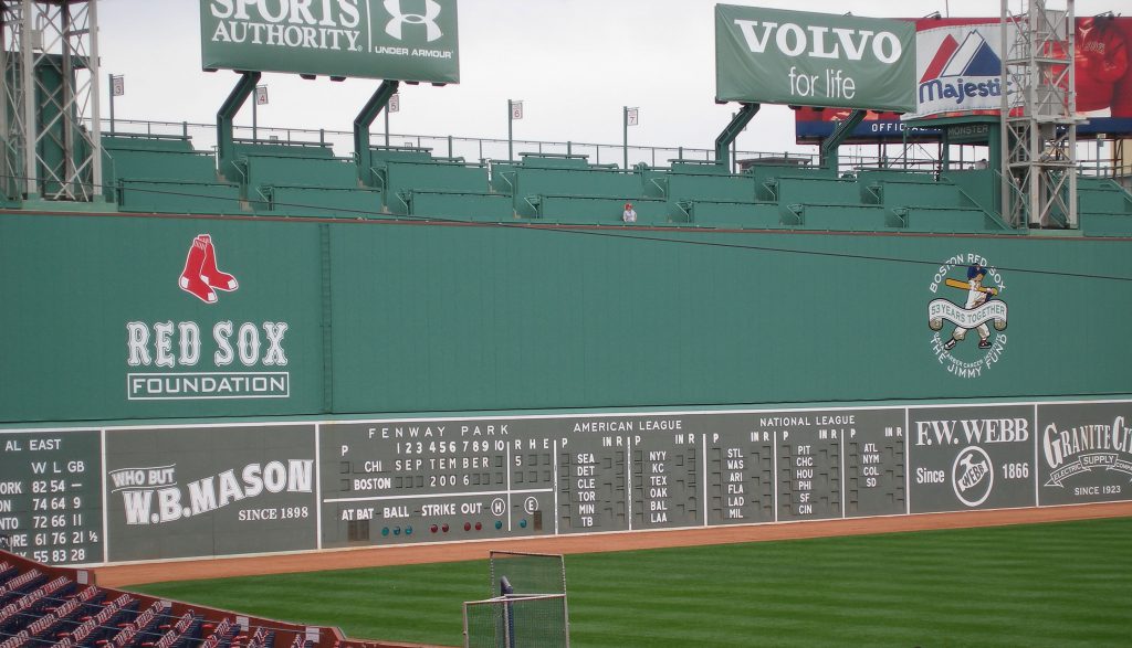
Image of Fenway Park, courtesy of Wikipedia
4. What is the voice & tone of content?
When you read the raw content, you can assess what sort of voice is being spoken. The tone of the writing will give you more clues to the personality of typeface to choose.
I used to give a project in school where my students had to pick a poem and lay it out with type only, across a spread. Typeface choice was critical, because one wouldn’t choose a fancy script for say, a quote by Teddy Roosevelt or Winston Churchill. You’re going to pick something heavy, perhaps set in all caps, to reflect the voice of the speaker.
5. How much content? How will it be read?
How many pages are you going to be typesetting? How much content is involved, and in what form? If the format will be a 6″ x 9″ tabletop menu and the client has over 20 different drinks, you already know that the typeface will be pretty small. And if there’s a lot of reading copy, consider a typeface that has letterform legibility at small sizes.
If you’re working on screen, how will the typeface affect the reading experience on a low-resolution device or moving fast in a movie title treatment? Will the user be reading all the content or just merely scanning?
6. How many levels of content?
Hierarchy works as navigation to lead the reader across the page and to separate the content and indicate context. Assess how much content you have to deal with in the space, and then determine how many levels you’ll need to help you determine the font family needed.
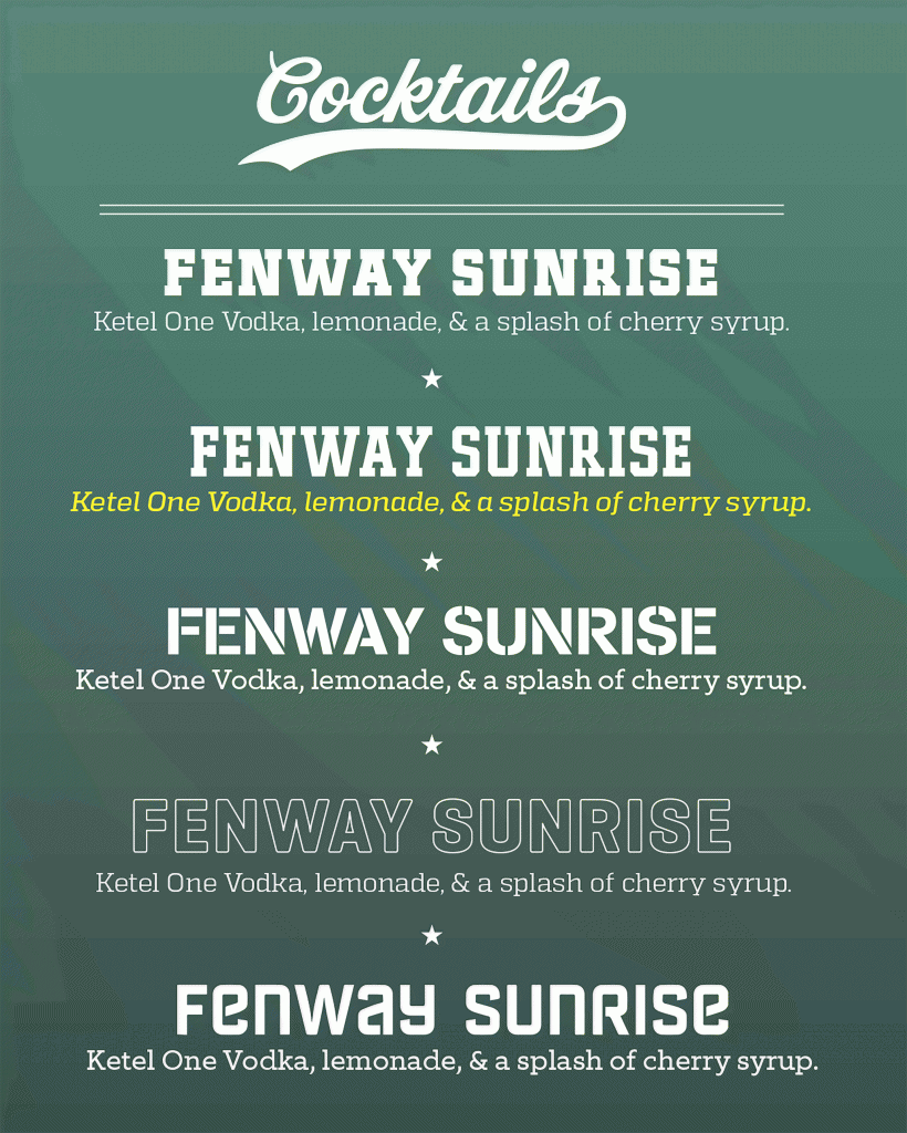
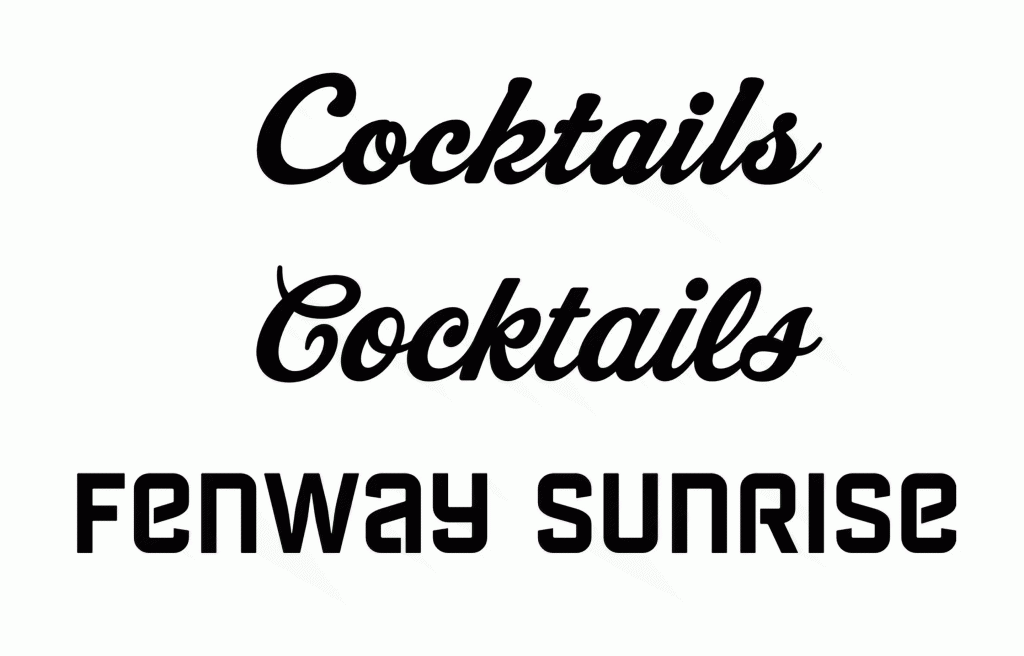
On our baseball drink menu menu, we will only need two levels of hierarchy to separate the name of the drink from the description, and there are many typefaces with only 2 or 3 weights. However, if you are redesigning a magazine, you may need up to 15 or 20 weights and styles, so seek for large families or super families, which narrows your quest considerably.
In order to choose and find the font that works best for your graphic design project, all aspects of the final outcome have to be considered. You need to know what you want in order to be happiest. Just do your due diligence, and you’ll find happiness in a font that fits the project. Don’t worry, letter love is waiting for you.
Michael Stinson is a co-founder and instructor at TypeEd, where he helps designers implement better typography, efficiently. Get more typography in your inbox when you sign up for more updates about TypeEd.