Hey, here’s my resume. Read it. No really, go on. I’ll wait.

The last time I heard someone scoff at the concept of resumes was just a few weeks ago, over lunch. “Oh come on, who actually reads a resume?” Um, I do. And you probably should too.
The funny thing was that just days prior I’d placed a copy of my own resume in this very person’s hands. I like the guy, and he had no way of knowing what an unexpected pain in the rear it had been to put together five copies of my portfolio on short notice. (First, the realization that my husband had been ignoring his printer’s pleas for new ink cartridges past the point of usability; then the unanticipated time spent driving to Staples and back; and then the friend who tried to help me but ended up mis-ordering all the pages and somehow cutting her hand and getting blood on two of the front pages, setting me back to square one.)

What I mean to say, is that I wasn’t that miffed (it helps that he had been clearly receptive to my performance in said interview), but I was slightly appalled. It was less than six months ago that I was still working as the managing editor of a media company, which included participating in the hiring process. When it came to interns, the decision was typically left up entirely to me.
It was the kind of place that attracts young candidates, so our public calls for entry-level internships would result in mountains of resumes. I’m not going to lie and say I read each and every single one that hit my inbox—a few terrible lines in a cover letter were enough to send many applicants straight to the recycling bin. However, when you’re trying to differentiate the suitability of people who are largely just starting out, most of them don’t have a ton of tangible, finished work to reference, much less a slick, smoothly navigable profile site. Often their educational background is completely relevant to who they are in the present moment. They just haven’t done that much yet. So I actually read their resumes.

At some point in your career, writing your resume can evolve into an editing project. More than two pages is rude, so eventually you have to stop being exhaustive (and stop abusing tiny type sizes) and whittle it down to only the most impressive—a living document tailored by time and situation. Perhaps you remember writing your first resume—I know I do. That’s when all the opposite tricks were called for—furiously bumping up the type size to fill a single page and extracting every ounce of potential material from limited experience.

It’s kind of a great exercise, and frankly it can be a really interesting, not just useful, read. That’s partly because these types of resume writers are telling you everything—not just which schools they attended, but what their extracurricular activities were, or whether they studied abroad. A lot of them are also probably telling you revealing little white lies about what they did very little of (but, you know, they technically did… probably) and perhaps they now wish they’d done more of. They’re calling attention to their weirdest, least relevant work experience to simply reinforce the basic understanding that they’re a warm body who will show up on time and not steal the company laptops. Read as a whole, it’s actually a pretty effective map of a person’s life-experience.
Again, I’m not making the argument that anyone needs to read every resume they get. I’m totally down with the method of doing a quick first round of elimination based on a scan for minimum requirements. Blaze through those mountains. But by the time you get to the point of interviewing a candidate, I feel strongly that you should have read the thing in its entirety, whether you are dealing with entry-level or senior-level candidates (who probably ought to be able to edit a resume with at least some charm, anyway).

It’s not an etiquette thing. I relate to the fact that it can seem like more of a burden than it’s worth. But it’s only two pages (or less, and heavy on the returns and bullet points). It will take a very short time for you to read it, and the time it will save you in return makes for a fantastic ROI. Your conversations with candidates will be more efficient, you’ll be able to make decisions more quickly, and they will lead to better choices. Choices that may even have direct bearing on your own workload.
These are the people you’ll be seeing more days than not, after all. Read their resumes.


Marjorie is a former Creative Circle candidate based in Portland who recently accepted a full-time offer for her dream job. She is a writer/editor and stylist/producer with an emphasis in the design world. If you are interested in working with someone like Marjorie, please contact your nearest Creative Circle office.

No matter if you’re designing a book, a brochure, a web page or even your resume, line lengths can make or break the readability of your page.

It’s really all about the harmonious relationship, or proportion from one element to another that makes design beautiful. And the proportion between page, measure and type size is super important in creating perfect line lengths that create comfortable reading copy.

Proportion is a central principle to architectural theory and the connection between mathematics and art. Well-designed buildings have space, symmetry and proportion that you can experience and feel as you walk through the space. This physicality of proportion ignites the senses while walking through the space.

With hierarchy and proportion in graphic design, readers take cues from the designer on what to read when, in what order, with what speed, in what tone and so on. Think of the designer as the tour guide through ‘spaces’ of content.

Now you might not like numbers or math, but this is not mind-bending rocket science. It’s just a few steps to begin with to help make your page look better. Think about it like this: A triple play in baseball is a rare act, but can be done if the mindset of all the players involved are in sync. Let’s take it play-by-play.

First Play: From the Format to the Grid

Creating proportion in design starts with the format or page size, which determines the grid. For a large format, like a newspaper, you can have 5 or 6 columns and accommodate a lot of content. On a small format, like a medical pamphlet, you might be dealing with a single column.

Our Notebook-Typography Tidbits-grid types
The page size is like the outer walls of a house which determines the structure of the rooms on the inside. The page size will narrow down your grid choices, as will the type of content.

Second Play: From the Grid to the Measure

The Measure is the name given to the width of a body of type, or column. Let’s use the example of an 8″ x 10″ book. It’s small, needs to be easily read, and set for flowing body copy, so I’ll assume it needs a double-column grid. Let’s test that.

The page size is 8″ x 10″, with 8 inches being the horizontal size. Subtracting a margin of 1/2 inch on both sides, and we end up with a body copy area of only 7 inches wide. Seven inches converts to 42 picas (6 picas per inch) across. You know this because you have that Conversion Chart in your hand.

Third Play: From the Measure to Type Size

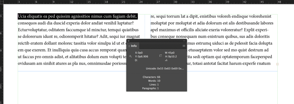
If we lay in 9 points body copy, we end up at 138 characters per line. Too long. So, to calculate the type size based on the size of the 42 pica measure, we’ll split that value in half to start. The measure, on average is 1.5 to 2 times the type size. That means if we stay with our single column, our type size is going to be between 21 to 28 points. Whoa, that’s too big for body copy.

138 characters across per line, as indicated by the Info palette, is too difficult to read.

If we divide the measure into two columns, each column will only be 21 picas, or less with alleys, let’s say 19 picas. If so, we can set our type size between at 9.5 and 12.5, depending on the typeface. Use your info palette in InDesign to check the character count, and aim between 50 and 70 characters. A trained eye will make the final call on the correct size and weight for the page.

66 characters across per line, that's in the sweet spot.
66 characters across per line, that’s in the sweet spot.

If you prefer to see it in action, you can view some of basics of line length calculation process in this video.

This formula saves a lot of time in guesswork, right? It has saved me tons of time. Just knowing the size of the book, report or page has allowed me to be able to estimate print prices on the spot for clients. Based on the format size, I know how many words will copyfit onto the page, and how many pages are needed and figure out a rough production budget for printing.

The format helps us decide on the grid and dictates the measure size. The measure size helps determine the body copy size. They all work together to score a home run for your design career.

We didn’t even address leading, margins, hierarchy, etc. But it’s okay, because now calculating line lengths and creating proportion on the page is now in your strike zone.

Did you try this formula out? Let me know on Twitter at @TypeEd. If you’d like to learn more, visit our blog at type-ed.com.


Michael Stinson is a co-founder and instructor at TypeEd, where he helps designers implement better typography, efficiently. Get more typography in your inbox when you sign up for more updates about TypeEd.

Matthew is a designer and Creative Circle candidate with 1+ years of experience working in Portland. Matthew is highly involved in the creative process and can have his hands in creating a branding identity for a brand. He designs mobile apps, teaming with a developer on functionality and user ease derived from UX research, and is experienced in designing web apps and responsive websites. He has designed print ads and packaging as well, while having the ability to art direct video ads.

After providing us an inside look of Portland for Design Week Portland, we caught up with Matthew again to hear more about how he lives creative.

Finding Creative Inspiration in Portland

One of the main ways that I’m continually reminded of Portland’s uniqueness is when I’m out and about; either headed to the studio or meeting a client. In each of the neighborhoods I encounter on a daily basis, either for work or play, there are residing some of the city’s unique makers and spaces that are guaranteed to inspire creativity or foster creative relationships. I do much of my creative dealings on Portland’s Eastside, due to its more relaxed pace. The Eastside was traditionally the more affordable, residential part of town, but with the exponentially increasing rate of Portland’s expansion, is has become a hub of industry in its own right.

Good Coffee in Buckman is where I love to start things off. They’re an independent group of shops serving the Eastside with a rotating repertoire of coffee and tea offerings. The impeccably minimal interior and walkway-side seating have provided countless beautiful backdrops for meetings with friends and clients.


Local to these Eastside neighborhoods are two open studios of local creatives, which are a great refresher and point of inspiration. The establishments allow space for both appreciation of their own wares, as well as interaction with other patrons and designers who may be visiting.
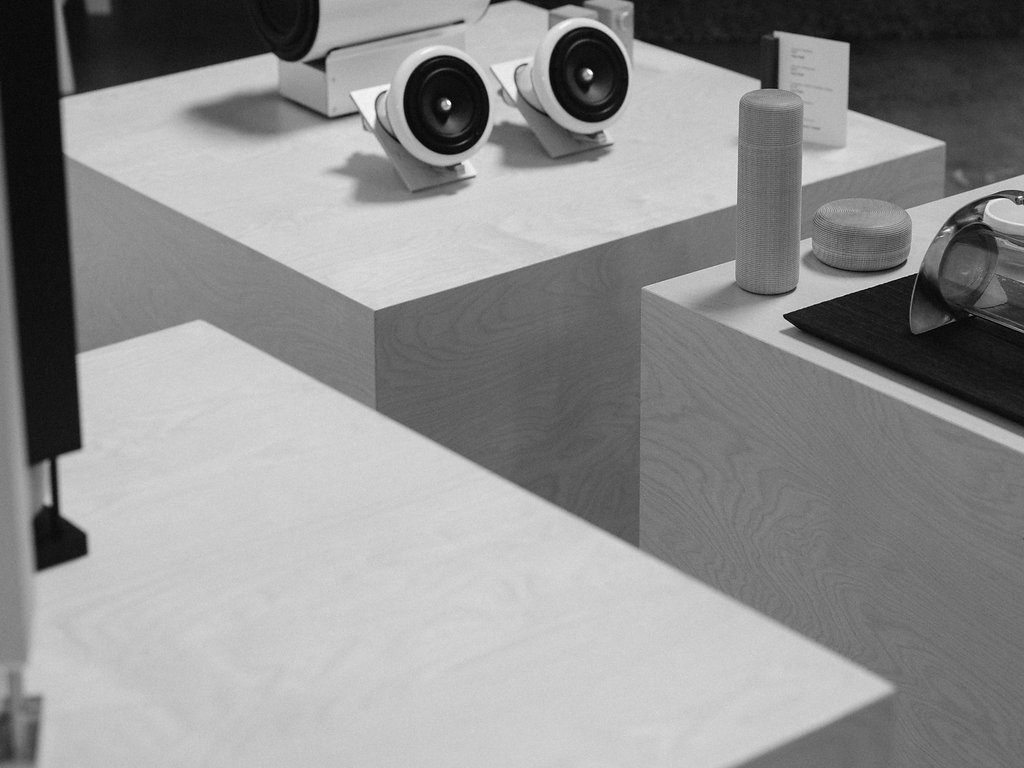
Joey Roth specializes in household utilities designed to meet specific needs
Joey Roth specializes in household utilities designed to meet specific needs.
Joey Roth specializes in household utilities designed to meet specific needs, and Laura Hosgard specializes in lifestyle items. Both creatives have influenced me in incredible ways and are always willing to lend an ear to your current experiences and thoughts.
Laura Hosgard specializes in lifestyle items. Both creatives have influenced me in incredible ways and are always willing to lend an ear to your current experiences and thoughts.
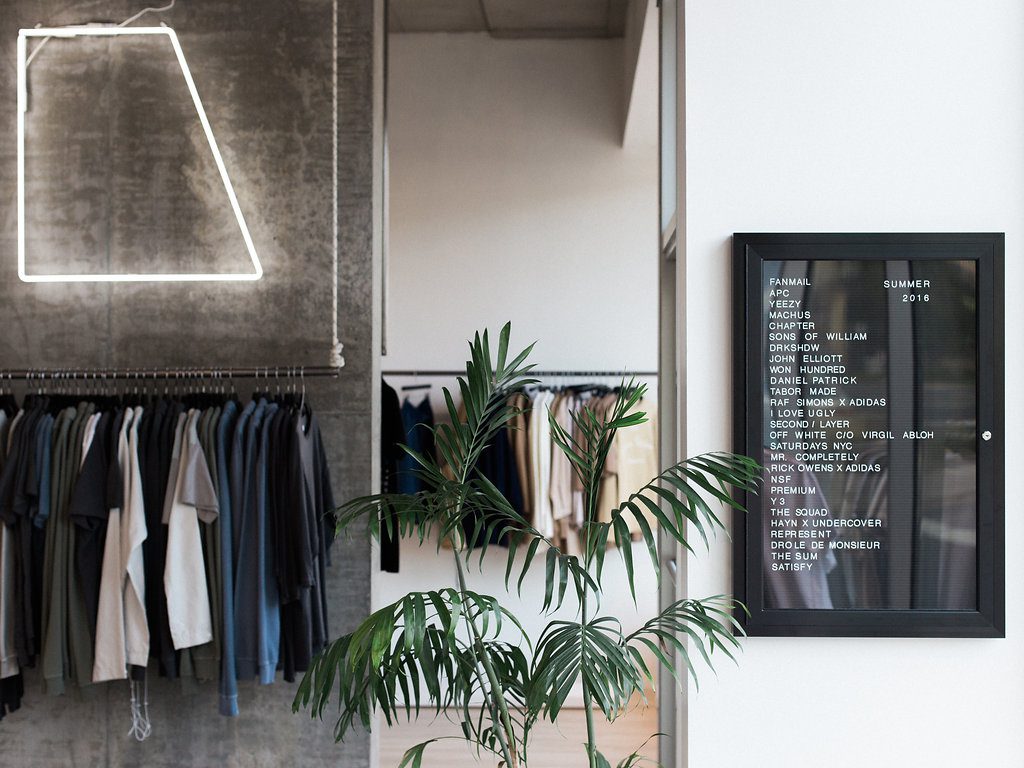
If I’m ever looking to shop for myself or simply get inspired by the latest in men’s lifestyle, I always stop by Machus. They are tirelessly looking to rotate through some of the best names in establishment and independent designers alike. Even if you’re not looking for something new to wear, it’s impossible to leave without witnessing something creative you haven’t seen before.

On the other side of the river, in what is steadily gaining identity as Portland’s “West End” is what may be a familiar sight for many.

Although the lobby of the Ace Hotel and its conjoined Stumptown Coffee and Clyde Common have long been a destination of locals and tourists alike, there is a balcony overlooking the entire spread which isn’t advertised at all. It’s tucked away but still in the path of the Ace’s signature natural light, creating an ideal environment to either get work done or host an individual client for brainstorming or review. With so many good cups of coffee and refreshments nearby, it’s hard not to feel good about the Ace as a choice to spend some time.
A wonderful place to retire the day is at Rontoms on East Burnside with a few friends, or even clients! The entire space was the brainchild of both the owner, who collects and restores midcentury furniture, and a local architect who designed the outdoor experience, including an asymmetrical patio roof for rainy days. A perfectly tasteful balance of work and play.

Rachel is a graphic designer, and Creative Circle candidate, with 5+ years of experience working out of Los Angeles and New York. Rachel works from concept to final production working with development teams and vendors. She has designed the UI for mobile and e-commerce websites, branding, email campaigns, banner ads, social media assets, presentation decks, brochures, infographics and other various print collateral.

In a collaboration with Bunch Magazine, the magazine for daring creatives, Rachel gave us an inside look at her life as a graphic designer. Watch the video below and get tips from Rachel on how to live creative.

A Day in the Life of a Graphic Designer

6 Ways to Live Creative and Still Get Your Work Done

1. Create a routine.

Working from home can at times get a bit disorienting. Days can fly past before you realize you’ve been in PJ’s for weeks. A trick that helps for me is getting dressed, and leaving the house in the morning. I usually grab fruit / coffee at the local grocery store. The accountability / structure of getting up and getting moving helps tons to send your brain those “time to work” signals.

2. Take a break.

Its easy to get in the zone and work for hours straight. Plan a break in your work schedule, whether its to go grab lunch, run an errand, or go to the gym — that mid-day break can work wonders for that mental block that’s keeping you from wrapping up a project.

3. Plan your workweek.

Keep a journal. Try and plan out what you’ll be working on for the week ahead. This way you can space projects out over the span of a few days, let it sit, and come back to it– within your deadlines. You’ll also be able to plan in advance which days will be your light days and which days will be all-nighters.

4. Give yourself enough time.

It’s really easy to over-commit. Predicting working hours is one of the toughest challenges for freelancers. Save yourself the headache and always pad in a bit of extra time in your schedule in case the project doesn’t wrap up as quickly as you anticipated. It’s always better to be early on a project (and make a good impression) than to be late on a delivery.

5. Take notes on your projects.

Sometimes a hectic weekend can wipe out all memory of Friday’s work-in-progress. Leave yourself notes about what you’re working on. When working through feedback, checklists are always great because you can see exactly where to pick back up and what you’ve completed already. A lot of times the client’s feedback will be scattered / coming from multiple stakeholders, so a checklist will help to piece together a cohesive plan.

6. Track your hours.

In the rare case that a client challenges you on your hours, or even just has sticker shock, you’ll want to have detailed notes on what you were working on and for how long. Keeping track of this in your journal makes billing / timesheets a breeze. I like to highlight my daily hours in my journal so I can quickly page through and reference the hours worked.
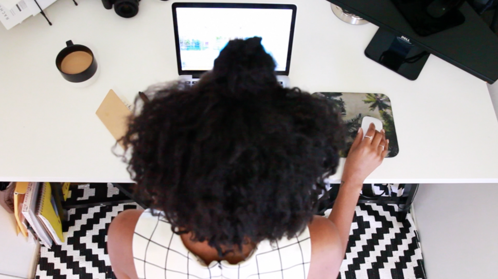
Day-in-the-Life-Computer

If you’re on the quest for a free font, this bit of advice is not for you. A true beauty is worth every penny. You get what you pay for when it comes to purchasing typefaces.

When you are seeking a mate, you need to know who you are and what you want to find a good match. It’s the same with typefaces; you need to know more about the project, and and who it’s for in order to find the ideal partner font. Because once you choose, you’ll be committed to her for the life of the project.

Good designers do more than just “pick a font.” There are other variables in play, such as how to pair well with other typefaces, where to place them in hierarchy for full effectiveness, and how well they work with the visuals on the page. I call the process “typecasting,” similar to casting an actor in a movie. Designers will want to ask themselves these questions about the nature of the project to create seamless storytelling.

1. Who’s the client and who are their clients?

Are they a big beverage brand speaking to consumers, or a small boutique hotel looking for travelers? Is there a large standards guide to follow, or is it a fresh, new campaign? Always begin by gaining an understanding of the nature of your client or campaign, you can begin to narrow down to type classification.

2. What is the project? And what are all the mediums and languages involved?

Will you need screen fonts or desktop fonts? Is the project large enough that you’ll need licensing for multiple mediums? If so, no matter which font family you use, you’ll want to plan to source web font versions for your desktop fonts or vice versa. This may limit the foundries from where you source your typefaces from. Or is it a an international ad campaign where you’ll need some translation? If that’s the case, look at Pro versions or typefaces with additional language support.

3. What’s the concept?

Once you have an idea of classification, begin by writing down all the words you can think of that describe the main idea. Reference imagery to help your brainstorming session. Open it up to related themes if you need more words or you’re designing a few directions. Then sift through and choose the top six that best describes the direction.

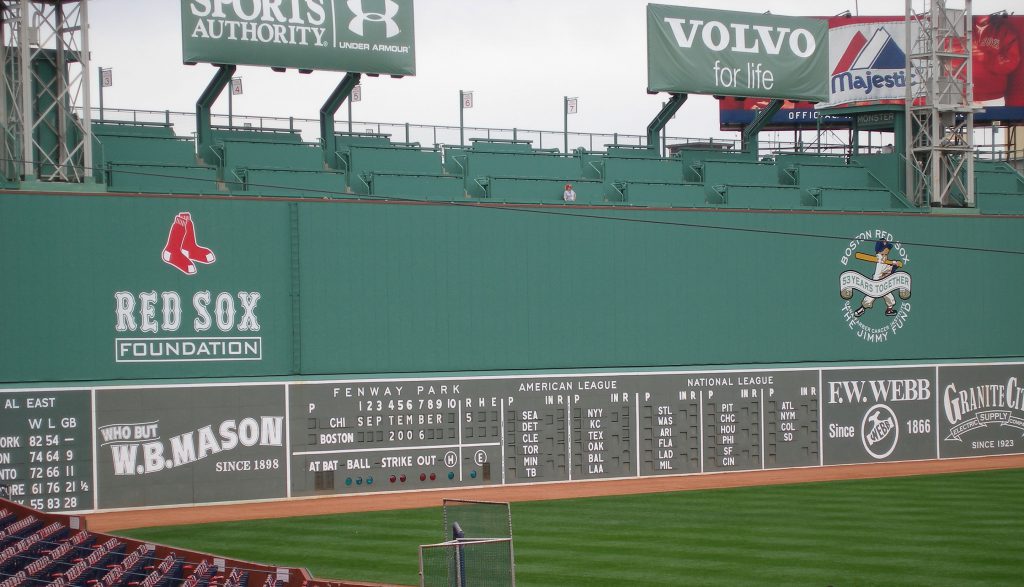
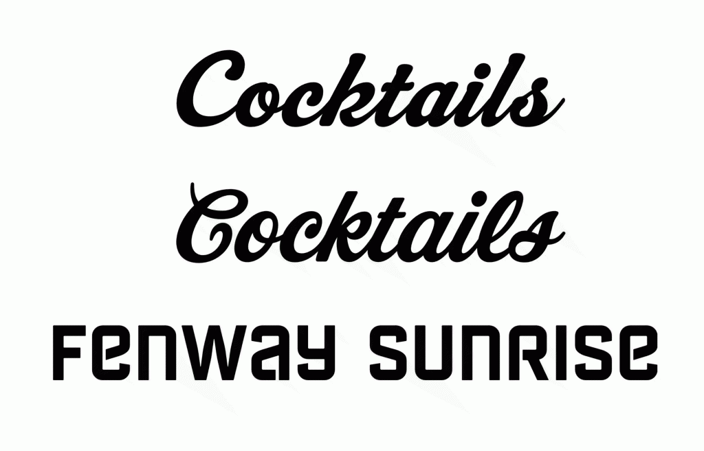
For example, if the project is a tabletop bar menu promoting baseball season, I will begin by start looking at type baseball field images. I’ll look at photos of Fenway Park, scoreboards, signage, uniforms. Since we’re talking about America’s game, I’ll Google images of vintage baseball and see if that conjures up nostalgic words for possibly another design direction.

Wikipedia_Green_Monster
Image of Fenway Park, courtesy of Wikipedia

4. What is the voice & tone of content?

When you read the raw content, you can assess what sort of voice is being spoken. The tone of the writing will give you more clues to the personality of typeface to choose.

I used to give a project in school where my students had to pick a poem and lay it out with type only, across a spread. Typeface choice was critical, because one wouldn’t choose a fancy script for say, a quote by Teddy Roosevelt or Winston Churchill. You’re going to pick something heavy, perhaps set in all caps, to reflect the voice of the speaker.

Our Notebook-Possibilities
5. How much content? How will it be read?

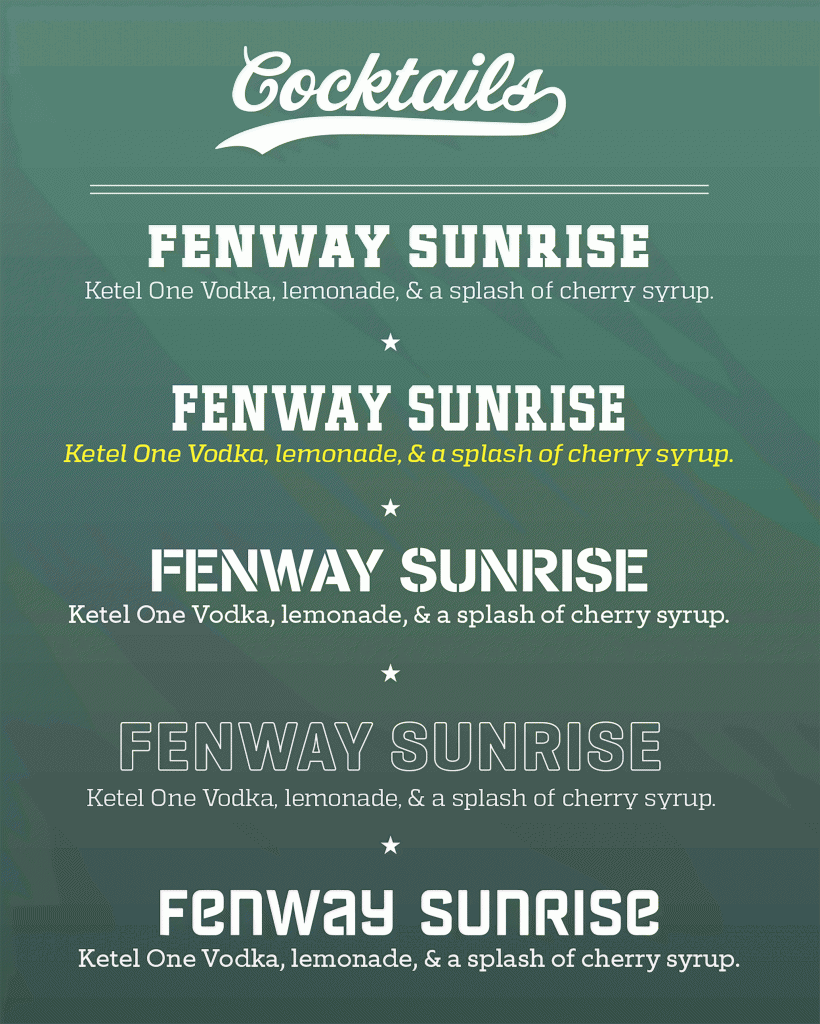
How many pages are you going to be typesetting? How much content is involved, and in what form? If the format will be a 6″ x 9″ tabletop menu and the client has over 20 different drinks, you already know that the typeface will be pretty small. And if there’s a lot of reading copy, consider a typeface that has letterform legibility at small sizes.

If you’re working on screen, how will the typeface affect the reading experience on a low-resolution device or moving fast in a movie title treatment? Will the user be reading all the content or just merely scanning?

6. How many levels of content?

Hierarchy works as navigation to lead the reader across the page and to separate the content and indicate context. Assess how much content you have to deal with in the space, and then determine how many levels you’ll need to help you determine the font family needed.

Our Notebook-Menu Test
On our baseball drink menu menu, we will only need two levels of hierarchy to separate the name of the drink from the description, and there are many typefaces with only 2 or 3 weights. However, if you are redesigning a magazine, you may need up to 15 or 20 weights and styles, so seek for large families or super families, which narrows your quest considerably.

In order to choose and find the font that works best for your graphic design project, all aspects of the final outcome have to be considered. You need to know what you want in order to be happiest. Just do your due diligence, and you’ll find happiness in a font that fits the project. Don’t worry, letter love is waiting for you.


Michael Stinson is a co-founder and instructor at TypeEd, where he helps designers implement better typography, efficiently. Get more typography in your inbox when you sign up for more updates about TypeEd.

The silver lining of life’s most uncomfortable moments is without a doubt the comedy. All but the most harrowing of today’s embarrassments and blunders eventually become tomorrow’s knee slappers—we laugh because we survived, and we survived because we learned something… albeit the hard way.

Job interviews are an excellent arena for this type of fodder. When someone’s very future is on the line, and they’re looking down the path of a possible future (“Could this be me?” “Am I home?” “Are you my mommy?”) weird things can happen. Sometimes these things are very, very bad in the moment, but we can all laugh about them now… and take furious notes to ensure we don’t make the same mistakes in our own interview.

On the flip side, it’s terrible practice to give a crappy performance as the interviewer, too—acting bored, insulting someone’s experience, getting their name wrong, making someone in an incredibly vulnerable position feel absolutely terrible… (or, in the case of the stories I heard, much, much worse). Unless you don’t care about attracting good employees and coworkers? Either way, you’ll get what you give.

In that spirit, I recently solicited stories about people’s worst interview experiences — from both sides of the table.

The Bad

  • “The interviewer fell asleep during my interview. Right in the middle of my answer, his head just went down.”
  • “I’ve had a few where candidates seem like they have a chip on their shoulder. I’ve called it out.”
  • “I was like 30 minutes late! I couldn’t get service on my cell phone, so I started to panic. And I ended up being way too dressed up—I’m talking super corporate attire—because I’d always been told that it’s better to be overdressed than underdressed. I felt like it was the worst experience… but I got the job.”
  • “I had a candidate show up with nothing—no purse, no pen, no paper, no resume… nothing. Another whose resume spelled “communication” three different ways—for a PR job—then kicked off the interview by talking shit about his current job. I interrupted him after two minutes to tell him he wasn’t getting the position but then I offered to give him some tips on what not to do.”
  • “The following things happened: They took a polaroid of me, they played a video of Arnold Schwarzenegger giving a speech at a fat camp, and they made me fill out an “employee test,” which was about five pages of math story problems that had been printed on a ditto machine (purple ink!).”
  • “Six months after giving birth, I was called in to interview at a high-profile ad agency. I was lumpy and tired and had lost my ability to think. I had cut my own bangs the night before—like Dumb & Dumber I wore so many Spanx I almost died taking them off. When I get there, I pull the front door and it somehow runs over my foot, which breaks the strap on my shoe. So I walk up the stairs kind of sliding so the shoe stays on. The woman comes out and she’s all cute and small and has her shit together. We go to this café, and she starts talking about wine and looking at the wine menu. I order wine. She doesn’t. She asked me to describe myself. I started saying stuff like ‘You go girl!’ I repeated myself and went into a dark place. Finally it ended.”

The Ugly

  • “[The worst are] hostile non-verbals, like furrowed brows, head in hands, near-throwing of pens, and—my favorite—the dropping of glasses on the table then looking out the window.”
  • “I had an interviewer on the phone ask if I was A) tall and B) blonde. Shockingly, I made it to the in-person interview, where he proceeded to walk me through the office—shadowed by an aghast HR rep—announcing all the derogatory nicknames he’d given his employees.”
  • “I was once interviewed by a CEO who went off on a tangent about how, if he had to choose between meth and cocaine, he’d go for coke every time because it’s natural.”
  • “One guy recently actually had cocaine on his face when he came in at 10 am to interview.”
  • “I was in a group interview on Skype when, in the background of the person we were interviewing, a human crawled out of a refrigerator box in the corner. The box had been there the whole time, not moving, and he said nothing about it.”

Have an interview story of your own? Share it with us in the comments!


Marjorie is a former Creative Circle candidate based in Portland who recently accepted a full-time offer for her dream job. She is a writer/editor and stylist/producer with an emphasis in the design world. If you are interested in working with someone like Marjorie, please contact your nearest Creative Circle office.
What’s your best line? I usually have good luck with the one where I compare my career trajectory to that of a grandpa’s: you start out sweeping the floors of a company, and you work your way up the ladder until they give you a watch after 15-odd years. (It started as an internship and I left with a pewter flask, but you get the idea.)

Job interviews are like Tinder dates except extremely worse, because it’s usually 9:30 a.m., there’s no booze anywhere, and it feels like the whole of your tiny life is being held—ready to be crushed—in the palm of a stranger’s hand. Go to enough of them, and you start recycling your material. Practicing it. Perfecting it, like a comedian making open mic rounds before hitting the big clubs. If there’s anything “awesome” about interviewing for a job you don’t get, it’s that practice. Your nerves are going to do their thing in these situations whether you like it or not. The better you have your lines rehearsed, the easier they’ll roll off the tongue without having to fight through your anxiety to find the right words.

When you’re job-seeking — including saying hey to a roster of prospective new freelance clients — you’re having a lot of these conversations, just as you’re having a lot of awkward drinks with strangers if you’re working the singles scene. Although these types of interactions are typically — literally — the difference between night and day, they share one crucial component: chemistry.

We’ve all been on a vaguely awkward date. Afterward, your friends ask about it and you say something like, “Oh, it was fine…” or “They were nice, but…” The missing component that takes either of this circumstances from “meh” to “promising” is hard to pinpoint; it just works, or it doesn’t. No matter how well you match up on paper (You have the B2B experience they’re looking for! You both like dogs!), if they don’t like your tone, or they don’t get your jokes (the worst), or you fail to convince them of your interest in who designed the atrium of their agency’s new offices, things can start to feel tainted, fast.

Of course the flip side is that all of this is mutual. It’s natural to feel like it’s on you to be the impressive one in an interview setting, but it’s helpful to realize that’s not entirely the case. After all, how badly do you want to work with someone who doesn’t think you’re funny, or isn’t all that friendly? You probably wouldn’t put that much pressure on yourself when heading out on a blind date. You’d brush your hair and make sure that there isn’t anything stuck between your teeth, and you’d do your best to be charming and smart, but you’d expect a similar show of effort on your date’s part.

Yes, it’s important to put your best foot forward in dealing with a prospective employer. But if it doesn’t work out — and you get that sinking feeling mid-interview, though sometimes it’s from the start — you might also consider the fact that you’ve also dodged a bullet. You won’t benefit from being in an unhealthy, tense relationship with a boss or a client any more than you would be in a relationship where one or both of you aren’t totally feeling it. You’d end up feeling under-appreciated or burdensome, and even worse, it would chip away at your confidence, which is by far your most valuable tool in any setting.

I used to think all interviews were pretty awkward by nature until I had one that wasn’t — at all. I left on a high, like I’d made a new friend… and not to muddy the water too much but yeah, like I’d been on a really promising first date. Fast forward and I’m two weeks into a freelance gig of indeterminate length at his offices, with the possibility of full-time work a subject of open dialogue.

Whoever said that you have to kiss a few frogs before finding a prince wasn’t talking about a job interview, but I’d argue it’s just as applicable. You have to have a couple of ill-fitting encounters before you can strike up a business relationship that might have long-term mutual benefit. And, when it comes to the ones that end badly, just think: It’s not you, it’s them.


Marjorie is a former Creative Circle candidate based in Portland who recently accepted a full-time offer for her dream job. She is a writer/editor and stylist/producer with an emphasis in the design world. If you are interested in working with someone like Marjorie, please contact your nearest Creative Circle office.

Sitting down to write or review your resume is daunting. Believe me, we know. Especially when you’re hoping to make a change in your career and go after a role that’s different than all others you’ve had, it can be an intimidating thing to wrap your head around. Here is one page of blank space…and you’re supposed to fit your career history there, along with the skills you’ve acquired? That’s hard enough. What if what you used to do, isn’t directly related to what you want to do?

We meet candidates looking to change the direction of their careers and it is possible to do. By reassessing the direction you’d like to go in, acknowledging your transferrable skills, and arranging how to best present them to prospective employers and clients, you have the ability to make a change.

Here’s how to approach the goal without losing your head.

1. Breathe

Do you think every high-level director (or even CEO) had in mind the direct path they thought they’d go to get in their position? No, of course not. They got there through a maze of side steps and their GPS redirecting them at different corners. It’s okay to decide to make a change, the key is to be strategic about it (which is where Creative Circle can help). Remember that you probably know more about what you’re doing than you think.

2. Use Your Resources

Thanks to the world wide web, there are so many resources available to people in the job market. It goes far beyond sites that are clearly only for job seekers. If you’re interested in a new role in an area that is something different than what you’re doing now, do your research! Hop on to Google and see where searches take you. Search job descriptions, reviews of roles at specific companies, and even people’s personal descriptions on their LinkedIn profiles. Search until you’ve practically overdosed on informational content. Get to know what it is you’ll be expected to do, what you’ll need to learn, what types of people you’ll be expected to interface with (and what their skills are), and what the current challenges and goings-on of this industry are. Just as it’s important before an interview to get excited about the company you’re meeting with and know as much about them as possible, think of your new industry that way as well (whether or not you have an interview there or not).

3. Read and Apply Your Words

Look at job descriptions of the roles you want to be in and remember that not only does each company write their job descriptions in a specific way, but specific industries have nuanced terms they use when discussing a specialty or role. As Jocelyn, a senior recruiter at Creative Circle NY says, “There can be seven different ways to say the same thing.” Pay attention to the language used, and apply it to your resume and cover letters. Buzzwords can be a great way to catch the eye of the person tasked to pool the most well-matched applications.

4. Remember: Skills are Transferrable

When you’re looking over your resume and your skills, don’t take your skill sets for granted. All skills are transferrable (another great point made by Jocelyn) and you can almost always find a way to apply skills you used in one role to the role you’re applying for or the new direction you’re headed in your career. Use the buzzwords mentioned above to describe your responsibilities at previous positions and in your cover letter, explain how your acquired skills can be applied to your new role.

All in all, when you’re focused on making a change in your career, keep in mind that it is going to be a learning process. Do your best not to get frustrated. Instead, use the resources at your disposal, and remain inspired. Think about how far you’ve come, what you know, and how you can use that to your advantage in this next chapter!


Allison is a former Creative Circle Account Executive, with a background in creative writing, content writing/strategy, publishing, and business development. Her world revolves around words and the relationships and interactions they inspire. Allison is now the Content Specialist at Raizlabs, a design and development firm in Boston and San Francisco.

Proportional and Tabular

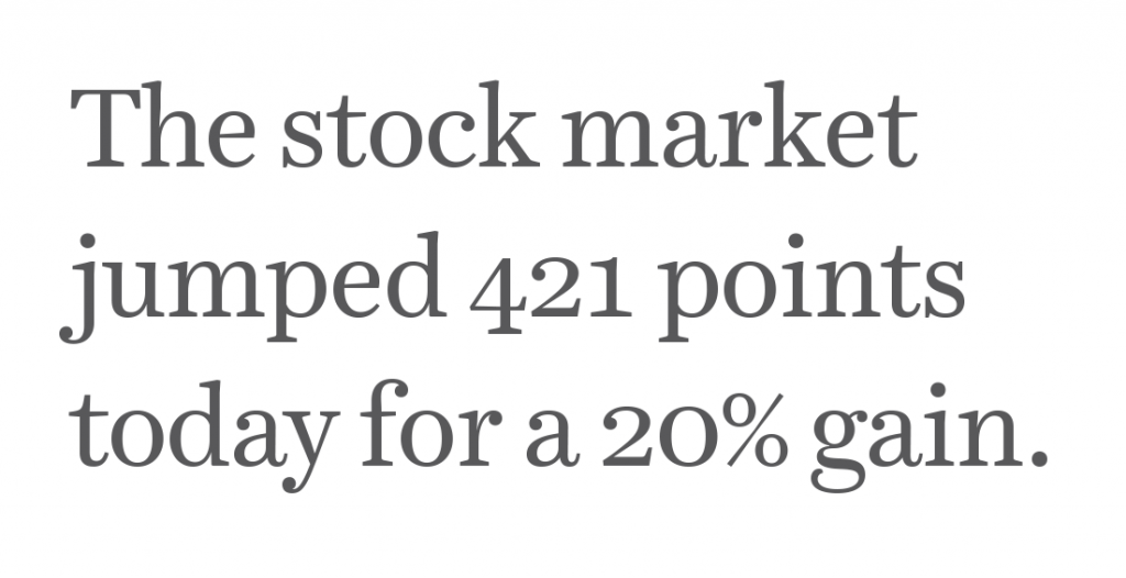
Did you know that there are two ways to set numerals? You know uppercase and lowercase letters exist, but did you know there are also ‘uppercase’ and ‘lowercase’ figures? In addition to lining and old-style, there’s also two different spacing formats, proportional and tabular.

So much to know about figures, so here’s how it breaks down.

Differences in Height

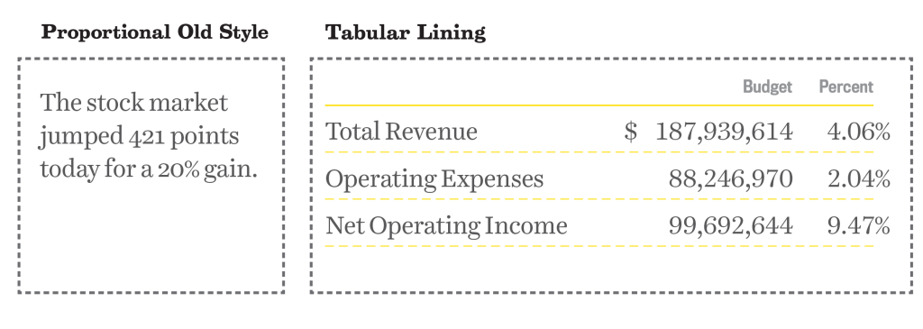
Old Style numerals (otherwise known as text or lowercase figures) have varied heights in a fashion that resembles a typical line of running text. They follow the ascenders and descenders of lowercase letters. If you set body copy, use old style figures for dates, phone numbers and other uses. Whenever sentence case is used, set your figures in old style. It might look weird because you’re not used to it, but it follows the way people read.

Old Style
Notice how the old style figures here rise to the x-height and have descenders much like lowercase letters.

Using lining numerals (otherwise known as titling or uppercase figures) in body copy disrupts the flow of reading, in the same way that ALL CAPS SHOUT to your reader. Lining numerals work best next to all-cap height letters, or more commonly, in financials for accounting applications. Having all the figures line up at the cap-height makes them easy to read in a line.

Differences in Width

Proportional figures have variable spacing, which results in even color on the page created by horizontal rhythm and reading. The spacing around each figure allow for the width of each figure. Not only do I recommend old style numerals for body copy, I will also recommend them to be proportional. In order to implement, look for “proportional old style” numerals.

Tabular
Notice how the tabular figures here line up vertically. The decimal points line up all the way down.

By contrast, tabular figures have uniform spacing and have the same width. These numerals act more like monospaced glyphs, so where no matter what the actual width of the character is, the space in the glyph will be the same. Tabular figures are perfect for financials, price lists and setting math, because they will be aligned vertically when set into columns. For accounting applications, be sure to choose “tabular lining” numerals.

Why it Matters

When choosing a typeface, not only are glyphs important to the usage, but so are the numbers. Figure height and width spacing matters. If you’re setting long-form reading content, choose a typeface that has proportional old style figures. If setting financial-heavy documents, choose a typeface that has tabular lining figures. Choosing the right typeface for your project will help you design a great reading experience.

I explain more about numerals, letters and glyphs and all you need to know about choosing the perfect typeface in our online typography basics class, Type 1. Does your favorite typeface have old-style or lining numerals as a default? Let me know by tweeting us at @TypeEd. I’d love to see what type of numerals you’re using.


Michael Stinson is a co-founder and instructor at TypeEd, where he helps designers implement better typography, efficiently. Get more typography in your inbox when you sign up for more updates about TypeEd.